Plot matrix with the R package GGally
Want to share your content on R-bloggers? click here if you have a blog, or here if you don't.
I am glad to have found the R package GGally. GGally is a convenient package built upon ggplot2 that contains templates for different plots to be combined into a plot matrix through the function ggpairs. It is a nice alternative to the more limited pairs function. The package has also functions to deal with parallel coordinate and network plots, none of which I have tried yet.
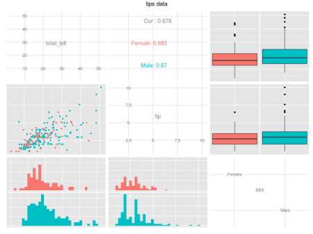
The following code shows how easy it is to create very informative plots like the one in Figure 1.
require(GGally)
data(tips, package="reshape")

ggpairs(data=tips, # data.frame with variables
        columns=1:3, # columns to plot, default to all.
        title="tips data", # title of the plot
        colour = "sex") # aesthetics, ggplot2 style
Plots like the one above are very helpful, among others things, in the pre-processing stage of a classification problem, where you want to analyze your predictors given the class labels. It is particularly amazing that we can now use the arguments colour, shape, size and alpha provided by ggplot2.
Controlling plot types
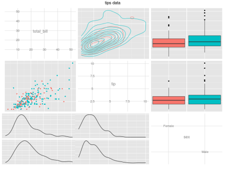
We have some control over which type of plots to use. We can choose which type of graph will be used for continuous vs. continuous (continuous), continuous vs. discrete (combo) and discrete vs. discrete (discrete). We can also have different plots for the upper diagonal (upper) and for the lower diagonal (lower).
For example, the code below
pm = ggpairs(data=tips,
             columns=1:3,
             upper = list(continuous = "density"),
             lower = list(combo = "facetdensity"),
             title="tips data",
             colour = "sex")
print(pm)
creates Figure 2, which uses the same data used in Figure 1, but with a density plot in the upper diagonal for continuous vs. continuous variables and a density plot faceted by a discrete variable in a continuous vs. discrete scenario.
The details section of the help file of the ggpairs function describes which plots are available for each scenario. Currently, the following are described there:
- continuous: exactly one of ‘points’, ‘smooth’, ‘density’, ‘cor’ or ‘blank’;
- combo: exactly one of ‘box’, ‘dot’, ‘facethist’, ‘facetdensity’, ‘denstrip’ or ‘blank’;
- discrete: exactly one of ‘facetbar’,’ratio’ or ‘blank’.
Auxiliary functions
We can insert a customized plot within a plot matrix created by ggpairs using the function putPlot. The following code creates a custom ggplot object cp and insert it in the second row and third column of the ggpairs object pm.
cp = ggplot(data.frame(x=1:10, y=1:10)) +
  geom_point(aes(x, y))

putPlot(pm, cp, 2, 3)
We can also retrieve an specific ggplot object from a ggpairs object using the getPlot function, with the following syntax:
getPlot(plotMatrix, rowFromTop, columnFromLeft)
References:
[1] GGally reference manual and help files.
R-bloggers.com offers daily e-mail updates about R news and tutorials about learning R and many other topics. Click here if you're looking to post or find an R/data-science job.
Want to share your content on R-bloggers? click here if you have a blog, or here if you don't.


