Amateur Urbanist Critique of Work-Live-Ride using 360k Fairfield County Parcels


library(data.table)
library(glue)
library(arrow)
##
## Attaching package: 'arrow'
## The following object is masked from 'package:utils':
##
##     timestamp
library(duckdb)
## Loading required package: DBI
library(tictoc)
##
## Attaching package: 'tictoc'
## The following object is masked from 'package:data.table':
##
##     shift
library(ggplot2)
library(scales)
library(dplyr)
##
## Attaching package: 'dplyr'
## The following objects are masked from 'package:data.table':
##
##     between, first, last
## The following objects are masked from 'package:stats':
##
##     filter, lag
## The following objects are masked from 'package:base':
##
##     intersect, setdiff, setequal, union
library(bit64)
## Loading required package: bit
##
## Attaching package: 'bit'
## The following object is masked from 'package:data.table':
##
##     setattr
## The following object is masked from 'package:base':
##
##     xor
## Attaching package bit64
## package:bit64 (c) 2011-2017 Jens Oehlschlaegel
## creators: integer64 runif64 seq :
## coercion: as.integer64 as.vector as.logical as.integer as.double as.character as.bitstring
## logical operator: ! & | xor != == < <= >= >
## arithmetic operator: + - * / %/% %% ^
## math: sign abs sqrt log log2 log10
## math: floor ceiling trunc round
## querying: is.integer64 is.vector [is.atomic} [length] format print str
## values: is.na is.nan is.finite is.infinite
## aggregation: any all min max range sum prod
## cumulation: diff cummin cummax cumsum cumprod
## access: length<- [ [<- [[ [[<-
## combine: c rep cbind rbind as.data.frame
## WARNING don't use as subscripts
## WARNING semantics differ from integer
## for more help type ?bit64
##
## Attaching package: 'bit64'
## The following object is masked from 'package:utils':
##
##     hashtab
## The following objects are masked from 'package:base':
##
##     :, %in%, is.double, match, order, rank
library(microbenchmark)
uscompany <- "~/Documents/Projects/uscompanies/data/"
options(scipen = 999)
knitr::opts_chunk$set(echo = TRUE, warning = FALSE)
Introduction It has been a while since loading Large, Messy ...

library(data.table)
library(here)
## here() starts at /Users/davidlucey/Desktop/David/Projects/redwall-analytics
library(glue)
## Warning: package 'glue' was built under R version 4.1.2
library(tictoc)
setDTthreads(percent = 90)
path_to_data <- "~/Desktop/David/Projects/uscompanies/data"
path_to_original <- here::here(path_to_data, "uscompanieslist.csv")
Introduction On a recent side project, we encountered a large (7GB) csv of 30+ million US business names and addresses, which couldn’t be loaded into R, because of corrupted records. While not widely discussed, we have known for some time that it was possible ...

# Libraries
if(!require("pacman")) {
  install.packages("pacman")
}
pacman::p_load(
  data.table,
  re2,
  scales,
  ggplot2,
  plotly,
  DT,
  patchwork,
  survival,
  ggfortify,
  scales)

# Set knitr params
knitr::opts_chunk$set(
  comment = NA,
  fig.width = 12,
  fig.height = 8,
  out.width = '100%'
)
NOTE: The read time for this post is overstated because of the formatting of the Plotly code. There are ~2,500 words, so read time should be ~10 minutes.
Click to see R code generating plot
# Load function to plot dual y-axis plot
source("train_sec.R")

# Get data series from FRED
symbols <- c("CP", "GDP", "WASCUR")
start_date <- '1947-01-01'
end_date <- '2021-07-30'
quantmod::getSymbols(
  Symbols = symbols,
  src = "FRED",
  start_date = start_date,
  end_date = end_date
)
[1] "CP" "GDP" "WASCUR"
# Merge series and convert to dt
d <- as.data.table(merge(WASCUR/GDP, CP/GDP, join = "inner"))

# Build superimposed dual y-axis line plot
sec <- with(d, train_sec(CP, WASCUR))
p <-
  ggplot(d, aes(index)) +
    geom_line(aes(y = CP),
              colour = "blue",
              size = 1) +
    geom_line(aes(y = sec$fwd(WASCUR)),
              colour = "red",
              size = 1) +
    scale_y_continuous(
      "Corporate Profits to GDP",
      labels = scales::percent,
      sec.axis = sec_axis(
        ~ sec$rev(.),
        name = "Compensation of Employees to GDP",
        labels = scales::percent)
    ) +
    scale_x_date(date_breaks = "10 years",
                 date_labels = "%Y") +
    labs(title = "Labor vs Capital",
         x = "Year",
         caption = "Source: Lots of places") +
    theme_bw(base_size = 22)
Introduction
The rise in monopoly power particularly ...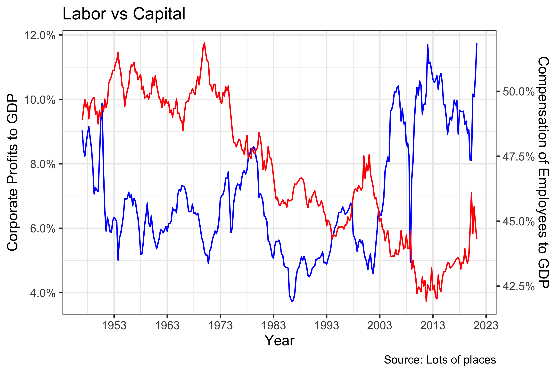
# Libraries
if(!require("pacman")) {
  install.packages("pacman")
}
pacman::p_load(
  data.table
  )

# Set knitr params
knitr::opts_chunk$set(
  comment = NA,
  fig.width = 12,
  fig.height = 8,
  out.width = '100%'
)
Introduction
As we discussed in our last post Introducing the Redwall ‘Red Flag’ Explorer with New Constructs Data, we were able to test the response of 125,000 quarterly and annual financial statements to incidence of “red flag” ratios, but some of the most interesting ... [Read more...]# Libraries
if(!require("pacman")) {
install.packages("pacman")
}
pacman::p_load(
data.table,
scales,
ggplot2,
plotly,
DT)
# Set knitr params
knitr::opts_chunk$set(
comment = NA,
fig.width = 12,
fig.height = 8,
out.width = '100%'
)
# Load annual data only
path <-
"~/Desktop/David/Projects/new_constructs_targets/_targets/objects/"
red_flags <-
readRDS(paste0(path, "nc_annual_red_flags"))
annual_data <-
readRDS(paste0(path, "nc_annual_final"))
Key Findings
1999-2000 was an exceptional period for both “Red Flag” prevalence and return differentiation, though apparent benefits of the strategy appear in most periods.
Approximately 2.0% of filings we checked had 5 or more “Red Flags” among annual and quarterly filings, so sparsity is ...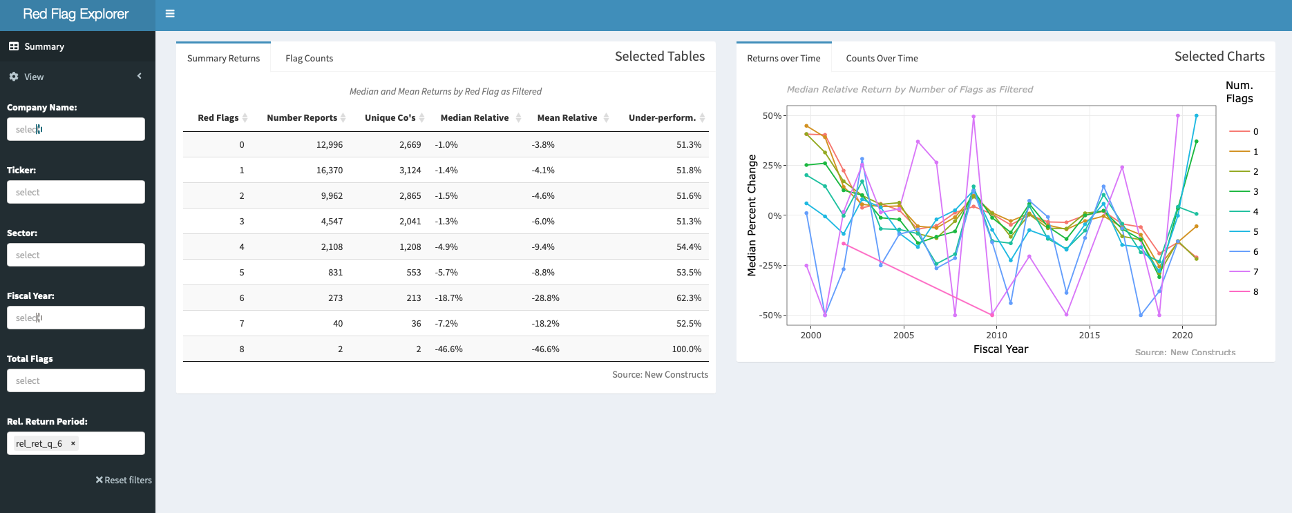

# Libraries
packages <-
  c("tidyverse",
    "sergeant",
    "tictoc"
    )

if (length(setdiff(packages,rownames(installed.packages()))) > 0) {
  install.packages(setdiff(packages, rownames(installed.packages())))
}

invisible(lapply(packages, library, character.only = TRUE))

knitr::opts_chunk$set(
  comment = NA,
  fig.width = 12,
  fig.height = 8,
  out.width = '100%'
)
Introduction
At Redwall, we have been in nonstop exploration of new data sets over the last couple of years. As our data grows and the targets of interest get bigger, we have been finding the old method of loading csv’s from disc, and ...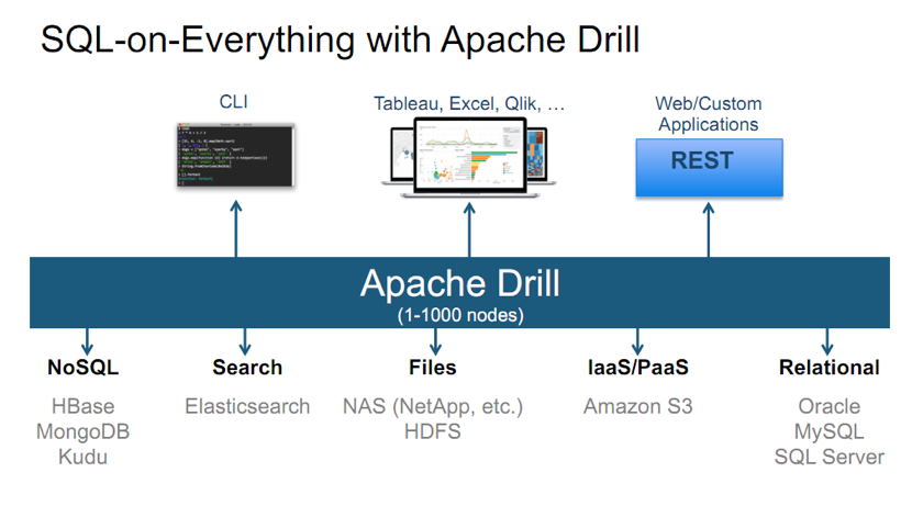
# Libraries
packages <-
  c("vitae",
    "tibble",
    "spelling"
    )

if (length(setdiff(packages, rownames(installed.packages()))) > 0) {
  install.packages(setdiff(packages, rownames(installed.packages())))
}

invisible(lapply(packages, library, character.only = TRUE))

knitr::opts_chunk$set(
  comment = NA,
  fig.width = 12,
  fig.height = 8,
  out.width = '100%'
)
Introduction
This will be a post about building a resume (curriculum vitae) with the R {vitae} package, by a professional who somehow managed to spend 25 years without one. I am also making one of the more unusual career transitions, moving from investment research sales to look for interesting challenges ... [Read more...]# Libraries
packages <-
c("data.table",
"ggplot2",
"stringr",
"skimr",
"janitor",
"glue"
)
if (length(setdiff(packages,rownames(installed.packages()))) > 0) {
install.packages(setdiff(packages, rownames(installed.packages())))
}
invisible(lapply(packages, library, character.only = TRUE))
knitr::opts_chunk$set(
comment = NA,
fig.width = 12,
fig.height = 8,
out.width = '100%',
cache = TRUE
)
EPA AirData Air Quality Monitors
Introduction
As our journey with open source software continues, there is a growing list of things we have tried, but were unable to or took too long to figure out, so moved on. Sometimes its a blog or twitter post, others a new package ...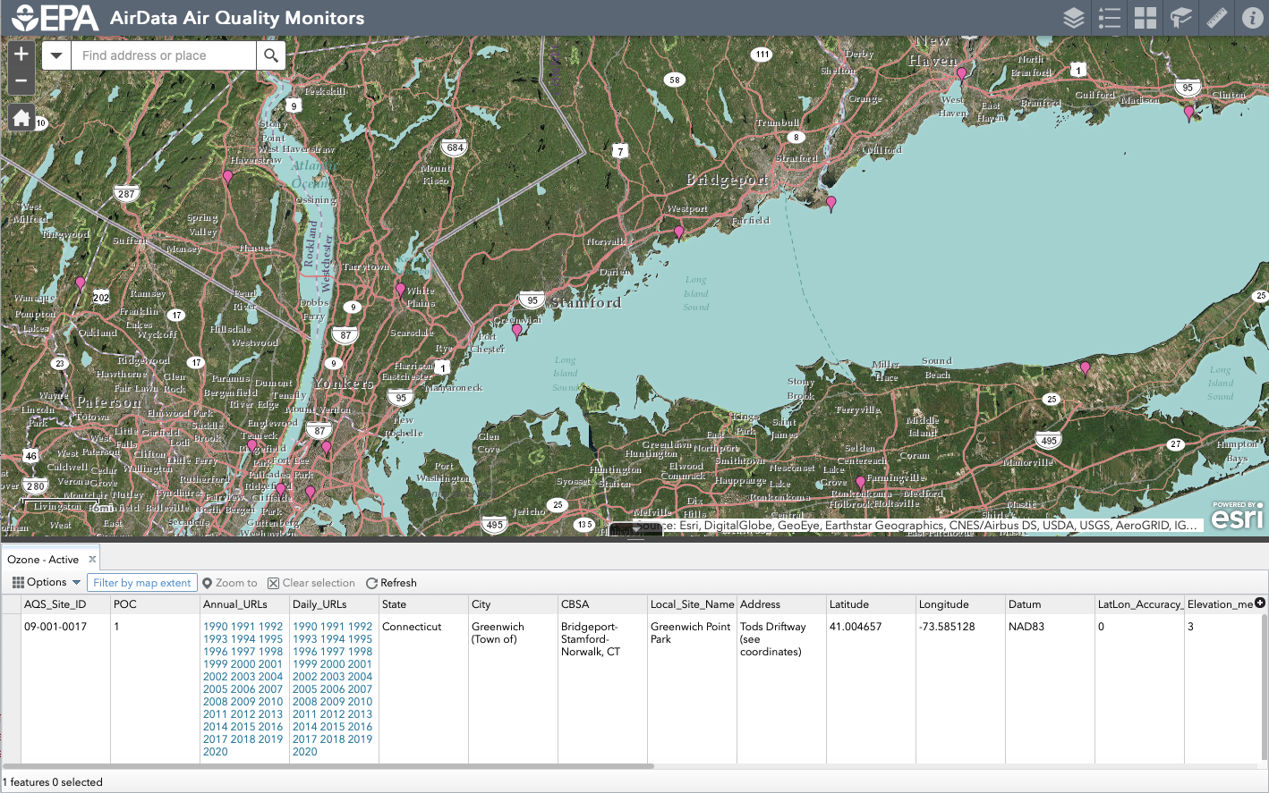
# Libraries
packages <-
  c("data.table",
    "DBI",
    "reticulate",
    "keyring",
    "RAthena"
    )

if (length(setdiff(packages,rownames(installed.packages()))) > 0) {
  install.packages(setdiff(packages, rownames(installed.packages())))
}

invisible(lapply(packages, library, character.only = TRUE))

knitr::opts_chunk$set(
  comment = NA,
  fig.width = 12,
  fig.height = 8,
  out.width = '100%'
)
Introduction
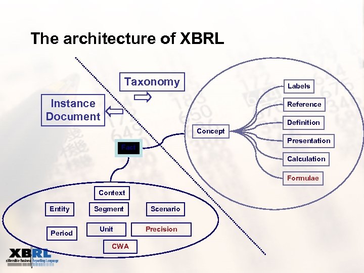
In A Walk Though of Accessing Financial Statements with XBRL in R - Part 1, we showed how to use R to extract Apple financial statement data from the SEC Edgar website. This would be a cumbersome process to scale across sectors, but works well for a single company. ...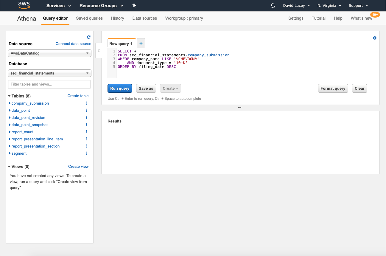
# R Libraries for this blogdown post
# See Github for libraries used in drake project
library(data.table)
library(DT)

knitr::opts_chunk$set(
  fig.width = 15,
  fig.height = 8,
  out.width = '100%')
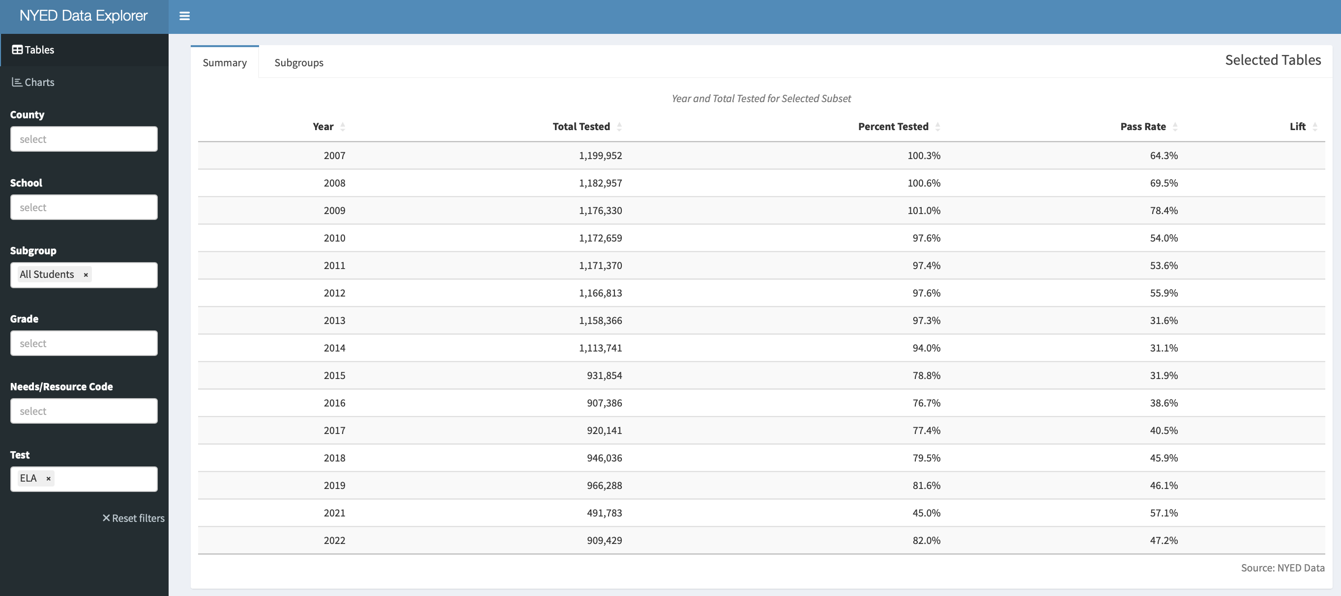
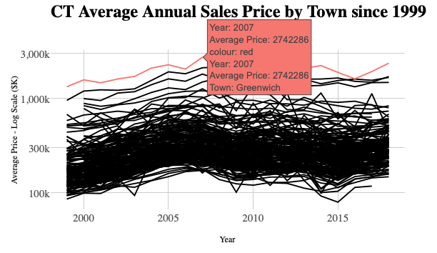
Introduction The State of Connecticut requires each of its 169 municipalities to report real estate sales used in the assessment process. All reported transactions by towns are published on the Office of Policy and Management (OPM) website. In the past, annual databases were disclosed with differing storage formats each year (...
# R Libraries
library("reticulate")

knitr::opts_chunk$set(
  fig.width = 15,
  fig.height = 8,
  out.width = '100%')
# Choose Python 3.7 miniconda
reticulate::use_condaenv(
  condaenv = "r-reticulate",
  required = TRUE
  )
# Install Python packages
lapply(c("plotnine"), function(package) {
       conda_install("r-reticulate", package, pip = TRUE)
})
# Python libraries
from datatable import *
import numpy as np
import plotnine as p9
import re
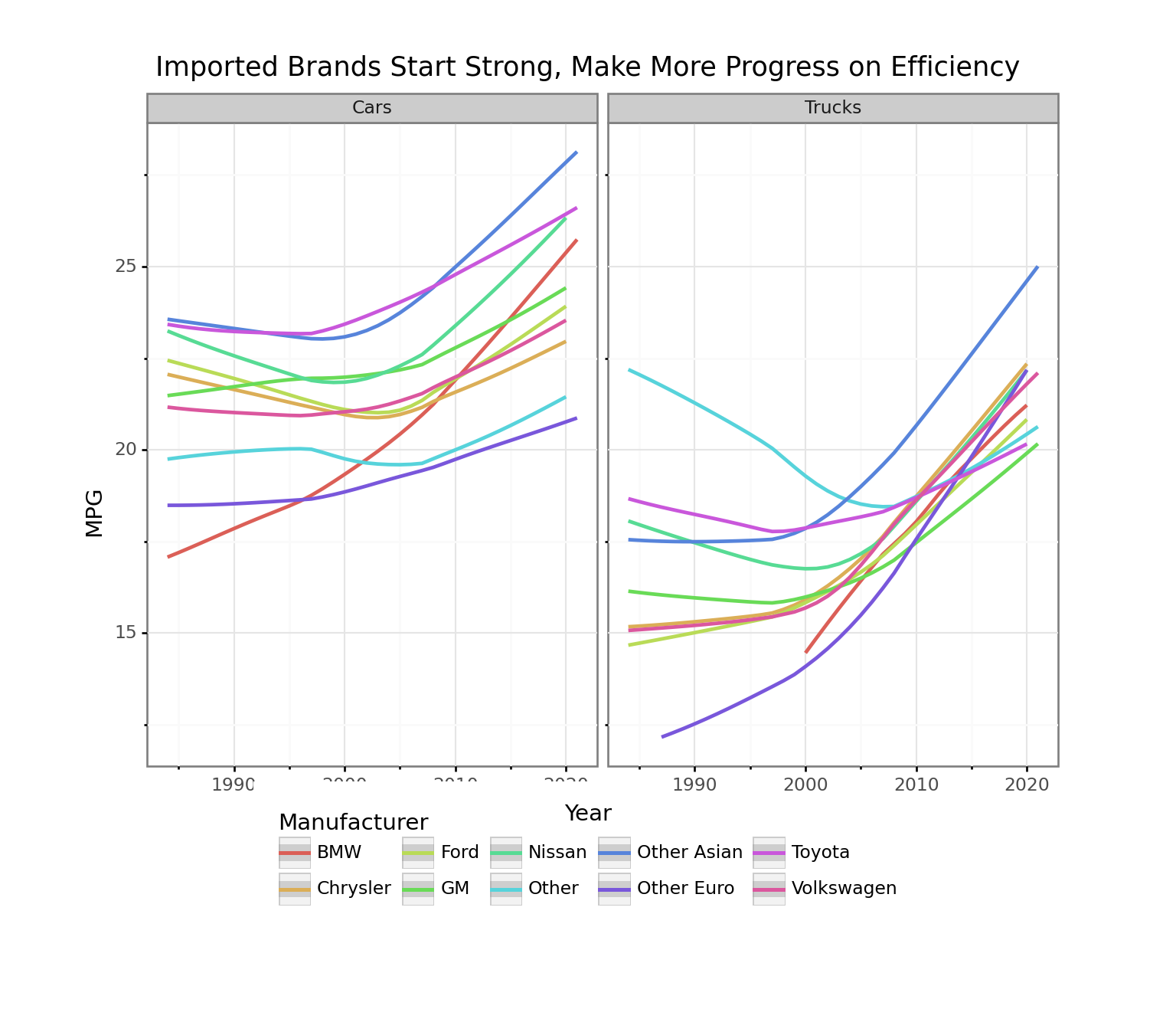
Introduction In this post, we start out where we left off in Exploring Big MT Cars with Python datatable and plotnine-Part 1. In the chunk below, we load our cleaned up big MT Cars data set in order to be able to refer directly to the variable ...
# R Libraries
library("reticulate")
library("skimr")

knitr::opts_chunk$set(
  fig.width = 15,
  fig.height = 8,
  out.width = '100%')
# Install Python packages
lapply(c("datatable", "pandas"), function(package) {
       conda_install("r-reticulate", package, pip = TRUE)
})
# Python libraries
from datatable import *
import numpy as np
import re
import pprint
Introduction As mentioned in our last series Parsing Mass Municipal PDF CAFRs with Tabulizer, pdftools and AWS Textract - Part 1 and A Walk Though of Accessing Financial Statements with XBRL in R - Part 1, this is a year of clean-up. Redwall Analytics is going through this year, ... [Read more...]
Copyright © 2025 | MH Corporate basic by MH Themes