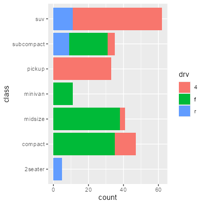
Articles by R on Nicola Rennie

Working with colours in R

January 9, 2025 | R on Nicola Rennie

When you create a data visualisation using R (or any other software), a set of default colours is used. These aren’t always the most effective, or aesthetically pleasing, set of colours. That means that, at some point, you’ll likely want to...
[Read more...]

Introducing the {messy} package

December 2, 2024 | R on Nicola Rennie

When teaching examples using R, instructors often use nice datasets, but these aren’t very realistic, and aren’t what students will later encounter in the real world. Real datasets have typos, missing values encoded in strange ways, and wei...
[Read more...]

Getting started with generative art

September 30, 2024 | R on Nicola Rennie

Last month, as part of the RSS pre-conference workshop for early career statisticians organised by the Young Statisticians Section, I delivered a workshop on Getting started with generative art. The slides from the workshop can be found online. I&rsquo...
[Read more...]

Five ways to improve your chart axes

September 2, 2024 | R on Nicola Rennie

When it comes to crafting visualisations, people often put a lot of thought into what type of plot they’re going to make and what colour scheme they’re going to use. One thing that sometimes get less attention than it should is the choice o...
[Read more...]

What’s new in {PrettyCols} 1.1.0?

June 19, 2024 | R on Nicola Rennie

Back in September 2022 I submitted {PrettyCols}, an R package containing aesthetically pleasing colour palettes, to CRAN. If you missed it, you can read the blog post introducing the package! Over a year after the last CRAN release, it was time for an ...
[Read more...]

Sketchy waffle charts in R

April 28, 2024 | R on Nicola Rennie

Waffle charts are a common way to visualise counts or percentages of categorical data. There are already several excellent ways of creating waffle charts in R - including approaches using {ggplot2} or {waffle}. This blog post uses neither of those. Instead, it describes a somewhat back-to-basics approach of simply drawing ...
[Read more...]
1 2 3

Never miss an update!
Subscribe to R-bloggers to receive
e-mails with the latest R posts.
(You will not see this message again.)

Click here to close (This popup will not appear again)