Recently, I wrote a post about creating control charts in R, and now I want to experiment with animating one of those charts.
Lets start with the tidyverse, gganimate, and ggQC.
library(tidyverse)
library(gganimate)
library(ggQC)
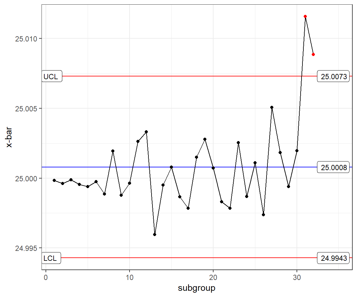
Now, lets rebuild the last control chart from my previous post.
# Generate sample data
set.seed(20190117)
example_df <- data_frame(values = rnorm(n=30*5, mean = 25, sd = .005),
                         subgroup = rep(1:30, 5),
                         n = rep(1:5, each = 30)) %>%
  add_row(values = rnorm(n=2*5, mean = 25 + .006, sd = .005),
          subgroup = rep(31:32, 5),
          n = rep(1:5, each = 2))

violations <- example_df %>%
  QC_Violations(value = "values", grouping = "subgroup", method = "xBar.rBar") %>%
  filter(Violation == TRUE) %>%
  select(data, Index) %>%
  unique()

ggQC_example <- example_df %>%
  ggplot(aes(x = subgroup, y = values)) +
  stat_summary(fun.y = mean, geom = "line", aes(group = 1)) +
  stat_summary(fun.y = mean, geom = "point", aes(group = 1)) +
  stat_QC(method = "xBar.rBar", auto.label = TRUE, label.digits = 4) +
  scale_x_continuous(expand =  expand_scale(mult = c(.05, .15))) + # Pad the x-axis for the labels
  ylab("x-bar") +
  theme_bw() +
  geom_point(data = violations, aes(x = Index, y = data), color = "red", group = 1)
ggQC_example
You can see that I added ...


