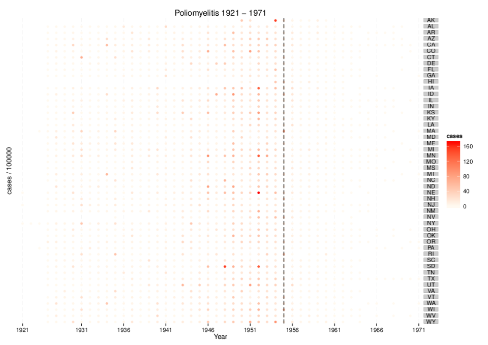
The real meaning of spurious correlations
Like many data nerds, I’m a big fan of Tyler Vigen’s Spurious Correlations, a humourous illustration of the old adage “correlation does not equal causation”. Technically, I suppose it should be called “spurious interpretations” since the correlations themselves are quite real, but then good marketing is everything. There ...
