Articles by Nick Horton

ggformula: another option for teaching graphics in R to beginners

September 21, 2017 | Nick Horton

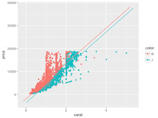
A previous entry (http://sas-and-r.blogspot.com/2017/07/options-for-teaching-r-to-beginners.html) describes an approach to teaching graphics in R that also “get[s] students doing powerful things quickly”, as David Robinson suggested. In this guest blog entry, Randall Pruim offers an alternative way based on a different formula interface. Here's Randall: For ...
[Read more...]

Options for teaching R to beginners: a false dichotomy?

July 27, 2017 | Nick Horton

I've been reading David Robinson's excellent blog entry "Teach the tidyverse to beginners" (http://varianceexplained.org/r/teach-tidyverse), which argues that a tidyverse approach is the best way to teach beginners.  He summarizes two competing curricula:1) "Base R first": teach syntax such as $ and [[]], built in functions like ave() and ...
[Read more...]

thinking with data with "Modern Data Science with R"

July 26, 2017 | Nick Horton

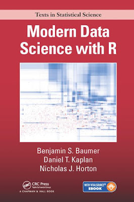
One of the biggest challenges educators face is how to teach statistical thinking integrated with data and computing skills to allow our students to fluidly think with data.  Contemporary data science requires a tight integration of knowledge from statistics, computer science, mathematics, and a domain of application. For example, how ...
[Read more...]

R and SAS in the curriculum: getting students to "think with data"

January 6, 2016 | Nick Horton

We're pleased to announce that a special issue of the American Statistician on "Statistics and the Undergraduate Curriculum" (November, 2015) is available at http://amstat.tandfonline.com/toc/utas20/69/4. Johanna Hardin (Pomona College) and Nick were the guest editors. There are a number of excellent and provocative papers that reinforce the ...
[Read more...]

R and SAS in the curriculum: getting students to "think with data"

January 6, 2016 | Nick Horton

We're pleased to announce that a special issue of the American Statistician on "Statistics and the Undergraduate Curriculum" (November, 2015) is available at http://amstat.tandfonline.com/toc/utas20/69/4. Johanna Hardin (Pomona College) and Nick were the guest editors. There are a number of excellent and provocative papers that reinforce the ... [Read more...]

The Statistical Sleuth (second edition) in R

August 14, 2012 | Nick Horton

For those of you who teach, or are interested in seeing an illustrated series of analyses, there is a new compendium of files to help describe how to fit models for the extended case studies in the Second Edition of the Statistical Sleuth: A Course in... [Read more...]

Example 9.38: dynamite plots, revisited

July 16, 2012 | Nick Horton

Dynamite plots are a somewhat pejorative term for a graphical display where the height of a bar indicates the mean, and the vertical line on top of it represents the standard deviation (or standard error). These displays are commonly found in many scientific disciplines, as a way of communicating group ... [Read more...]

Example 9.37: (Mis)behavior of binomial confidence intervals

July 9, 2012 | Nick Horton

While traditional statistics courses teach students to calculate intervals and test for binomial proportions using a normal or t approximation, this method does not always work well. Agresti and Coull ("Approximate is better than "exact' for interval estimation of binomial proportions". The American Statistician, 1998; 52:119-126) demonstrated this and reintroduced an ... [Read more...]

Example 9.29: the perils of for loops

April 30, 2012 | Nick Horton

A recent exchange on the R-sig-teaching list featured a discussion of how best to teach new students R. The initial post included an exercise to write a function, that given a n, will draw n rows of a triangle made up of "*", noting that for a beginner, this may require ...
[Read more...]

Example 9.28: creating datasets from tables

April 23, 2012 | Nick Horton

RThere are often times when it is useful to create an individual level dataset from aggregated data (such as a table). While this can be done using the expand.table() function within the epitools package, it is also straightforward to do directly within R.Imagine that instead of the individual ...
[Read more...]

Example 9.22: shading plots and inequalities

March 1, 2012 | Nick Horton

A colleague teaching college algebra wrote in the R-sig-teaching list asking for assistance in plotting the solutions to the inequality x^2 - 3 __ 0. This type of display is handy in providing a graphical solution to accompany an analytic one. RThe plot...
[Read more...]

managing projects using RStudio

February 10, 2012 | Nick Horton

We're continually amazed with new developments within RStudio, the integrated developed environment for R that we highlighted previously (Among others, Andrew Gelman agrees with us about its value). The most recent addition addresses one of our earlie...
[Read more...]

Example 9.17: (much) better pairs plots

December 6, 2011 | Nick Horton

Pairs plots (section 5.1.17) are a useful way of displaying the pairwise relations between variables in a dataset. But the default display is unsatisfactory when the variables aren't all continuous. In this entry, we discuss ways to improve these dis...
[Read more...]
1 2 3 4

Never miss an update!
Subscribe to R-bloggers to receive
e-mails with the latest R posts.
(You will not see this message again.)

Click here to close (This popup will not appear again)