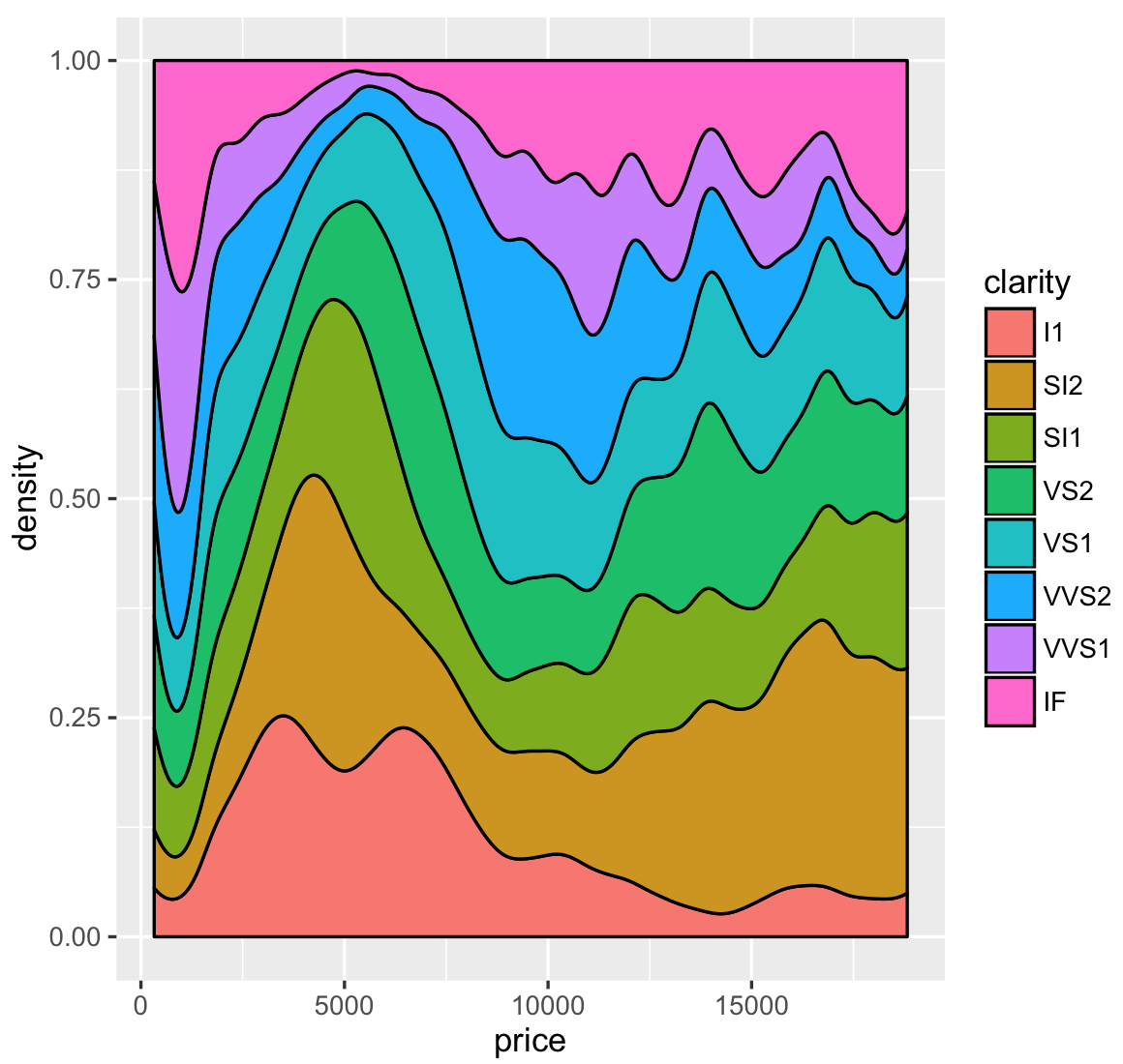
One of the Best and Most Underutilized Graphs in ggplot2
Understanding how a distribution of a variable changes over time can make a great visualization. These highly intuitive graphics can display a lot of information and can be simply rendered in R using ggplot2. However, based on my experience, they are one of the most underutilized graphs in R.A ...