Little useless-useful R functions – Plotting the decimal and binary conversion
Want to share your content on R-bloggers? click here if you have a blog, or here if you don't.
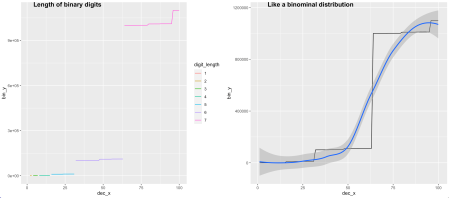
How does the conversion between decimal to binary or from binary to decimal behave? With another useless function, I have plotted the points (x = decimal number, y = converted binary number) on a scatter plot. Just to find out that the graph shows the binomial distribution function. 
First we create a useless function to convert from decimal to binary base:
dec2bin <- function(dec){
  dec_start <- dec
  str <- ''
  while (dec > 0) {
      if ((dec %% 2)==1){
        str <- paste0(str, '1')
      } else { #((dec %% 2)==0)
        str <- paste0(str, '0')
      }
    dec <- floor(dec/2)
  }
  splits <- strsplit(str, "")[[1]]
  reversed <- rev(splits)
  f_str <- paste(reversed, collapse = "")
  #return(paste("Decimal", dec_start, "is ",f_str," in binary"))
  return(f_str)
}
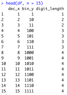
After we have the conversion function, we can create a dataset, that will hold the conversion results and the length of the binary number.
### Draw scatter plot for the conversion
df <- data.frame(dec_x = 1, bin_y = 1, digit_length=1)

for (i in 2:100){
    d <- c(dec_x = i, bin_Y = dec2bin(i), nchar(dec2bin(i)))
   df <-  rbind(df,d)
}
The data.frame can be created either way, from binary to decimal, respectively. The length of the binary number will be used to create groups of numbers for the scatterplot.
And finally, we create a scatter plot and line chart with smoothing line with the code:
library(ggplot2)
library(cowplot)
line <- ggplot(df, aes(x=dec_x, y=bin_y, colour=digit_length)) + geom_line()
line2 <- ggplot(df, aes(x=dec_x, y=bin_y)) + geom_line() + geom_smooth()
plot_grid(line, line2, labels = c("Length of binary digits", "Like a binominal distribution"))
And get final two graphs:
The left graph is the scatterplot with an x-axis of decimal numbers and the y-axis with binary numbers. The colour of the dots represents the length of the binary numbers. We can see that the steps appear with every circa every 20th number. This is when the length is increased and corresponding values are increased exponentially. The right graph shows the same behaviour of the conversion ( binary and decimal numbers) that clearly shows the similarities to the binomial distribution function. And the binomial distribution will appear regardless of the number of numbers converted.
As always, code is available on the Github in the same Useless_R_function repository. Check Github for future updates.
Happy R-coding and stay healthy!“
R-bloggers.com offers daily e-mail updates about R news and tutorials about learning R and many other topics. Click here if you're looking to post or find an R/data-science job.
Want to share your content on R-bloggers? click here if you have a blog, or here if you don't.


