Advent of 2021, Day 24 – Data Visualisation with Spark
Want to share your content on R-bloggers? click here if you have a blog, or here if you don't.
Series of Apache Spark posts:
- Dec 01: What is Apache Spark
- Dec 02: Installing Apache Spark
- Dec 03: Getting around CLI and WEB UI in Apache Spark
- Dec 04: Spark Architecture – Local and cluster mode
- Dec 05: Setting up Spark Cluster
- Dec 06: Setting up IDE
- Dec 07: Starting Spark with R and Python
- Dec 08: Creating RDD files
- Dec 09: RDD Operations
- Dec 10: Working with data frames
- Dec 11: Working with packages and spark DataFrames
- Dec 12: Spark SQL
- Dec 13: Spark SQL Bucketing and partitioning
- Dec 14: Spark SQL query hints and executions
- Dec 15: Introduction to Spark Streaming
- Dec 16: Dataframe operations for Spark streaming
- Dec 17: Watermarking and joins for Spark streaming
- Dec 18: Time windows for Spark streaming
- Dec 19: Data engineering for Spark streaming
- Dec 20: Spark GraphX processing
- Dec 21: Spak GraphX operators
- Dec 22: Spark in Azure Databricks
- Dec 23: Delta Live Tables with Azure Databricks
In previous posts, we have seen that Spark Dataframes (datasets) are compatible with other classes, functions. Regarding the preferred language (Scala, R, Python, Java).
Using Python
You can use any of the popular Python packages to do the visualisation; Plotly, Dash, Seaborn, Matplotlib, Bokeh, Leather, Glam, to name the couple and many others. Once the data is persisted in dataframe, you can use any of the packages. With the use of PySpark, plugin the Matplotlib. Here is an example
from pyspark.sql import SparkSession
import matplotlib.pyplot as plt

spark = SparkSession.builder.master("local[*]").getOrCreate()
df = spark.read.format("csv").option("header", "true").load("sampleData.csv")
sampled_data = df.select('x','y').sample(False, 0.8).toPandas()

# and at the end lets use our beautiful matplotlib
plt.scatter(sampled_data.x,sampled_data.y)
plt.xlabel('x')
plt.ylabel('y')
plt.title('relation of y and x')
plt.show()
Using R
With help of
library(sparklyr)
library(ggplot2)
library(dplyr)

#connect
sc <- spark_connect(master = "local")

# data wrangling
flights_tbl <- copy_to(sc, nycflights13::flights, "flights")
delay <- flights_tbl %>%
  group_by(tailnum) %>%
  summarise(count = n(), dist = mean(distance), delay = mean(arr_delay)) %>%
  filter(count > 20, dist < 2000, !is.na(delay)) %>%
  collect

# plot delays
ggplot(delay, aes(dist, delay)) +
  geom_point(aes(size = count), alpha = 1/2) +
  geom_smooth() +
  scale_size_area(max_size = 2)
Using Scala
The best way to use the visualisation with Scala is to use the notebooks. It can be a Databricks notebook, the Binder notebook, Zeppelin notebook. Store the results in dataframe and you can visualise the results fast, easy and practically with no coding.
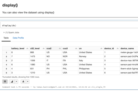
val ds = spark.read.json("/databricks-datasets/iot/iot_devices.json").as[DeviceIoTData]
display(ds)
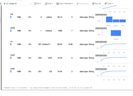
And now we can create graphs, that are available to the bottom left side as buttons on Azure Databricks notebooks. Besides the graphs, you can also do data profiling out-of-the-box.
Tomorrow we will look into Spark Literature and where to go for next steps.
Compete set of code, documents, notebooks, and all of the materials will be available at the Github repository: https://github.com/tomaztk/Spark-for-data-engineers
Happy Spark Advent of 2021! 
R-bloggers.com offers daily e-mail updates about R news and tutorials about learning R and many other topics. Click here if you're looking to post or find an R/data-science job.
Want to share your content on R-bloggers? click here if you have a blog, or here if you don't.


