Want to share your content on R-bloggers? click here if you have a blog, or here if you don't.
It’s been a while. I hope you are all well. Shall we make some charts?
About this time last year, one of my life-long dreams came true when I was told that I could work from home indefinitely. One effect of this – I won’t say downside – is that I don’t get through as many podcast episodes as I used to. Only a select few podcasts make the cut, and one of those is 99% Invisible.
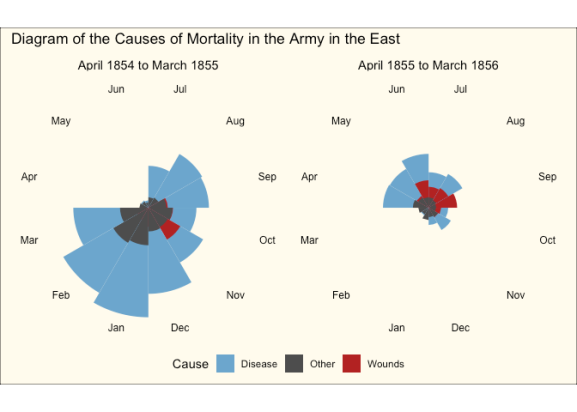
I first heard Florence Nightingale and her Geeks Declare War on Death, an episode of the Cautionary Tales podcast, premiered as a special episode of 99% Invisible. It discusses Nightingale’s work as a statistician and in particular, her visualisation of mortality causes in the Crimean War using the famous “rose chart”, or polar area diagram.
I’m sure you’re thinking: how can I explore that using R? The longer answer: take a look at my Github repository, which includes this report.
The shorter answer: a pretty good approximation of her chart can be achieved like so.
library(tidyverse)
library(histData)

Nightingale %>%
  select(Date, Month, Year, contains("rate")) %>%
  pivot_longer(cols = 4:6, names_to = "Cause", values_to = "Rate") %>%
  mutate(Cause = gsub(".rate", "", Cause),
         period = ifelse(Date <= as.Date("1855-03-01"), "April 1854 to March 1855", "April 1855 to March 1856"),
         Month = fct_relevel(Month, "Jul", "Aug", "Sep", "Oct", "Nov", "Dec", "Jan", "Feb", "Mar", "Apr", "May", "Jun")) %>%
  ggplot(aes(Month, Rate)) +
  geom_col(aes(fill = Cause), width = 1, position = "identity") +
  coord_polar() +
  facet_wrap(~period) +
  scale_fill_manual(values = c("skyblue3", "grey30", "firebrick")) +
  scale_y_sqrt() +
  theme_void() +
  theme(axis.text.x = element_text(size = 9),
        strip.text = element_text(size = 11),
        legend.position = "bottom",
        plot.background = element_rect(fill = alpha("cornsilk", 0.5)),
        plot.margin = unit(c(10, 10, 10, 10), "pt"),
        plot.title = element_text(vjust = 5)) +
  ggtitle("Diagram of the Causes of Mortality in the Army in the East")

A couple of things to note in the code:
- The polar area diagram is just a bar (column) chart, projected onto polar coordinates
- Relevelling of factors to get the months in the right place (can also be achieved using the start argument to
coord_polar) scale_y_sqrtis required to make the smaller wedges visibleposition = identityis required to achieve the same relative wedge heights as seen in Nightingale’s original chart
Is it, as the podcast episode suggests, a graph that persuades whether not it depicts reality? Listen to the episode, read the report and see what you think.
R-bloggers.com offers daily e-mail updates about R news and tutorials about learning R and many other topics. Click here if you're looking to post or find an R/data-science job.
Want to share your content on R-bloggers? click here if you have a blog, or here if you don't.
