What single step does with relationship
Want to share your content on R-bloggers? click here if you have a blog, or here if you don't.
We had a journal club about the single step GBLUP method for genomic evaluation a few weeks ago. In this post, we’ll make a few graphs of how the single step method models relatedness between individuals.
Imagine you want to use genomic selection in a breeding program that already has a bunch of historical pedigree and trait information. You could use some so-called multistep evaluation that uses one model for the classical pedigree + trait quantitative genetics and one model for the genotype + trait genomic evaluation, and then mix the predictions from them together. Or you could use the single-step method, which combines pedigree, genotypes and traits into one model. It does this by combining the relationship estimates from pedigree and genotypes. That matrix can then go into your mixed model.
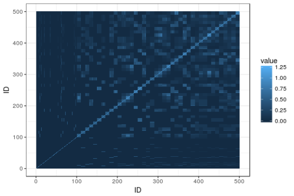
We’ll illustrate this with a tiny simulated population: five generations of 100 individuals per generation, where ten random pairings produce the next generation, with families of ten individuals. (The R code is on Github and uses AlphaSimR for simulation and AGHmatrix for matrices). Here is a heatmap of the pedigree-based additive relationship matrix for the population:
What do we see? In the lower left corner are the founders, and not knowing anything about their heritage, the matrix has them down as unrelated. The squares of high relatedness along the diagonal are the families in each generation. As we go upwards and to the right, relationship is building up.
Now, imagine the last generation of the population also has been genotyped with a SNP chip. Here is a heatmap of their genomic relationship matrix:
Genomic relationship is more detailed. We can still discern the ten families within the last generation, but no longer are all the siblings equally related to each other and to their ancestors. The genotyping helps track segregation within families, pointing out to us when relatives are more or less related than the average that we get from the pedigree.
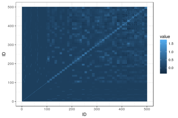
Enter the single-step relationship matrix. The idea is to put in the genomic relationships for the genotyped individuals into the big pedigree-based relationship matrix, and then adjust the rest of the matrix to propagate that extra information we now have from the genotyped individuals to their ungenotyped relatives. Here is the resulting heatmap:
You can find the matrix equations in Legarra, Aguilar & Misztal (2009). The matrix, called H, is broken down into four partitions called H11, H12, H21, and H22. H22 is the part that pertains to the genotyped animals, and it’s equal to the genomic relationship matrix G (after some rescaling). The others are transformations of G and the corresponding parts of the additive relationship matrix, spreading G onto A.
To show what is going on, here is the difference between the additive relationship matrix and the single-step relationship matrix, with lines delineating the genotyped animals and breaking the matrix into the four partitions:
What do we see? In the top right corner, we have a lot of difference, where the genomic relationship matrix has been plugged in. Then, fading as we go from top to bottom and from right to left, we see the influence of the genomic relationship on relatives, diminishing the further we get from the genotyped individuals.
Literature
Legarra, Andres, I. Aguilar, and I. Misztal. ”A relationship matrix including full pedigree and genomic information.” Journal of dairy science 92.9 (2009): 4656-4663.
R-bloggers.com offers daily e-mail updates about R news and tutorials about learning R and many other topics. Click here if you're looking to post or find an R/data-science job.
Want to share your content on R-bloggers? click here if you have a blog, or here if you don't.


