Tips for great graphics
Want to share your content on R-bloggers? click here if you have a blog, or here if you don't.
R is a great program for generating top-notch graphics. But to get the best out of it, you need to put in a little more work. Here are a few tips for adapting your R graphics to make them look a little better.
1) Dont use the “File/Save as…/” menu.
If you set up your graphic in the first place then theres no need to post-process (eg crop, scale etc) the graphic in other software.
Use the graphic devices (jpeg(), tiff(), postscript(), etc), set your height and width to whatever you want the finished product to be and then create the graph.
tiff("~/Manuscript/Figs/Fig1.tiff", width =2, height =2, units ="in", res = 600)
plot(dist ~ speed, cars) # cars is a base R dataset - data(cars)
dev.off()
The first argument to a graphic device such as tiff or jpeg is the filename, to which you can include the path. So that I dont have to worry about the order of arguments, I include the argument name. Width and height specify the width and height of the graphic in the units provided, in this case inches, but pixels, cm or mm can also be used. The resolution tells R how higher quality the graphic should be, the higher the better, but if you go too high, you could find that you have problems running out of space. I find 600 a nice compromise. Nice crisp lines, smooth curves and sharp letters. You can then import that straight into MS Word or whatever other word processor you use, or upload to go with that manuscript youve worked so hard on. Although, you could find yourself with BIG files. A 4×6 inch figure I made recently was 17.1MB! And for the web, 100 or 200 is probably enough.
This technique also provides you with the same output every time, which is not the case if you adjust the size of the default device window produced by plot()
2) Dont be afraid to change the default settings!
Personally, I find that a 1 inch margin at the base of the graphic is a bit generous. I also find the ticks a bit long and the gap between tick and the axis label a bit big. Luckily, these things are easy to change!
jpeg("t1.jpeg", width=3, height=3, units="in", res=100)
plot(dist~speed, cars)
dev.off()
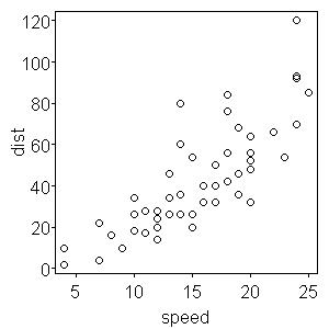
The above code produces this figure.

See what I mean about the margins?
Heres how to change it!
par(mai=c(0.5, 0.5, 0.1, 0.1) )
plot(dist ~ speed, cars, tck = -0.01, las=1, mgp=c(1.4,0.2,0))
That call to par changes the “MArgin in Inches” setting. The tck argument to par deals with TiCK length (negative for outside, positive for inside) while mgp controls on which line certain things are printed (titles are the first argument, labels are the second and the axis itself is the third). The las argument controls the rotation of the labels (1 for horizontal, 2 for perpendicular and 3 for vertical).
This leads me nicely to number 3: Dont be afraid to have separate lines for different parts of your plot.
This allows far more freedom and flexibility than setting par arguments in the plot argument. You can have different mgp settings for each axis for instance.
par(mai=c(0.4, 0.5, 0.1, 0.1))
plot(dist ~ speed, cars, xaxt="n", mgp=c(1.4,0.2,0), las=1, tck=-0.01)
axis(side=1, tck = -0.01, las=1, mgp=c(0.5,0.2,0))
mtext("speed", side=1, line= 1)
This plots the same graph, but allows different distances for the x and y axes, in terms of margin and where the title is situated. The axis function places an axis on the side determined by its side argument and mtext places Margin TEXT, again at the side in its argument and in this case on line 1.
R-bloggers.com offers daily e-mail updates about R news and tutorials about learning R and many other topics. Click here if you're looking to post or find an R/data-science job.
Want to share your content on R-bloggers? click here if you have a blog, or here if you don't.

