
The Illusion of linearity trap when making bubble charts in ggplot2
Want to share your content on R-bloggers? click here if you have a blog, or here if you don't.
Bubble charts are a great way to represent the data when you have instances that vary greatly, eg. the size of Canada compared to the size of Austria. However this type of a chart introduces a new dimension in the interpretation of data because the data is interpreted by the bubble size (area), and not linearly. The mistake when building such charts is that we ignore what is known as the illusion of linearity. This illusion (see this Article for more) is the effect that people tend to judge proportions linearly even when they are not linear. For example, the common mistake is that the pizza with the diameter of 20 cm is two times larger than the pizza with the diameter of 10 cm, while in fact the first pizza is 4 times larger than the second one because we judge the size of an area and not the diameter. The first pizza has the area of 314 cm² (r²Π) and the second one has 78,5 cm² → 314/78,5=4. Now back to bubble charts…
For this example I have loaded ggplot2 and created a simple dataset with three variables – x, y and size.
library(ggplot2)

dat=data.frame(c(1,2,3),c(2,3,1),c(10,20,30))
colnames(dat)<-c("x","y","size")
dat
The resulting dataset provides the coordinates and the bubble sizes for the chart. Now lets create the chart with annotated bubble sizes.
q<-ggplot(dat,aes())
q<-q + geom_point(aes(x=x,y=y), size=dat$size) #create bubbles
q<-q + xlim(-1,5)+ylim(-1,5) #add limits to axes
q<-q+ annotate("text",x=dat$x,y=dat$y,label=dat$size, color="white",size=6) #add size annotations
q<-q + theme_void() + theme(panel.background = element_rect(fill="lightblue")) #create a simple theme
q
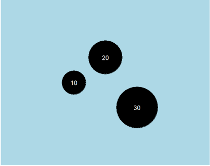
The chart looks like this:

The basic issue is that the smallest bubble looks as it is 9 times smaller than the largest bubble instead of 3 times smaller because the size parameter of geom_point is determined by the diameter and not by area size.
To correct for this and to make the chart interpretable we will use the simple transformation of the size parameter in geom_point by square root.
q<-ggplot(dat,aes())
q<-q + geom_point(aes(x=x,y=y), size=sqrt(dat$size)*10) #create bubbles with a correct scale
q<-q + xlim(-1,5)+ylim(-1,5) #add limits to axes
q<-q+ annotate("text",x=dat$x,y=dat$y,label=dat$size, color="white",size=6) #add size annotations
q<-q + theme_void() + theme(panel.background = element_rect(fill="lightblue")) #create a simple theme
q
The multiplication of squared size by the factor of 10 is just for creating the bubbles large enough compared to the limits of axes.
The chart now looks like this:
The areas are now in the correct scale and the bubbles are proportional to the size variable.
Of course, if we would like to make three dimensional shapes, the correction factor would be third root, because when the diameter is increased by the factor of n, the volume is increased by the factor of n³.
Happy charting 
This post was motivated by a lot of wonderful blogs on http://www.R-bloggers.com
R-bloggers.com offers daily e-mail updates about R news and tutorials about learning R and many other topics. Click here if you're looking to post or find an R/data-science job.
Want to share your content on R-bloggers? click here if you have a blog, or here if you don't.