Chart golf: the “demographic tsunami”
Want to share your content on R-bloggers? click here if you have a blog, or here if you don't.
“‘Demographic tsunami’ will keep Sydney, Melbourne property prices high” screams the headline.
While the census showed Australia overall is aging, there’s been a noticeable lift in the number of people aged between 25 to 32.
As the accompanying graph shows…
Whoa, that is one ugly chart. First thought: let’s not be too hard on Fairfax Media, they’ve sacked most of their real journalists and they took the chart from someone else. Second thought: if you want to visualise change over time, time as an axis rather than a coloured bar is generally a good idea.
Can we do better?
As usual, you can find this project at Github, with an accompanying published document at RPubs. I rarely copy/paste/format code here any more so if you want the details, take a look at the Rmd file. Some of the charts in this post are thumbnails, so click on them for the full-sized version.
First, grab the raw data: in this case, a spreadsheet (Table 59) from the Australian Bureau of Statistics (ABS). It contains counts of males, females and persons from ages 0 – 100+ in one year increments, for the years 1971 – 2016.
For some reason, government departments like to make their data as wide as possible. In this case, 251 columns where 1 = the year, 2 – 102 are male ages, 103-202 female ages and 203 – 251 are persons (male + female) ages 0 – 47. Persons ages 48 – 100+ are in a second sheet in the same file. No, I don’t know why either.
Fortunately, readxl takes care of all this, so all we need to do is give the columns some sensible names followed by the tidyr treatment.
## # A tibble: 11,500 x 5

##          Date gender   age  value  Year

##

##  1 1971-06-01      M     0 133347  1971

##  2 1972-06-01      M     0 136987  1972

##  3 1973-06-01      M     0 129492  1973

##  4 1974-06-01      M     0 124803  1974

##  5 1975-06-01      M     0 120678  1975

##  6 1976-06-01      M     0 115457  1976

##  7 1977-06-01      M     0 115298  1977

##  8 1978-06-01      M     0 115249  1978

##  9 1979-06-01      M     0 113443  1979

## 10 1980-06-01      M     0 114488  1980

## # ... with 11,490 more rows
Ages 21-42 from 2005 – 2016
The original chart from the SMH focused on ages 21 – 42 and years 2005 – 2016, so we’ll do the same. I thought it would be interesting to animate the changes in population by year. My first attempt posted to Twitter was incorrect, in that the numbers were summed year on year, so here’s a better version. The cumulative colouring gets a bit weird when numbers decrease, but I think it works to some degree.
Indeed, there does seem to be a recent surge in the “25 – 32 bracket” if that’s what we’re calling it.
Ages 25-32 as a proportion of 21-42
 Things get less tsunami-like when we try to visualize age brackets as a proportion of all ages. The 25-32 band grows a little but – tsunami?
Ages 25-32 as a proportion of total
When you put things out on Twitter, be sure that chart nerds will descent to join in the fun.
 Matt rightly asks: what’s the proportion of 25-32 year-olds anyway? We can reproduce his line charts like so. Now we see that 25-32 year-olds as a percentage of total population have increased recently after an all-time (since 1971) low and in fact, the rate of increase seems to have slowed.
In conclusion then:
- Years as coloured bars: not great
- Excel: no
- “Tsunami”: hardly
Bonus section: population pyramids
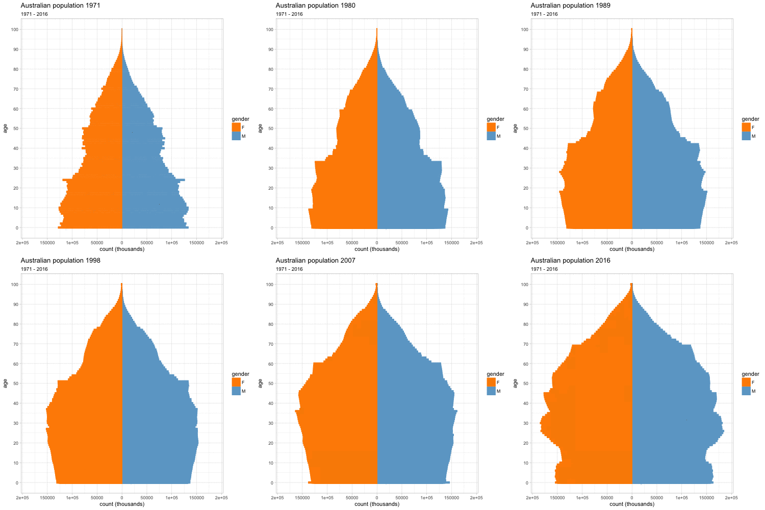
I’ve always liked population pyramids, ever since I first learned about them in high school geography class. Here’s my attempt to animate one. The trick is to subset the data by gender, then create two geoms and set the values for one subset to be negative (but not the labels). More commonly, ages are binned and proportions rather than counts may be used, but I did neither in this case.
I find it either mesmerising or a bit “too much”, depending on my mood. How about you?
Filed under: R, statistics Tagged: news, smh, sydney, visualisation
R-bloggers.com offers daily e-mail updates about R news and tutorials about learning R and many other topics. Click here if you're looking to post or find an R/data-science job.
Want to share your content on R-bloggers? click here if you have a blog, or here if you don't.


