Make a bar plot with ggplot
Want to share your content on R-bloggers? click here if you have a blog, or here if you don't.
The first time I made a bar plot (column plot) with ggplot (ggplot2), I found the process was a lot harder than I wanted it to be. This post steps through building a bar plot from start to finish.
First, let’s make some data. I’m going to make a vector of months, a vector of the number of chickens and a vector of the number of eggs. That’s random enough for this purpose.
# make some data
months <-rep(c("jan", "feb", "mar", "apr", "may", "jun",
               "jul", "aug", "sep", "oct", "nov", "dec"), 2)
chickens <-c(1, 2, 3, 3, 3, 4, 5, 4, 3, 4, 2, 2)
eggs <-c(0, 8, 10, 13, 16, 20, 25, 20, 18, 16, 10, 8)
values <-c(chickens, eggs)
type <-c(rep("chickens", 12), rep("eggs", 12))
mydata <-data.frame(months, values)
If parts of the above code don’t make sense, take a look at my post on using the R functions seq (sequence), rep (repeat), and cbind (column bind) HERE.
Now let’s load the ggplot package.
library(ggplot2)
We want to make a plot with the months as the x-axis and the number of chickens and eggs as the height of the bar. To do this, we need to make sure we specify stat = “identity”. Here’s the basic code for this plot.
p <-ggplot(mydata, aes(months, values))
p +geom_bar()
Notice that you will get the error shown above, “stat_count() must not be used with a y aesthetic.” We forgot to specify that we want the height of the column to equal the value for that month. So let’s do it again.
p <-ggplot(mydata, aes(months, values))
p +geom_bar(stat = "identity")

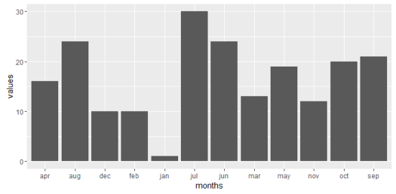
This time we get a plot, but it looks fairly ugly, and the months are out of order. In fact the months are in alphabetical order so let’s fix that first. If we investigate the months, we will see they have ordered levels.
mydata$months
#[1] jan feb mar apr may jun jul aug sep oct nov dec jan feb mar apr may
#[18] jun jul aug sep oct nov dec
#Levels: apr aug dec feb jan jul jun mar may nov oct sep
We can fix the order of this category by changing the factor. Here’s some code that will fix our problem.
mydata$months <-factor(mydata$months,
                      levels = c("jan", "feb", "mar", "apr", "may", "jun",
                                 "jul", "aug", "sep", "oct", "nov", "dec"))
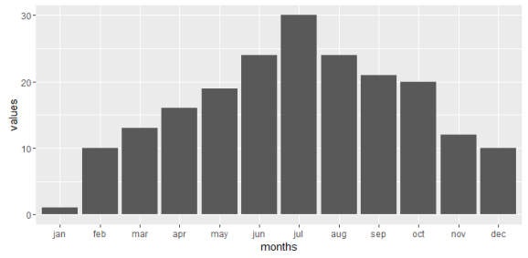
Now if we look at the levels again, we will see that they’re rearranged in the order that we want.
mydata$months
#[1] jan feb mar apr may jun jul aug sep oct nov dec jan feb mar apr may
#[18] jun jul aug sep oct nov dec
#Levels: jan feb mar apr may jun jul aug sep oct nov dec
Okay, let’s make our plot again, this time with the months in the correct order.
p <-ggplot(mydata, aes(months, values))
p +geom_bar(stat = "identity", aes(fill = type))

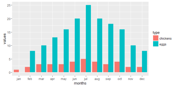
Okay, now the months are working, but we realize we only have one set of columns being plotted. We should have two sets, ‘chickens’ and ‘eggs’. To fix this we need to specify some feature that separates them. We already created this in the “type” column when we made our data frame.
If we make the color of the graphs based off of the data category then we should get two sets of columns. In our data frame, we put our categories in the column named “type”. Fill is a property of bar plots. If we were making a line plot and we wanted to set the colors by the type of data we would use color = type rather than fill = type.
p <-ggplot(mydata, aes(months, values))
p +geom_bar(stat = "identity", aes(fill = type))

Cool! Sort of. We have stacked bar plots, but I want them next to one another, not stacked. We can fix that with one more change to our code using dodge.
p <-ggplot(mydata, aes(months, values))
p +geom_bar(stat = "identity", aes(fill = type), position = "dodge")

Finally, let’s spruce the plot up a little bit. We’ll adjust the x-axis label (xlab), y-axis label (ylab), title (ggtitle) and update the look using theme_bw().
p <-ggplot(mydata, aes(months, values))
p +geom_bar(stat = "identity", aes(fill = type), position = "dodge") +
  xlab("Months") + ylab("Count") +
  ggtitle("Chickens & Eggs") +
  theme_bw()

The plot finally looks good and we’re done. Happy plotting!
R-bloggers.com offers daily e-mail updates about R news and tutorials about learning R and many other topics. Click here if you're looking to post or find an R/data-science job.
Want to share your content on R-bloggers? click here if you have a blog, or here if you don't.
