Graphical Data Exploration
Want to share your content on R-bloggers? click here if you have a blog, or here if you don't.
The first step in any datascience project is understanding the data at hand and identifying patterns and relationships. In today’s post we will do just that, using the “visa-salary-set”, which is a dataset containing information from US visa applications for “high-skilled” including annual wages, job title, employer name, work state, etc.
Similar data can be obtained from the Bureau of Labor Statistics or sites like myvisajobs.com. The latter is a great tool if you want to check out if your “dream” company sponsors work-visas! We will also be using numerous R-packages for advanced visualizations and interactive maps.
The full code is provided here, while the post below is simply a high-level explanation.
So let’s get started…
Step 1: Prepare the workspace
In this step, we first empty the workspace to delete unwanted variables and free up memory. Remember to load all the required library packages (sqldf to use SQL queries, ggplot and ggvis for visualizations, etc.), specify default number formatting, before loading the actual dataset.
In some cases, there may be separate training and test datasets and even a file with supplemental data (specially Kaggle competitions). The last usually is analogous to a secondary table with foreign key. To make sense or do anything meaningful (like feature engineering) you have to connect/join it to the main table.
In our case, we only have one file “salary.csv“. I prefer using the fread() instead of read.csv due to the speed. It does not matter much in this case, but you will see a significant speed advantage for any sets with 5million+ rows. We will also read in a tiny file containing US states, union territories and geographical coordinates of their capital cities. I created this myself and find it very useful when working with maps or leaflets. Feel free to download and store for your own use as well.
saldata = fread(“salary_data.csv”) # 167278 rows and 26 columns.
state_us = fread(“C:/anu/data analytics/us_states_abbr.csv”) #geog info – US states
Step 2 : Data Preparation
I always like to start by exploring basic summary for the dataset, followed by a quick check to see number of NAs and unique values in every column. This allows to identify which columns to ignore and which ones to keep.
summary(saldata) # median and quantile information for all columns.
sapply(saldata, function(x) sum(is.na(x))) # no. of NAs
sapply(saldata, function(x) length(unique(x))) # no. of factors or unique values, useful if you have gender, state or recurring values.
High-level observations:
- 6 columns (COLLEGE_MAJOR_REQUIRED, WORK_POSTAL_CODE, etc.) have too many missing values, so we discard them from our set.
- Some missing values can be logically added, like EXPERIENCE_REQUIRED_Y_N should default to “y”, so we will add code to fill those missing values.
- Date values are interpreted as “string”, so we format them using the as.Date() function to extract year, month and day of the year.
Next, we add geographical coordinates using the “state-info” dataset by using a join with name of the state. This will simply create a “generic” geographical marker for each state, located at the location of its capital (not center of state). We use this step to narrow the dataset further.
sal = sqldf(“select activesal.EMPLOYER_NAME, activesal.JOB_TITLE,
activesal.WORK_STATE2, activesal.VISA_CLASS,
activesal.PAID_WAGE_PER_YEAR,
activesal.JOB_TITLE_SUBGROUP, activesal.caseyr,
state_us.Latitude, state_us.Longitude
FROM activesal , state_us
where activesal.WORK_STATE2 = state_us.WORK_STATE2”) ## SQL join
Step 3: Graphical Data Exploration:
Now we come to the exciting part, and my favorite- visual exploration!  Using the graphical library functions, we see the following patterns:
Highest paying Employers by State: (Notice the markers at the capital locations. Markers are automatically clustered for smaller states too close to each other)
 100vw, 676px” /><p class=) Highest paying employers by state
Highest paying employers by stateTop 10 employers (2008-2015), in terms of number visas applications filed were predominantly West Coast tech companies, as seen from table below:
</p>
” data-medium-file=”https://journeyofanalytics.files.wordpress.com/2016/07/top-employers-visa-ct.jpg?w=676?w=300″ data-large-file=”https://journeyofanalytics.files.wordpress.com/2016/07/top-employers-visa-ct.jpg?w=676?w=555″ class=”alignnone size-full wp-image-1282″ src=”https://journeyofanalytics.files.wordpress.com/2016/07/top-employers-visa-ct.jpg?w=676″ alt=”Best employers for high-skilled immigrant workers” srcset_temp=”https://journeyofanalytics.files.wordpress.com/2016/07/top-employers-visa-ct.jpg 555w, https://journeyofanalytics.files.wordpress.com/2016/07/top-employers-visa-ct.jpg?w=150 150w, https://journeyofanalytics.files.wordpress.com/2016/07/top-employers-visa-ct.jpg?w=300 300w” sizes=”(max-width: 555px) 100vw, 555px” /><p class=) Employers with maximum number of work-visa applications
Employers with maximum number of work-visa applicationsTop 10 employers (by Salary) in 2014 are shown below. Notice the numerous law firms (LLP) in the list!
 100vw, 676px” /><p class=) Top 10 highest salary visa applications (2014)
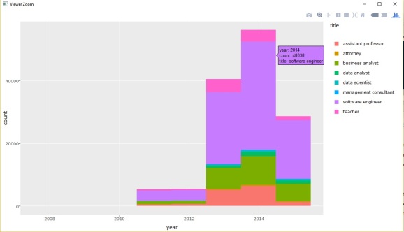
Top 10 highest salary visa applications (2014)Basic plots showing number of visa applications versus year, grouped by visa type and job-title. We use ggplotly() to see information on mouse-hover actions.

2014 saw the highest count of visa applications per year. The dataset was created in mid-2015, so 2015 obviously showed a decrease.

Like these graphs? Then do check the entire source code at this link. Feel free to tweak and explore, and if you notice other interesting patterns, do share them in the comments section below!
Until next time, adieu!
Filed under: learning resources, R Tagged: advanced graphics in R, data exploration, data visualization, data visualization with R, graphical data exploration, interactive maps R, leaflet, maps with R, r-projects
R-bloggers.com offers daily e-mail updates about R news and tutorials about learning R and many other topics. Click here if you're looking to post or find an R/data-science job.
Want to share your content on R-bloggers? click here if you have a blog, or here if you don't.
