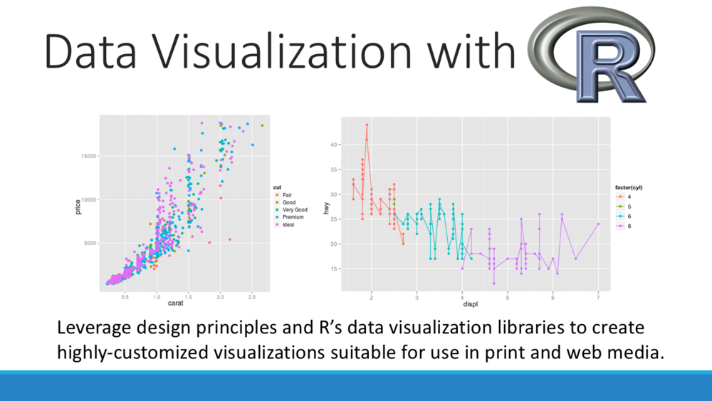
Data Visualization with R Workshop on April 2nd
Want to share your content on R-bloggers? click here if you have a blog, or here if you don't.

Data Community DC and District Data Labs are hosting a Data Visualization with R workshop on Saturday April 2nd from 9am – 5pm. Register before March 19th for an early bird discount!
OVERVIEW
It’s said that a picture is worth a thousand words, and a picture can also be worth a thousand (or more) data points. Visualizing data can be an important way of understanding and communicating the meaning and patterns that lie hidden within. Whether you’re creating a quick exploratory chart to identify patterns in a dataset or designing a complex visualization to communicate your findings to an external audience, data scientists need the skills to visually demonstrate their data.
This one-day course will introduce students to theoretical considerations for designing visualizations and provide them with the tools to create highly customized visualizations using R. We’ll make quick-and-dirty charts that will help us find patterns in complex data sets, as well as elegant custom visualizations suitable for publication.
WHAT YOU WILL LEARN
This course will focus on creating visualizations with the R package ggplot2. This package builds upon a design theory called the Grammar of Graphics and allows users to create visualizations that are customizable to a nearly endless degree. We’ll also use RColorBrewer, a package that makes it easy to create custom color palettes, including color-blind friendly palettes. The course will focus on how to use these tools to create visualizations that incorporate the elements of design and effectively communicate data according to the principles of good design.
COURSE OUTLINE
This course will cover the following topics:
- Design theory
- Designing for visual perception: understanding how the brain perceives images in order to create visualizations that will be easily and correctly understood by the viewer
- Elements of design: how we create meaningful visualizations using line, shape, size, texture, value, and color.
- Special considerations: color-blind friendly design, understanding color spaces, and designing for different media including print and web
- Chart types and how to select the right chart for your data
- Creating visualizations for exploratory data analysis using ggplot2’s quick plot (qplot) function
- Using ggplot2 to create publication- and web-ready visualizations
- Understanding the “grammar of graphics”
- Building the layers of a visualization using ggplot2
- Designing customized color palettes with RColorBrewer
After taking this workshop, students will understand how to demonstrate data in visually appealing ways and effectively communicate their message to viewers. This course will teach students how to use R to create highly customized visualizations suitable for use in print and web media.
INSTRUCTOR: LISA FEDERER
Lisa Federer is a Research Data Informationist at the National Institutes of Health Library, where she provides training and support for data science and data visualization, and she has taught over 200 scientists how to program with R. She received her Master of Library and Information Science from the University of California, Los Angeles and has completed professional certifications in Data Analytics from Georgetown University and Data Visualization Design from New York University. Her professional interests include data visualization, data mining, and facilitating sharing and reuse of scientific research data.
More Info and Registration
R-bloggers.com offers daily e-mail updates about R news and tutorials about learning R and many other topics. Click here if you're looking to post or find an R/data-science job.
Want to share your content on R-bloggers? click here if you have a blog, or here if you don't.
