Customize a scatterplot exercises
Want to share your content on R-bloggers? click here if you have a blog, or here if you don't.
 In the following exercises we practice how to customize a scatterplot. We will use
 axis , to add an axis; mtext to add a text; and legend to add a legend. Moreover we practice how to add details in every stage. We will use the mtcars dataset, provided by R Cran (we can upload dataset by type mtcars and then attach our dataset by attach(mtcars)). A description of the data is available here.
This set is the second set of exercises is a series on data visualization. Click here for the other sets in the series. For the Answers to the exercises are available here.
If you obtained a different (correct) answer than those listed on the solutions page, please feel free to post your answer as a comment on that page.
Exercise 1
Create a scatterplot of mpg (y-axis) against drat (x-axis) and add a label to the x-axis. Which of the following statements is correct:
a. plot(mpg,drat,xaxis="Miles per gallon")
b. plot(mpg,drat,xlab="Miles per gallon")
Exercise 2
We just saw how to customize the label on the x-axis. For the next exercise:
a. Customize the y-axis label like we customized the x-axis in the previous exercise..
b. Produce a plot customizing x and y axis, range and colours. Choose a range for x axis from 0 to 40, for y axis from 0 to 7, red colour and highlighted points.
Exercise 3
We have to add a title to our plot. What command do we have to type?
a. plot(mpg,drat,main="Miles vs Rar")
b. plot(mpg,drat,title="Miles vs Rar")
Exercise 4
We just saw how to add labels, titles and custom details such as colours and the size of points. Now we will
have to construct our plot in different stages. Firstly we have to plot our data, secondly we will add axes, title and text.
a.Plot our data specifying that axes haven’t to be plotted.
b.Add axes, labels and text afterwards
Exercise 5
Now we want to add a legend to our plot. Which statement is correct?
a. plot(mpg,drat,legend=1)
b. plot(mpg,drat);legend()
Exercise 6
Customize our legend:
a.Use different types of symbols, colours, background colours and position.
b.Insert new variables to our plot and then customize the legend
Exercise 7
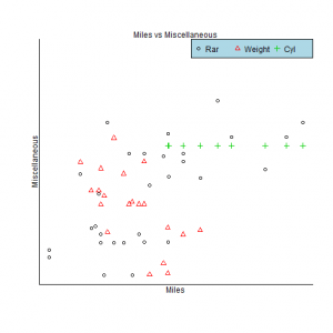
Finally, we will build a plot using four continuous variables in two stages:
a. plot two variables at a time, eliminating axes. Introduce axes and labels afterwards.
b. Insert a legend using diffent colours and adifferent symbol for every variable. Put the legend in a top right position using x and y coordinates.
R-bloggers.com offers daily e-mail updates about R news and tutorials about learning R and many other topics. Click here if you're looking to post or find an R/data-science job.
Want to share your content on R-bloggers? click here if you have a blog, or here if you don't.
