Network Visualization with Plotly and Shiny
Want to share your content on R-bloggers? click here if you have a blog, or here if you don't.
In addition to their more common uses, networks can be used as powerful multivariate data visualizations and exploration tools. Networks not only provide mathematical representations of data but are also one of the few data visualization methods capable of easily displaying multivariate variable relationships. The process of network mapping involves using the network manifold to display a variety of other information e.g. statistical, machine learning or functional analysis results (see more mapped network examples).

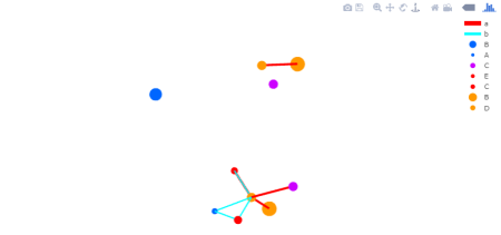
The combination of Plotly and Shiny is awesome for creating your very own network mapping tools. Networkly is an R package which can be used to create 2-D and 3-D interactive networks which are rendered with plotly and can be easily integrated into shiny apps or markdown documents. All you need to get started is an edge list and node attributes which can then be used to generate interactive 2-D and 3-D networks with customizable edge (color, width, hover, etc) and node (color, size, hover, label, etc) properties.
2-Dimensional Network (interactive version)
3-Dimensional Network (interactive version)

View all code used to generate the networks above.
R-bloggers.com offers daily e-mail updates about R news and tutorials about learning R and many other topics. Click here if you're looking to post or find an R/data-science job.
Want to share your content on R-bloggers? click here if you have a blog, or here if you don't.
