Seattle’s Fremont Bridge Bicyclists Again in the News
Want to share your content on R-bloggers? click here if you have a blog, or here if you don't.
Back in 2013, David Smith had done analysis of bicycle trips across Seattle’s Fremont bridge. More recently, Jake Vanderplas (creator of Python’s
very popular Scikit-learn package) wrote a nice blog post on
“Learning Seattle Work habits from bicycle counts” at Fremont bridge.
I wanted to work through Jake’s analysis using R since I am learning R. Please read the original article by Jake to get the full context and thinking behind the analysis. For folks interested in Python, Jake has provided link in the blog post to iPython notebook where you can work through the analysis in Python (and learn some key Python modules: pandas, matplotlib, sklearn along the way)
The R code that I used to work through the analysis is in the following link.
Below are some key results/graphs.
1. Doing a PCA analysis on bicycle count data (where each row is a day and columns are 24 hr bicycle counts from East and West side) shows that 2 components can explain 90% of variance. The scores plot of first 2 principal components indicates 2 clusters. Coloring the scores by day of week suggest a weekday cluster and a weekend cluster
- The average bike counts for each cluster and side (East/West) better shows the patterns for weekday and weekend commute (weekday commute peaks in the morning and evening)

-
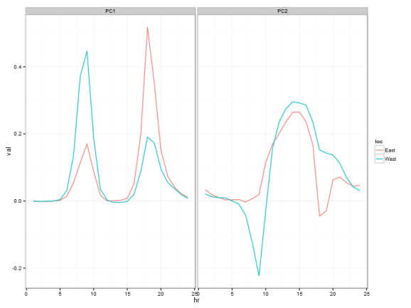
While this was not in the original post, looking at the loadings of the first 2 principal components also suggests the weekday vs weekend interpretation of clusters.

Thanks again to Jake Vanderplas for the analysis and illustrating how lot of insights could be gathered from data.
R-bloggers.com offers daily e-mail updates about R news and tutorials about learning R and many other topics. Click here if you're looking to post or find an R/data-science job.
Want to share your content on R-bloggers? click here if you have a blog, or here if you don't.

