Feature Engineering versus Feature Extraction: Game On!
Want to share your content on R-bloggers? click here if you have a blog, or here if you don't.
“Feature engineering” is a fancy term for making sure that your predictors are encoded in the model in a manner that makes it as easy as possible for the model to achieve good performance. For example, if your have a date field as a predictor and there are larger differences in response for the weekends versus the weekdays, then encoding the date in this way makes it easier to achieve good results.
However, this depends on a lot of things.
First, it is model-dependent. For example, trees might have trouble with a classification data set if the class boundary is a diagonal line since their class boundaries are made using orthogonal slices of the data (oblique trees excepted).
Second, the process of predictor encoding benefits the most from subject-specific knowledge of the problem. In my example above, you need to know the patterns of your data to improve the format of the predictor. Feature engineering is very different in image processing, information retrieval, RNA expressions profiling, etc. You need to know something about the problem and your particular data set to do it well.
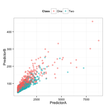
Here is some training set data where two predictors are used to model a two-class system (I’ll unblind the data at the end):

There is also a corresponding test set that we will use below.
There are some observations that we can make:
- The data are highly correlated (correlation = 0.85)
- Each predictor appears to be fairly right-skewed
- They appear to be informative in the sense that you might be able to draw a diagonal line to differentiate the classes
Depending on what model that we might choose to use, the between-predictor correlation might bother us. Also, we should look to see of the individual predictors are important. To measure this, we’ll use the area under the ROC curve on the predictor data directly.
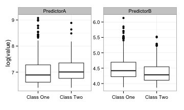
Here are univariate box-plots of each predictor (on the log scale):

There is some mild differentiation between the classes but a significant amount of overlap in the boxes. The area under the ROC curves for predictor A and B are 0.61 and 0.59, respectively. Not so fantastic.
What can we do? Principal component analysis (PCA) is a pre-processing method that does a rotation of the predictor data in a manner that creates new synthetic predictors (i.e. the principal components or PC’s). This is conducted in a way where the first component accounts for the majority of the (linear) variation or information in the predictor data. The second component does the same for any information in the data that remains after extracting the first component and so on. For these data, there are two possible components (since there are only two predictors). Using PCA in this manner is typically called feature extraction.
Let’s compute the components:
> library(caret)
> head(example_train)

   PredictorA PredictorB Class
2    3278.726  154.89876   One
3    1727.410   84.56460   Two
4    1194.932  101.09107   One
12   1027.222   68.71062   Two
15   1035.608   73.40559   One
16   1433.918   79.47569   One
> pca_pp <- preProcess(example_train[, 1:2],
+                      method = c("center", "scale", "pca"))
+ pca_pp


Call:
preProcess.default(x = example_train[, 1:2], method = c("center",
 "scale", "pca"))

Created from 1009 samples and 2 variables
Pre-processing: centered, scaled, principal component signal extraction

PCA needed 2 components to capture 95 percent of the variance
> train_pc <- predict(pca_pp, example_train[, 1:2])
> test_pc <- predict(pca_pp, example_test[, 1:2])
> head(test_pc, 4)

        PC1         PC2
1 0.8420447  0.07284802
5 0.2189168  0.04568417
6 1.2074404 -0.21040558
7 1.1794578 -0.20980371
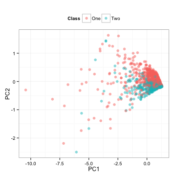
Note that we computed all the necessary information from the training set and apply these calculations to the test set. What do the test set data look like?

These are the test set predictors simply rotated.
PCA is unsupervised, meaning that the outcome classes are not considered when the calculations are done. Here, the area under the ROC curves for the first component is 0.5 and 0.81 for the second component. These results jive with the plot above; the first component has an random mixture of the classes while the second seems to separate the classes well. Box plots of the two components reflect the same thing:

There is much more separation in the second component.
This is interesting. First, despite PCA being unsupervised, it managed to find a new predictor that differentiates the classes. Secondly, it is the last component that is most important to the classes but the least important to the predictors. It is often said that PCA doesn't guarantee that any of the components will be predictive and this is true. Here, we get lucky and it does produce something good.
However, imagine that there are hundreds of predictors. We may only need to use the first X components to capture the majority of the information in the predictors and, in doing so, discard the later components. In this example, the first component accounts for 92.4% of the variation in the predictors; a similar strategy would probably discard the most effective predictor.
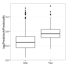
How does the idea of feature engineering come into play here? Given these two predictors and seeing the first scatterplot shown above, one of the first things that occurs to me is "there are two correlated, positive, skewed predictors that appear to act in tandem to differentiate the classes". The second thing that occurs to be is "take the ratio". What does that data look like?

The corresponding area under the ROC curve is 0.8, which is nearly as good as the second component. A simple transformation based on visually exploring the data can do just as good of a job as an unbiased empirical algorithm.
These data are from the cell segmentation experiment of Hill et al, and predictor A is the "surface of a sphere created from by rotating the equivalent circle about its diameter" (labeled as EqSphereAreaCh1 in the data) and predictor B is the perimeter of the cell nucleus (PerimCh1). A specialist in high content screening might naturally take the ratio of these two features of cells because it makes good scientific sense (I am not that person). In the context of the problem, their intuition should drive the feature engineering process.
However, in defense of an algorithm such as PCA, the machine has some benefit. In total, there are almost sixty predictors in these data whose features are just as arcane as EqSphereAreaCh1. My personal favorite is the "Haralick texture measurement of the spatial arrangement of pixels based on the co-occurrence matrix". Look that one up some time. The point is that there are often too many features to engineer and they might be completely unintuitive from the start.
Another plus for feature extraction is related to correlation. The predictors in this particular data set tend to have high between-predictor correlations and for good reasons. For example, there are many different ways to quantify the eccentricity of a cell (i.e. how elongated it is). Also, the size of a cell's nucleus is probably correlated with the size of the overall cell and so on. PCA can mitigate the effect of these correlations in one fell swoop. An approach of manually taking ratios of many predictors seems less likely to be effective and would take more time.
Last year, in one of the R&D groups that I support, there was a bit of a war being waged between the scientists who focused on biased analysis (i.e. we model what we know) versus the unbiased crowd (i.e. just let the machine figure it out). I fit somewhere in-between and believe that there is a feedback loop between the two. The machine can flag potentially new and interesting features that, once explored, become part of the standard book of "known stuff".
R-bloggers.com offers daily e-mail updates about R news and tutorials about learning R and many other topics. Click here if you're looking to post or find an R/data-science job.
Want to share your content on R-bloggers? click here if you have a blog, or here if you don't.
