This is one of my favorite ggplot2 plots I’ve ever made, but it…
[This article was first published on Jeffrey Horner, and kindly contributed to R-bloggers]. (You can report issue about the content on this page here)
Want to share your content on R-bloggers? click here if you have a blog, or here if you don't.
Want to share your content on R-bloggers? click here if you have a blog, or here if you don't.

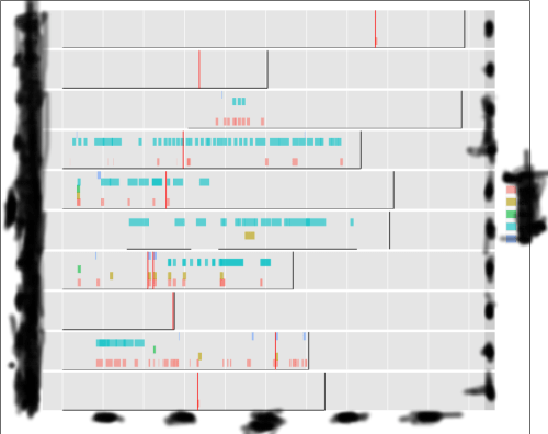
This is one of my favorite ggplot2 plots I’ve ever made, but it makes me sad. Can you deduce what this plot conveys?
Explain the sporadically dashed colored horizontal bands.
Explain the red vertical bars.
Explain the black vertical bars.
If you answer all three correctly, and you can explain the rest of the plot, I’ll give you the code.
To leave a comment for the author, please follow the link and comment on their blog: Jeffrey Horner.
R-bloggers.com offers daily e-mail updates about R news and tutorials about learning R and many other topics. Click here if you're looking to post or find an R/data-science job.
Want to share your content on R-bloggers? click here if you have a blog, or here if you don't.
