Graphs in R – Overlaying Data Summaries in Dotplots
Want to share your content on R-bloggers? click here if you have a blog, or here if you don't.
Dotplots are useful for the graphical visualization of small to medium-sized datasets. These simple plots provide an overview of how the data is distributed, whilst also showing the individual observations. It is however possible to make the simple dotplots more informative by overlaying them with data summaries and/or smooth distributions.
This post is about creating such superimposed dotplots in R – we first see how to create these plots using just base R graphics, and then proceed to create them using the ggplot2 R package.
## First things first - dataset 'chickwts': Weights of
## chickens fed with any one of six different feed types

?chickwts
data(chickwts)  ## load the dataset
Graphs using base R:
## First some plot settings

par(cex.main=0.9,cex.lab=0.8,font.lab=2,cex.axis=0.8,font.axis=2,col.axis="grey50")
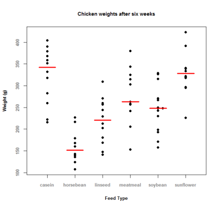
We first create a dotplot where the median of each group is also displayed as a horizontal line:
## Getting the dotplot first, expanding the x-axis to leave room for the line
stripchart(weight ~ feed, data = chickwts, xlim=c(0.5,6.5), vertical=TRUE, method = "stack", offset=0.8, pch=19,
main = "Chicken weights after six weeks", xlab = "Feed Type", ylab = "Weight (g)")

## Then compute the group-wise medians
medians <- tapply(chickwts[,"weight"], chickwts[,"feed"], median)

## Now add line segments corresponding to the group-wise medians
loc <- 1:length(medians)
segments(loc-0.3, medians, loc+0.3, medians, col="red", lwd=3)

Next , we create a dotplot where the median is shown, along with the 1st and 3rd quartile, i.e., the ‘box’ of the boxplot of the data is overlaid with the dotplot:
## Getting the dotplot first, expanding the x-axis to leave room for the box
stripchart(weight ~ feed, data = chickwts, xlim=c(0.5,6.5), vertical=TRUE, method="stack", offset=0.8, pch=19,
main = "Chicken weights after six weeks", xlab = "Feed Type", ylab = "Weight (g)")

## Now draw the box, but without the whiskers!
boxplot(weight ~ feed, data = chickwts, add=TRUE, range=0, whisklty = 0, staplelty = 0)
Plots similar to ones created above, but using the ggplot2 R package instead:
## Load the ggplot2 package first
library(ggplot2)

## Data and plot settings
p <- ggplot(chickwts, aes(x=feed, y=weight)) +
labs(list(title = "Chicken weights after six weeks", x = "Feed Type", y = "Weight (g)")) +
theme(axis.title.x = element_text(face="bold"), axis.text.x = element_text(face="bold")) +
theme(axis.title.y = element_text(face="bold"), axis.text.y = element_text(face="bold"))
We use the stat_summary function to plot the median line as an errorbar, but we need to define our own function that calculates the group-wise median and produces output in a format suitable for stat_summary like so:
## define custom median function
plot.median <- function(x) {
  m <- median(x)
  c(y = m, ymin = m, ymax = m)
}

## dotplot with median line
p1 <- p + geom_dotplot(binaxis='y', stackdir='center', method="histodot", binwidth=5) +
stat_summary(fun.data="plot.median", geom="errorbar", colour="red", width=0.5, size=1)
print(p1)

For the dotplot overlaid with the median and the 1st and 3rd quartile, the ‘box’ from the boxplot is plotted using geom_boxplot function:
## dotplot with box
p2 <- p + geom_boxplot(aes(ymin=..lower.., ymax=..upper..)) +
geom_dotplot(binaxis='y', stackdir='center', method="histodot", binwidth=5)
print(p2)

Additionally, let’s also plot a dotplot with a violin plot overlaid. We cannot do this in base R!
## dotplot with violin plot
## and add some cool colors
p3 <- p + geom_violin(scale="width", adjust=1.5, trim = FALSE, fill="indianred1", color="darkred", size=0.8) +
geom_dotplot(binaxis='y', stackdir='center', method="histodot", binwidth=5)
print(p3)

R-bloggers.com offers daily e-mail updates about R news and tutorials about learning R and many other topics. Click here if you're looking to post or find an R/data-science job.
Want to share your content on R-bloggers? click here if you have a blog, or here if you don't.

