Modeling Contagion Using Airline Networks in R
Want to share your content on R-bloggers? click here if you have a blog, or here if you don't.
I first became interested in networks when reading Matthew O’Jackson’s 2010 paper describing networks in economics. At some point during the 2014 ebola outbreak, I became interested in how the disease could actually come to the U.S. I was caught up with work/classes at the time, but decided to use airline flight data to at least explore the question.
This is the same dataset I used here. The datasource is given in that post.
I assumed that the disease had a single origin (Liberia) and wanted to explore the question of how fast the disease could travel to the U.S.
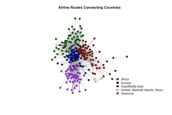
A visualization of the network can be seen below. Each node is a country and each edge represents an existing airline route from one country to another. Flights that take off and land in the same country are omitted to avoid clutter.

Communities and Homophily
I used a spinglass algorithm to detect “communities” of countries, i.e. sets of countries with many flights between themselves, but few flights between them and countries not in the set. Roughly speaking, the algorithm tended to group countries in the same continent together. However, this is not always the case. For example, France was was placed in the same community as several African countries, due to the close relationships with its former colonies. Roughly speaking, this network seems to exhibit homophily – where countries on the same continent tend to be connected more with each other than with countries off their continent.
Liberia, the US, and Degree Distribution
The labels are unclear in the plot, but the United States and Liberia are in two separate communities, which may lead us to believe that Ebola spreading from the former to the latter would be unlikely. In fact, the degrees (number of countries a given country is connected to) of the countries differ greatly, which would also support this intuition. The US is connected to 186 other countries, whereas Liberia is connected to only 12. The full degree distribution is shown below. It roughly follows a power law, which, according to wikipedia, is what we should expect. Note that the approximation is asymptotic, which could be why this finite sample is off. According to the degree distribution, half of all countries are connected to 27 other countries. Liberia falls far below the median and the US falls far above the median.

Small Worlds
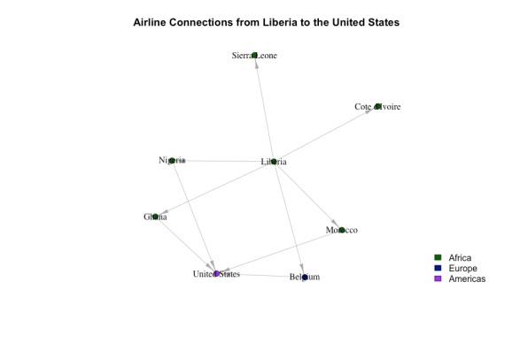
Let’s zoom in and look at Liberia’s second-degree connections:

Even though they’re in two different communities, Liberia and the US are only two degrees of separation away. This is generally case for all countries. If, for each node, we calculated the shortest path between it and every other node, the average shortest distance would be about 2 (specifically 2.3) hops. This is called the small world phenomenon. On average, every country is 2 hops away from every other country. Many networks exhibit this phenomenon largely due to “hubs” – countries (more generally, nodes) with lots of connections to other countries. For example, you can imagine that Charles de Gaulle airport in France is a hub, which links countries in the US, Eastern Europe, Asia, and Africa. The existence of these hubs makes it possible to get from one country to another with very few transfers.
Contagion
The close-up network above shows that if ebola were to spread to the US, it might be through Nigeria, Ghana, Morocco, and Belgium. If we knew the proportion of flights that went from liberia to each of these countries and from each of these countries to the US, we could estimate the probability of Ebola spreading for each route. I don’t have time to do this, although it’s certainly possible given the data.
Of course, this is a huge simplification for many reasons. Even though Sierra Leon, for example, doesn’t have a direct connection to the US, it could be connected to other countries that are connected to the US. This route could have a very high proportion of flights end up in the US. So we would need to account for this factor.
There are also several epidemiological parameters that could change how quickly the disease spreads. For example, the length of time from infection to symptoms is important. If the infected don’t show symptoms until a week after infection, then they can’t be screened and contained as easily. They could infect many others before showing symptoms.
The deadliness of the disease is also important. If patients die within hours of being infected, then the disease can’t spread very far. To take the extreme, consider a patient dies within a second of being infected. Then there’s very little time for him to infect others.
Finally, we assumed a single origin. If the disease is already present in several countries when we run this analysis, then we would have to factor in multiple origins.
routes=read.table('.../routes.dat',sep=',')
ports=read.table('.../airports.dat',sep=',')

library(igraph)

# for each flight, get the country of the airport the plane took off from and landed at.
ports=ports[,c('V4','V5')]
names(ports)=c('country','airport')

routes=routes[,c('V3','V5')]
names(routes)=c('from','to')

m=merge(routes,ports,all.x=TRUE,by.x=c('from'),by.y=c('airport'))
names(m)[3]=c('from_c')
m=merge(m,ports,all.x=TRUE,by.x=c('to'),by.y=c('airport'))
names(m)[4]=c('to_c')

m$count=1
# create a unique country to country from/to route ID
m$id=paste(m$from_c,m$to_c,sep=',')

# see which routes are flown most frequently
a=aggregate(m$count,list(m$id),sum)
names(a)=c('id','flights')
a$fr=substr(a$id,1,regexpr(',',a$id)-1)
a$to=substr(a$id,regexpr(',',a$id)+1,100)
a=a[,2:4]

a$perc=(a$flights/sum(a$flights))*100

# create directed network graph
a=a[!(a[,2]==a[,3]),]
mat=as.matrix(a[,2:3])

g=graph.data.frame(mat, directed = T)

edges=get.edgelist(g)
deg=degree(g,directed=TRUE)
vv=V(g)

# use spinglass algo to detect community
set.seed(9)
sgc = spinglass.community(g)
V(g)$membership=sgc$membership
table(V(g)$membership)

V(g)[membership==1]$color = 'pink'
V(g)[membership==2]$color = 'darkblue'
V(g)[membership==3]$color = 'darkred'
V(g)[membership==4]$color = 'purple'
V(g)[membership==5]$color = 'darkgreen'

plot(g,
     main='Airline Routes Connecting Countries',
     vertex.size=5,
     edge.arrow.size=.1,
     edge.arrow.width=.1,
     vertex.label=ifelse(V(g)$name %in% c('Liberia','United States'),V(g)$name,''),
     vertex.label.color='black')
legend('bottomright',fill=c('darkgreen','darkblue', 'darkred', 'pink', 'purple'),
       c('Africa', 'Europe', 'Asia/Middle East', 'Kiribati, Marshall Islands, Nauru', 'Americas'),
       bty='n')

# plot degree distribution
dplot=degree.distribution(g,cumulative = TRUE)

plot(dplot,type='l',xlab='Degree',ylab='Frequency',main='Degree Distribution of Airline Network',lty=1)
lines((1:length(dplot))^(-.7),type='l',lty=2)
legend('topright',lty=c(1,2),c('Degree Distribution','Power Law with x^(-.7)'),bty='n')

# explore membership...regional patterns exist
cc=cbind(V(g)$name,V(g)$membership)
tt=cc[cc[,2]==5,]

# explort connection from Liberia to United States
m=mat[mat[,1]=='Liberia',]

t=mat[mat[,1] %in% m[,2],]
tt=t[t[,2]=='United States',]

# assess probabilities

lib=a[a$fr=='Liberia',]
lib$prob=lib$flights/sum(lib$flights)
  # most probable route from liberia is Ghana

vec=c(tt[,1],'Liberia')
names(vec)=NULL

g2=graph.data.frame(mat[(mat[,1] %in% vec & mat[,2] == 'United States') | (mat[,1]=='Liberia'),], directed = T)
V(g2)$color=c('darkblue','darkgreen','darkgreen','darkgreen','darkgreen','purple','darkgreen','darkgreen')

plot(g2,
     main='Airline Connections from Liberia to the United States',
     vertex.size=5,
     edge.arrow.size=1,
     edge.arrow.width=.5,
     vertex.label.color='black')
legend('bottomright',fill=c('darkgreen','darkblue','purple'),
       c('Africa', 'Europe', 'Americas'),
       bty='n')


aa=a[a$fr %in% tt[,1],]
sum=aggregate(aa$flights,list(aa$fr),sum)

bb=a[a$fr %in% tt[,1] & a$to=='United States',]

fin=data.frame(bb$fr,sum$x,bb$flights,bb$flights/sum$x)

s=shortest.paths(g)
mean(s)
R-bloggers.com offers daily e-mail updates about R news and tutorials about learning R and many other topics. Click here if you're looking to post or find an R/data-science job.
Want to share your content on R-bloggers? click here if you have a blog, or here if you don't.
