Mixing Numbers and Symbols in Time Series Charts
Want to share your content on R-bloggers? click here if you have a blog, or here if you don't.
One of the things I’ve been trying to explore with my #f1datajunkie projects are ways of representing information that work both in a glanceable way as well as repaying deeper reading. I’ve also been looking at various ways of using text labels rather than markers to provide additional information around particular data points.
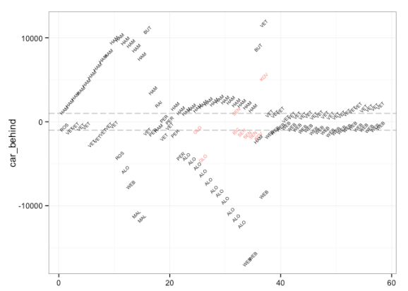
For example, in a race battlemap, with lap number on the horizontal x-axis and gap time on the vertical y-axis, I use a text label to indicate which driver is ahead (or behind) a particular target driver.
In the revised version of this chart type shown in F1 Malaysia, 2015 – Rosberg’s View of the Race, and additional numerical label along the x-axis indicatesd the race position of the target driver at the end of each lap.
What these charts are intended to do is help the eye see particular structural shapes within the data – for example whether a particular driver is being attacked from behind in the example of a battlemap, or whether they are catching the car ahead (perhaps with intervening cars in the way – although more needs to be done on the chart with respect to this for examples where there are several intervening cars; currently, only a single intervening car immediately ahead on track is shown.)
Two closer readings of the chart are then possible. Firstly, by looking at the y-value we can see the actual time a car is ahead (and here the dashed guide line at +/1 1s helps indicate in a glanceable way the DRS activation line; I’m also pondering how to show an indication of pit loss time to indicate what effect a pit stop might have on the current situation). Secondly, we can read off the labels of the drivers involved i a battle to get a more detailed picture of the race situation.
The latest type of chart I’ve been looking at are session utilisation maps, which in their simplest form look something like the following:
The charts show how each driver made use of a practice session or qualifying – drivers are listed on the vertical y-axis and the time into the session each lap was recorded at is identified along the horizontal x-axis.
This chart makes it easy to see how many stints, and of what length, were completed by each driver and at what point in the session. Other information might be inferred – for example, significant gaps in which no cars are recording times may indicate poor weather conditions or red flags. However, no information is provided about the times recorded for each lap.
We can, however, use colour to identify “purple” laps (fastest lap time recorded so far in the session) and “green” laps (a driver’s fastest laptime so far in the session that isn’t a purple time), as well as laps on which a driver pitted:
But still, no meaningful lap times.
One thing to note about laptimes is that they come in various flavours, such as outlaps, when a driver starts the lap from the pitlane; inlaps, or laps on which a driver comes into the pits at the end of the lap; and flying laps when a driver is properly going for it. There are also those laps on which a driver may be trying out various new lines, slowing down to give themselves space for a flying lap, and so on.
Assuming that inlaps and outlaps are not the best indicators of pace, we can use a blend of symbols and text labels on the chart to identify inlaps and outlaps, as well as showing laptimes for “racing” laps, also using colour to highlight purple and green laps:
The chart is produced using ggplot, and a layered approach in which chart elements are added to the chart in separate layers.
#The base chart with the dataset used to create the original chart
#In this case, the dataset included here is redundant
g = ggplot(f12015test)

#Layer showing in-laps (laps on which a driver pitted) and out-laps
#Use a subset of the dataset to place markers for outlaps and inlaps
g = g + geom_point(data=f12015test[f12015test['outlap'] | f12015test['pit'],],aes(x=cuml, y=name, color=factor(colourx)), pch=1)

#Further annotation to explicitly identify pit laps (in-laps)
g = g + geom_point(data=f12015test[f12015test['pit']==TRUE,],aes(x=cuml, y=name),pch='.')

#Layer showing full laps with rounded laptimes and green/purple lap highlights
#In this case, use the laptime value as a text label, rather than a symbol marker
g = g + geom_text(data=f12015test[!f12015test['outlap'] & !f12015test['pit'],],aes(x=cuml, y=name, label=round(stime,1), color=factor(colourx)), size=2, angle=45)

#Force the colour scale to be one we want
g = g + scale_colour_manual(values=c('darkgrey','darkgreen','purple'))
This version of the chart has the advantage of being glanceable when it comes to identifying session utilisation (number, duration and timing of stints) as well as when purple and green laptimes were recorded, as well as repaying closer reading when it comes to inspecting the actual laptimes recorded during each stint.
To reduce clutter on the chart, laptimes are round to 1 decimal place (tenths of a second) rather than using the full lap time which is recorded down to thousandths of a second.
Session utilisation charts are described more fully in a forthcoming chapter of the Wrangling F1 Data With R Leanpub book. Buying a copy of the book gains you access to future updates of the book. A draft version of the chapter can be found here.
R-bloggers.com offers daily e-mail updates about R news and tutorials about learning R and many other topics. Click here if you're looking to post or find an R/data-science job.
Want to share your content on R-bloggers? click here if you have a blog, or here if you don't.


