Visualize pre-post comparison of intervention #rstats
Want to share your content on R-bloggers? click here if you have a blog, or here if you don't.
My sjPlot-package was just updated on CRAN, introducing a new function called sjp.emm.int to plot estimated marginal means (least-squares means) of linear models with interaction terms. Or: plotting adjusted means of an ANCOVA.
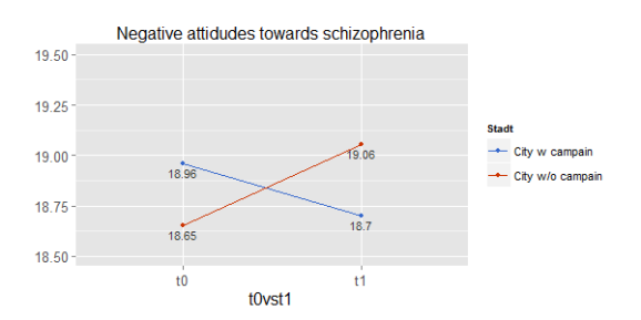
The idea to this function came up when we wanted to analyze the effect of an intervention (an educational programme on knowledge about mental disorders and associated stigma) between two groups: a “treatmeant” group (city) where a campaign on mental disorders was conducted and another city without this campaign. People from both cities were asked about their attitudes and knowledge about specific mental disorders at t0 before the campaign started in the one city. Some month later (t1), again people from both cities were asked the same questions. The intention was to see a) whether there were differences in knowledge and pro-social attidutes of people towards mental disorders and b) if the compaign successfully reduces stigma and increases knowledge.
To analyse these questions, we used an ANCOVA with knowledge and stigma score as dependent variables, “city” and “time” (t0 versus t1) as predictors and adjusted for covariates like age, sex, education etc. The estimated marginal means (or least-squares means) show you the differences of the dependent variable.
Here’s an example plot, quickly done with the sjp.emm.int function:

Since the data is not publicly available, I’ve set an an RPubs-documentation with reproducable examples (though those example do not fit very well…).
The latest development snapshot of my package is available on GitHub.
BTW: You may have noticed that this function is quite similar to the sjp.lm.int function for visually interpreting interaction terms in linear models…
Tagged: ANCOVA, data visualization, ggplot, R, rstats, sjPlot, Statistik
R-bloggers.com offers daily e-mail updates about R news and tutorials about learning R and many other topics. Click here if you're looking to post or find an R/data-science job.
Want to share your content on R-bloggers? click here if you have a blog, or here if you don't.
