Spatial Data Visualization with R
Want to share your content on R-bloggers? click here if you have a blog, or here if you don't.


I’ve been fooling around with spatial data lately. As it turns out, there are some great R packages for visualizing this kind of data.
Below is a set of charts I put together. It’s a good sample of the possibilities.
Motherjones.com keeps a dataset with characteristics of every mass shooting since 1983. The location of each shooting is marked on the map below with a red circle. The size of the circle is determined by the number of fatalities. Newtown and Virginia Tech (both school shootings) are among the deadliest within this time period.
In the vast majority of these cases, the shooters were white males with a history of mental illness who obtained their weapons legally.

# Mass Shootings
# packages used: rworldmap rworldxtra
# data source: www.motherjones.com
US <- getMap(resolution = "high")

plot(US,xlim=c(-125,-65),ylim=c(39,39), asp=1.31803)
title(main="Mass Shootings 1982-2013")

points(d$longitude,d$latitude,col="red",cex=d$Fatalities*.25)

text(-69.31142,37.21232,"Newtown")
text(-72.41394,30.22957,"Virginia Tech")
text(-111.04308,38.55200,"San Ysidro n McDonald's Massacre")
text(-89.72780,25.9,"Luby's Massacre")

#using locator() -- add lines from circles to labels
points(c(-77.67630,-72.99422),c(36.08547,31.16065),type='l')
points(c(-71.71729, -69.05702),c(39.79927,37.94237),type='l')
points(c(-96.51104, -92.68024),c(29.62669,26.23582),type='l')
points(c(-115.8778, -111.4086),c(33.98637, 36.73135),type='l')
R is flexible with spatial data. It can zoom out of the United States and display global data. Malaysia Airlines has been in the news a few times over the last year, so it’s a pretty topical example. We can plot all of the Malaysia airline’s routes below using data from openflights.org. In the last chart, magnitude was shown using the size of the circles, but here we can show magnitude using the shade of the routes. Routes to popular destinations are a brighter shade of blue.
I’ve also plotted the Air France and American Airlines routes. The actual mapping was easy to do. I used a combination of xworldmap and xworldxtra for the world map along with geosphare for the route arcs.
# Airline Data
# Packages: rworldmap rworldxtra geosphere
# Source: OpenFlights.org; flowingdata.com

# plot world map
map("world", col="grey15", fill=TRUE, bg="Black")

#create 100 shades of blue
pal <- colorRampPalette(c("#f2f2f2", "Blue"))
colors <- pal(100)

#plot each route
attach(gs)
for(i in 1:length(S_Long)){
  inter <- gcIntermediate(cbind(gs[i,]$S_Long, gs[i,]$S_Lat),
  cbind(gs[i,]$D_Long, gs[i,]$D_Lat), n=100)

  index<-round( (Dest_Count/max(Dest_Count))*length(colors))

  lines(inter, col=colors[index], lwd=.2)
}
title(main="American Airline Routes",col.main="Blue")
I saved the best for last.
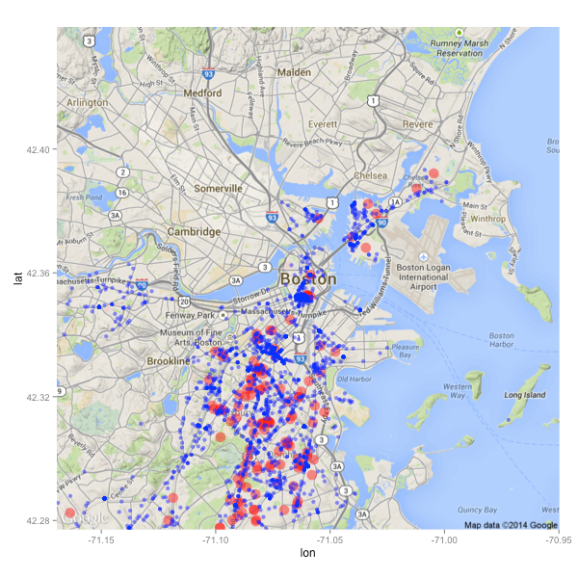
Ggmap allows R to fetch maps directly from Google and zoom into specific cities. Below is a map of Boston showing crime locations in 2014. The red dots represent shootings and blue dots represent drug offenses. I downloaded the data from data.cityofboston.gov Darker red areas represent more shooting events at that location. Most of the shootings seem to be clustered around Brookline/Roxbury.

If we zoom into the center of Boston, we see much fewer shootings. There are still many drug busts, but they’re concentrated in mainly three areas: Chinatown (shocker!), East Boston, and the South End.
bos_2<-boston[which(boston$Shooting=='Yes' & boston$Year=='2014'),]
bos_3<-boston[which(boston$INCIDENT_TYPE_DESCRIPTION=='DRUG CHARGES' & boston$Year=='2014'),]

bos_plot<-ggmap(get_map("Boston, Massachusetts",zoom=13))
bos_plot+geom_point(data=bos_2,aes(x=bos_2$Lat,y=bos_2$Long),
 col='red',alpha=.5,
 size=5)+geom_point(data=bos_3,aes(x=bos_3$Lat,y=bos_3$Long),
 col='blue',alpha=.5,
 size=2)
R-bloggers.com offers daily e-mail updates about R news and tutorials about learning R and many other topics. Click here if you're looking to post or find an R/data-science job.
Want to share your content on R-bloggers? click here if you have a blog, or here if you don't.


