Bootleg CourtVision with non-proprietary NBA data and [R]
Want to share your content on R-bloggers? click here if you have a blog, or here if you don't.
Mike likes Basketball. Mike likes Spatial Data. Mike likes Open Access.
I’m a big fan of what Kirk Goldsberry and friends are doing. I’ve been following his work since he hit the scene (Awesome).
Let’s make some bootleg CourtVision heatmaps.
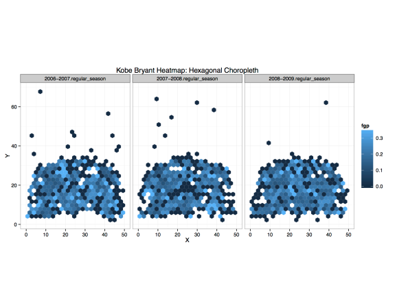
Nowadays we only see Kobe in black suits riding the pine; let’s get in the hot tub and travel back to a more golden time. We have three years of regular season data beginning in 2006 and ending in 2009.
 Check out 2006. Fans would remember this as the 81 game season. Equally as impressive, this was also the season Kobe had the crazy flurry of contiguous 50 point games (eat your heart out Kevin Durant). Hence, we see many bright blue hexagons lit across the court (areas with higher field goal percentage). People would also geek out for his 30+ feet jumpers.
The next year, 2007, we see darker tiles near the mid-range front of the rim. This was the year we got Pau Gasol. Giving Pau low post touches was a necessity. Opposing Defenses reinforced their interior defensive schemes, resulting in difficult interior shots.
Finally, in 2008, we see the most dark spots (also more intense). What’s interesting is the geographic distribution of these lower field goal percentage areas; they seem much more “integrated” instead of being clustered in a single area (like we saw in 2007 right in front of the rim).
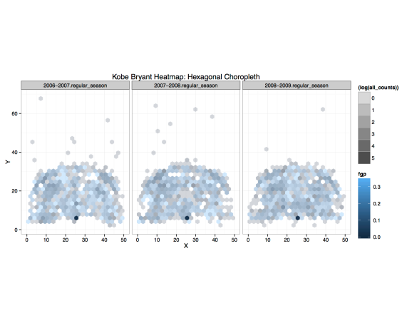
Our above heat map showed basic aggregates of within hexagon observations (the actual x’s and y’s). Each tile is composed of a varying number of observations. It would be nice to visually display the ‘uncertainty’ of each hexagon’s field goal percentage ‘estimate.’
So, I’ve mapped ‘shot attempts’ to the alpha (transparency) levels. Below is the result. We see the crazy gun-slinging 30+ foot jumpers as more transparent, because we observed less attempts in those tiles.
As an alternative, I believe Kirk maps this feature to the actual hexagon size. I wanted to dig up his original piece to get confirmation, but his archives stop on page 5.
 I’d love to see and work with proprietary data, such as the trendy “SportVU” data sets. I believe the utility of these hi res tracking system data sets is the ability to define much more realistic and complex “events” (scenarios). For example, check out “Kobe Assists,” that defines Kobe’s misses as an “assist” due to his teammates scoring off of offensive rebounds. My old attempt of wrangling custom events, turnover conversions, was a pain to do.
However, this exercise demonstrates the availability of tools (ggplot2 and [R]) and resources (free data); all that’s left is applying your ability.
R-bloggers.com offers daily e-mail updates about R news and tutorials about learning R and many other topics. Click here if you're looking to post or find an R/data-science job.
Want to share your content on R-bloggers? click here if you have a blog, or here if you don't.
