Hurricanes in South Carolina
Want to share your content on R-bloggers? click here if you have a blog, or here if you don't.
In a recent post, I discussed the occurrence of hurricanes in the North Atlantic basin. The data comes from the National Oceanic and Atmospheric Association, a member of the US federal government. The data spans a bit more than 150 years. In that post, I make the observation that the data supports a model wherein decade is a meaningful predictor of the number of hurricanes per year and that this model supports the inference that the number of observed hurricanes increases from one decade to the next. I posed a question about whether this was the result of climatological effects or merely an artifact of the manner in which data was collected in earlier time periods. My presumption is that is the latter.
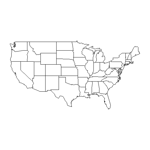
In this post, I will investigatge this further. First, though, let’s have a bit of fun drawing some maps. To do this, we’ll need to load the maps package, which will allow us to draw a picture of the lower 48 US states.
library(maps)
map("state")

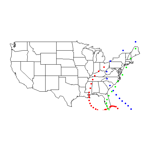
Next, we’ll load in our hurricane data and plot the path of a few hurricanes. When pulling in paths of named storms, we’re going to narrow it down to the most recent storm. Names are recycled until a particular storm name is retired. Katrina, Hugo and Donna are examples of storms whose impact was so great that those names will not be used again.
Remember that the data was downloaded from the NOAA website and modified slightly. Details may be seen in the first post, or on Github.
map("state")
setwd("~/GitHub/Hurricane/Data")
df = read.csv("Hurricanes.csv")

dfKatrina = df[df$Name == "KATRINA", ]
dfKatrina = dfKatrina[dfKatrina$Year == max(dfKatrina$Year), ]

points(dfKatrina$Longitude, dfKatrina$Latitude, pch=19, col = "red")

dfHugo = df[df$Name == "HUGO", ]
dfHugo = dfHugo[dfHugo$Year == max(dfHugo$Year), ]
points(dfHugo$Longitude, dfHugo$Latitude, pch = 19, col = "blue")

dfDonna = df[df$Name == "DONNA", ]
dfDonna = dfDonna[dfDonna$Year == max(dfDonna$Year), ]
points(dfDonna$Longitude, dfDonna$Latitude, pch = 19, col = "green")

I love maps and could probably do that all day. For the record, I found great inspiration in plotting these maps from a post on the Statistical Research blog maintained by Wes Stevenson.
What I’d like to work towards is measuring the number of times that a hurricane hits a particular state. Not only will this make it easier to plan your next vacation, it will go some way to indicating something about the increase in hurricane observations. My guess is that the increase is largely due to recording storms which never make landfall. Historically, I think that records about such storms were scant and inconsistent. Without satellites or radios, seaborne storms would only have been observed by ships. This data may not have been collected.
So, that’s what we want to test. First, we need a mechanism to parse the 45,000 records of hurricane positions in such a way that we can indicate whether they passed over land. To do that, we’ll use ggplot2 and its capability to extract the position data from a map. I’ll briefly pause here to reflect again on how elegant maps can be. Such massive concepts may be reduced to a set of points which are plotted just like any other set of data. Let’s look
library(ggplot2)

myMapData = map_data("state")

sc = myMapData[myMapData$region == "south carolina", ]

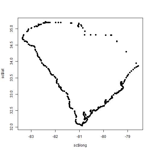
plot(sc$long, sc$lat, pch=19)
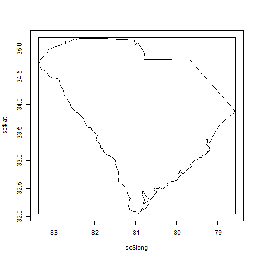
The map_data function will tanslate the map into a data frame so that it’s a bit more intuitive to manipulate. We then filter to get one particular region (in this case South Carolina as it’s where we spent a week of vacation). When the points are plotted, it looks quite a lot like an outline of the state. Let’s draw that again, but change the plot type to “l”. While we’re at it, let’s add in some points for hurricane Hugo.
plot(sc$long, sc$lat, type = "l")
points(dfHugo$Longitude, dfHugo$Latitude, pch = 19)

Say, that looks like South Carolina! Note that just one observation from Hugo falls within the borders of the state. Wouldn’t it be nice to identify this in some other way? We can do this by using the sp package and its function point.in.polygon. We’ll redraw the whole US map and color code the observation which lies inside of South Carolina.
library(sp)
inSC = point.in.polygon(dfHugo$Longitude, dfHugo$Latitude, sc$long, sc$lat)

map("state")
colHugo = ifelse(inSC == 1, "red", "black")
points(dfHugo$Longitude, dfHugo$Latitude, pch = 19, col = colHugo)

The function point.in.polygon will work most of the time. It would be better if we could test for the intersection of a line with a polygon. This would account for casese like Hugo where the hurricane clearly passed through Ohio, but no observation was recorded. I’m not going to get too fussed about this now. Having lived in Ohio, Florida, North Carolina and New York, I can tell you that in one of those states, I never had any anxiety about hurricanes.
So, how many hurricanes did pass through South Carolina? The most direct way to do this would be to apply the point.in.polygon function to every point in the hurricane database. That will probably take a while. Note that the Hugo set only had 61 points. The full set of hurricane data has 45 thousand. To narrow our search, we’ll create a bounding box for the state and use that to reduce the number of records. Here’s what that looks like visually:
box.sc = list(left = min(sc$long), right = max(sc$long), top = max(sc$lat), bottom = min(sc$lat))

DrawBox = function(box){
  x = c(box$left, box$left, box$right, box$right)
  y = c(box$bottom, box$top, box$top, box$bottom)
  polygon(x, y)
}

plot(sc$long, sc$lat, type = "l")
DrawBox(box.sc)

Let’s remove every observation that doesn’t appear in South Carolina’s bounding box.
dfBounded = subset(df, Latitude >= box.sc$bottom)
dfBounded = subset(dfBounded, Latitude <= box.sc$top)
dfBounded = subset(dfBounded, Longitude >= box.sc$left)
dfBounded = subset(dfBounded, Longitude <= box.sc$right)
That very quickly takes us down to 380 entries. What do they look like?
plot(sc$long, sc$lat, type = "l")
points(dfBounded$Longitude, dfBounded$Latitude, pch = 19)
So, there are still a number of points outside South Carolina, but with only 380 it’s very easy to reduce that to legitimate points.
inSC = point.in.polygon(dfBounded$Longitude, dfBounded$Latitude, sc$long, sc$lat)
dfBounded = dfBounded[inSC == 1, ]
plot(sc$long, sc$lat, type = "l")
points(dfBounded$Longitude, dfBounded$Latitude, pch = 19)

Now, we’ll repeat the same technique we applied to the entire set and convert the data frame to number of hurricanes per year.
dfYearSC = unique(dfBounded[,c("Year", "Num")])

dfYearSC = aggregate(dfYearSC, by = list(dfYearSC$Year), length)
colnames(dfYearSC)[1] = "Year"
dfYearSC = dfYearSC[, -2]
plot(dfYearSC$Year, dfYearSC$Num, pch=19)

Notice any increase? I don’t. The same Poisson will confirm that decade has virutally no predictive power for this data set and this geographic region.
dfYearSC$Decade = trunc(dfYearSC$Year / 10)
dfYearSC$Decade = dfYearSC$Decade - min(dfYearSC$Decade)

fitPoissonByDecade = glm(Num ~ 1 + Decade, family = poisson, data = dfYearSC)
summary(fitPoissonByDecade)
## Call:
## glm(formula = Num ~ 1 + Decade, family = poisson, data = dfYearSC)
##
## Deviance Residuals:
##    Min      1Q  Median      3Q     Max
## -0.323  -0.303  -0.288   0.518   1.258
##
## Coefficients:
##             Estimate Std. Error z value Pr(>|z|)
## (Intercept)  0.26094    0.19424    1.34     0.18
## Decade       0.00303    0.02149    0.14     0.89
##
## (Dispersion parameter for poisson family taken to be 1)
##
##     Null deviance: 15.008  on 75  degrees of freedom
## Residual deviance: 14.988  on 74  degrees of freedom
## AIC: 185.6
##
## Number of Fisher Scoring iterations: 4
R-bloggers.com offers daily e-mail updates about R news and tutorials about learning R and many other topics. Click here if you're looking to post or find an R/data-science job.
Want to share your content on R-bloggers? click here if you have a blog, or here if you don't.


