Visual interpretation of interaction terms in linear models with ggplot #rstats
Want to share your content on R-bloggers? click here if you have a blog, or here if you don't.
I haven’t used interaction terms in (generalized) linear model quite often yet. However, recently I have had some situations where I tried to compute regression models with interaction terms and was wondering how to interprete the results. Just looking at the estimates won’t help much in such cases.
One approach used by some people is to compute the regressions with subgroups for each category of one interaction term. Let’s say predictor A has a 0/1 coding and predictor B is a continuous scale from 1 to 10, you fit a model for all cases with A=0 (hence excluding A from the model, no interaction of A and B), and for all cases with A=1 and compare the estimates of predictor B in each fitted model. This may give you an impression under which condition (i.e. in which subgroup) A has a stronger effect on B (higher interaction), but of course you don’t have the correct estimate values compared to a fitted model that includes both the interaction terms A and B.
Another approach is to calculate the results of y by hand, using the formula:
y = b0 + b1*predictorA + b2*predictorB + b3*predictorA*predictorB
This is quite complex and time-comsuming, especially if both predictors have several categories. However, this approach gives you a correct impression of the interaction between A and B. I investigated further on this topic and found this nice blogpost on interpreting interactions in regression (and a follow up), which explains very well how to calculate and interprete interaction terms.
Based on this knowledge, I thought of an automatization of calculating and visualizing interaction terms in linear models using R and ggplot.
You can download the script sjPlotInteractions.R from my script page. The function sjp.lmint requires at least one parameter: a fitted linear model object, including interaction terms.
What this script does:
- it extracts all significant interactions
- from each of these interactions, both terms (or predictors) are analysed. The predictor with the higher number of unique values is chosen to be printed on the x-axis.
- the predictor with fewer numbers of unique values is printed along the y-axis.
- Two regression lines are calulated:
- every y-value for each x-value of the predictor on the x-axis is calculated according to the formula
y = b0 + b(predictorOnXAxis)*predictorOnXAxis + b3*predictorOnXAxis*predictorOnYAxis, using the lowest value ofpredictorOnYAxis - every y-value for each x-value of the predictor on the x-axis is calculated according to the formula
y = b0 + b(predictorOnXAxis)*predictorOnXAxis + b3*predictorOnXAxis*predictorOnYAxis, using the highest value ofpredictorOnYAxis
- every y-value for each x-value of the predictor on the x-axis is calculated according to the formula
- the above steps are repeated for each significant interactions.
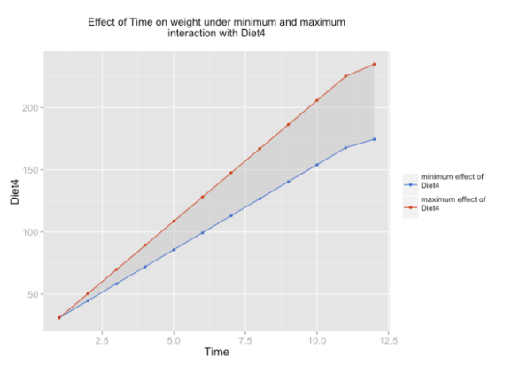
Now you should have a plot for each interaction that shows the minimum impact (or in case of 0/1 coding, the absence) of predictorYAxis on predictorXAxis according to y (the response, or dependent variable) as well as the maximum effect (or in case of 0/1 coding, the presence of predictorYAxis).
Some examples…
source("sjPlotInteractions.R")
fit <- lm(weight ~ Time * Diet, data=ChickWeight, x=T)
summary(fit)
This is the summary of the fitted model. We have three significant interactions.
Call:
lm(formula = weight ~ Time * Diet, data = ChickWeight, x = T)

Residuals:
     Min       1Q   Median       3Q      Max
-135.425  -13.757   -1.311   11.069  130.391

Coefficients:
            Estimate Std. Error t value Pr(>|t|)
(Intercept)  30.9310     4.2468   7.283 1.09e-12 ***
Time          6.8418     0.3408  20.076  < 2e-16 ***
Diet2        -2.2974     7.2672  -0.316  0.75202
Diet3       -12.6807     7.2672  -1.745  0.08154 .
Diet4        -0.1389     7.2865  -0.019  0.98480
Time:Diet2    1.7673     0.5717   3.092  0.00209 **
Time:Diet3    4.5811     0.5717   8.014 6.33e-15 ***
Time:Diet4    2.8726     0.5781   4.969 8.92e-07 ***
---
Signif. codes:  0 ‘***’ 0.001 ‘**’ 0.01 ‘*’ 0.05 ‘.’ 0.1 ‘ ’ 1

Residual standard error: 34.07 on 570 degrees of freedom
Multiple R-squared:  0.773,	Adjusted R-squared:  0.7702
F-statistic: 277.3 on 7 and 570 DF,  p-value: < 2.2e-16
As example, only one of these three plots is shown.
sjp.lmint(fit)
If you like, you can also plot value labels.
sjp.lmint(fit, showValueLabels=T)
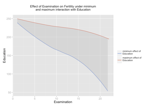
In case you have at least one dummy variable (0/1-coded) as predictor, you should get a clear linear line. However, in case of two scales, you might have “curves”, like in the following example:
source("lib/sjPlotInteractions.R")
fit <- lm(Fertility ~ .*., data=swiss, na.action=na.omit, x=T)
summary(fit)
The resulting fitted model:
Call:
lm(formula = Fertility ~ . * ., data = swiss, na.action = na.omit,
    x = T)

Residuals:
    Min      1Q  Median      3Q     Max
-8.7639 -3.8868 -0.6802  3.1378 14.1008

Coefficients:
                               Estimate Std. Error t value Pr(>|t|)
(Intercept)                  253.976152  67.997212   3.735 0.000758 ***
Agriculture                   -2.108672   0.701629  -3.005 0.005217 **
Examination                   -5.580744   2.750103  -2.029 0.051090 .
Education                     -3.470890   2.683773  -1.293 0.205466
Catholic                      -0.176930   0.406530  -0.435 0.666418
Infant.Mortality              -5.957482   3.089631  -1.928 0.063031 .
Agriculture:Examination        0.021373   0.013775   1.552 0.130915
Agriculture:Education          0.019060   0.015229   1.252 0.220094
Agriculture:Catholic           0.002626   0.002850   0.922 0.363870
Agriculture:Infant.Mortality   0.063698   0.029808   2.137 0.040602 *
Examination:Education          0.075174   0.036345   2.068 0.047035 *
Examination:Catholic          -0.001533   0.010785  -0.142 0.887908
Examination:Infant.Mortality   0.171015   0.129065   1.325 0.194846
Education:Catholic            -0.007132   0.010176  -0.701 0.488650
Education:Infant.Mortality     0.033586   0.124199   0.270 0.788632
Catholic:Infant.Mortality      0.009919   0.016170   0.613 0.544086
---
Signif. codes:  0 ‘***’ 0.001 ‘**’ 0.01 ‘*’ 0.05 ‘.’ 0.1 ‘ ’ 1

Residual standard error: 6.474 on 31 degrees of freedom
Multiple R-squared:  0.819,	Adjusted R-squared:  0.7314
F-statistic: 9.352 on 15 and 31 DF,  p-value: 1.077e-07
And the plot:
sjp.lmint(fit)
If you prefer, you can smoothen the line by using smooth="loess" parameter:
sjp.lmint(fit, smooth="loess")
Or you can force to print a linear line by using smooth="lm" parameter:
sjp.lmint(fit, smooth="lm")
I’m not sure whether I used the right terms in titles and legends (“effect on… under min and max interaction…”). If you have suggestions for alternative descriptions of title and legends that are “statistically” more correct, please let me know!
That’s it!
Tagged: ggplot, interaction terms, linear model, R, regression, rstats
R-bloggers.com offers daily e-mail updates about R news and tutorials about learning R and many other topics. Click here if you're looking to post or find an R/data-science job.
Want to share your content on R-bloggers? click here if you have a blog, or here if you don't.


