The tenure of Doctor Who incarnations
[This article was first published on 4D Pie Charts » R, and kindly contributed to R-bloggers]. (You can report issue about the content on this page here)
Want to share your content on R-bloggers? click here if you have a blog, or here if you don't.
Want to share your content on R-bloggers? click here if you have a blog, or here if you don't.
With a new actor being announced tomorrow, it got me pondering about the good Doctor. Specifically, who is the longest serving doctor? IMDB has the data:
whos <- data.frame(
  doctor = c(
    "William Hartnell",
    "Patrick Troughton",
    "Jon Pertwee",
    "Tom Baker",
    "Peter Davison",
    "Colin Baker",
    "Sylvester McCoy",
    "Paul McGann",
    "Christopher Ecclestone",
    "David Tennant",
    "Matt Smith"
  ),
  n_episodes = c(
    136,
    127,
    129,
    173,
    70,
    35,
    42,
    1,
    13,
    49,
    44
  ),
  stringsAsFactors = FALSE
)
whos$doctor <- factor(whos$doctor, levels = whos$doctor)
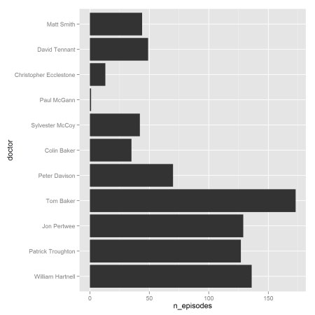
Let’s plot it to see how it changes over time.
library(ggplot2)
(bars <- ggplot(whos, aes(doctor, n_episodes)) +
  geom_bar(stat = "identity") +
  coord_flip()
)
There was a definite shift after Tom Baker towards a shorter term as the doctor. In terms of screen time, the shift is a little less pronounced due to the move from 25 minutes to 45 minutes per episode from Christopher Ecclestone onwards (and for one of the Colin Baker series).
Tagged: doctor who, ggplot2, r
To leave a comment for the author, please follow the link and comment on their blog: 4D Pie Charts » R.
R-bloggers.com offers daily e-mail updates about R news and tutorials about learning R and many other topics. Click here if you're looking to post or find an R/data-science job.
Want to share your content on R-bloggers? click here if you have a blog, or here if you don't.

