
Exporting plain, lattice, or ggplot graphics
Want to share your content on R-bloggers? click here if you have a blog, or here if you don't.

In a recent post I compared the Cairo packages with the base package for exporting graphs. Matt Neilson was kind enough to share in a comment that the Cairo library is now by default included in R, although you need to specify the type=”cairo” option to invoke it. In this post I examine how the ggplot and the lattice packages behave when exporting.
Basic plot
The nice thing about the export functions in the R package is that point size scales automatically with the resolution. You don’t need to multiply the “pointsize” parameter any more, you can just go with a higher resolution and everything will look just as nice. This is very convenient as you can adjust both the text and the plotted points by just changing one export parameter. Below is an example of a plot using pointsize 12.
1 2 3 4 5 6 7 8 9 10 11 12 13 14 15 16 17 18 19 20 21 22 23 24 | # Create the data
data <- rnorm(100, sd=15)+1:100
# Create a simple scatterplot
# with long labels to enhance
# size comparison
my_sc_plot <- function(data){
par(cex.lab=1.5, cex.main=2)
plot(data,
main="A simple scatterplot",
xlab="A random variable plotted",
ylab="Some rnorm value",
col="steelblue")
x <- 1:100
abline(lm(data~x), lwd=2)
}
png(filename="plain_PNG_pt12.png",
type="cairo",
units="in",
width=5,
height=4,
pointsize=12,
res=96)
my_sc_plot(data)
dev.off() |

Below is the same with slightly increased point size:
1 2 3 4 5 6 7 8 9 | png(filename="plain_PNG_pt14.png",
type="cairo",
units="in",
width=5,
height=4,
pointsize=14,
res=96)
my_sc_plot(data)
dev.off() |

ggplot2
This behavior is different for both the lattice and the ggplot2 packages. In both these packages the text is unchanged by the point size, although it might be good to know that the ggplot’s margins change with the point size:
1 2 3 4 5 6 7 8 9 10 11 12 13 14 15 16 17 18 19 20 21 22 23 24 | library(ggplot2)
my_gg_plot <- function(data){
ggplot(data.frame(y=data, x=1:100), aes(y=y, x)) +
geom_point(aes(x, y), colour="steelblue", size=3) +
stat_smooth(method="lm", se=FALSE, color="black", lwd=1) +
ggtitle("A simple scatterplot") + theme_bw() +
theme(title = element_text(size=20),
axis.title.x = element_text(size=18),
axis.title.y = element_text(size=18),
axis.text.x = element_text(size=14),
axis.text.y = element_text(size=14))+
xlab("A random variable plotted") +
ylab("Some rnorm value")
}
png(filename="GGplot_PNG_pt12.png",
type="cairo",
units="in",
width=5,
height=4,
pointsize=12,
res=96)
my_gg_plot(data)
dev.off() |

Now notice the marigns if we compare with a plot with a the point size x 3:
1 2 3 4 5 6 7 8 9 | png(filename="GGplot_PNG_pt36.png",
type="cairo",
units="in",
width=5,
height=4,
pointsize=12*3,
res=96)
my_gg_plot(data)
dev.off() |

My conclusion is that there seems to be an impact on the margins but not on the text.
Lattice
The lattice package in turn seems to be unaffected by any change to the point size:
1 2 3 4 5 6 7 8 9 10 11 12 13 14 15 16 17 18 19 20 21 22 23 24 | library(lattice)
my_lt_plot <- function(data){
xyplot(y~x, cex=1,
panel = function(x, y) {
panel.xyplot(x, y)
panel.abline(lm(y ~ x), lwd=2)
},
lwd=2,
data=data.frame(y=data, x=1:100),
main=list(label="A simple scatterplot", cex=2),
xlab=list(label="A random variable plotted", cex=1.8),
ylab=list(label="Some rnorm value", cex=1.8),
scales=list(cex=2))
}
png(filename="Lattice_PNG_pt12.png",
type="cairo",
units="in",
width=5,
height=4,
pointsize=12,
res=96)
my_lt_plot(data)
dev.off() |

And to compare with 3 times the point size:
1 2 3 4 5 6 7 8 9 | png(filename="Lattice_PNG_pt36.png",
type="cairo",
units="in",
width=5,
height=4,
pointsize=12*3,
res=96)
my_lt_plot(data)
dev.off() |

There seems to be no real difference.
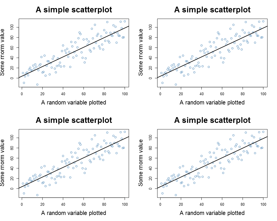
Panels
As a last exercise I checked what happens to the plots when using panels/side by side plots (hoping that I now covered the topic). Let’s start with the basic plot:
1 2 3 4 5 6 7 8 9 10 11 12 13 | png(filename="Plain_PNG_2x2.png",
type="cairo",
units="in",
width=5*2,
height=4*2,
pointsize=12,
res=96)
par(mfrow=c(2,2))
my_sc_plot(data)
my_sc_plot(data)
my_sc_plot(data)
my_sc_plot(data)
dev.off() |
Both the ggplot and the lattice performed better:
1 2 3 4 5 6 7 8 9 10 11 12 13 14 | png(filename="GGplot_PNG_2x2.png",
type="cairo",
units="in",
width=5*2,
height=4*2,
pointsize=12,
res=96)
p1 <- my_gg_plot(data)
pushViewport(viewport(layout = grid.layout(2, 2)))
print(p1, vp = viewport(layout.pos.row = 1, layout.pos.col = 1))
print(p1, vp = viewport(layout.pos.row = 1, layout.pos.col = 2))
print(p1, vp = viewport(layout.pos.row = 2, layout.pos.col = 1))
print(p1, vp = viewport(layout.pos.row = 2, layout.pos.col = 2))
dev.off() |

1 2 3 4 5 6 7 8 9 10 11 12 13 | png(filename="Lattice_PNG_2x2.png",
type="cairo",
units="in",
width=5*2,
height=4*2,
pointsize=12,
res=96)
p1 <- my_lt_plot(data)
print(p1, position=c(0, .5, .5, 1), more=TRUE)
print(p1, position=c(.5, .5, 1, 1), more=TRUE)
print(p1, position=c(0, 0, .5, .5), more=TRUE)
print(p1, position=c(.5, 0, 1, .5))
dev.off() |

Summary
In summary both ggplot and lattice seem to ignore the pointsize argument although the ggplot’s margins are affected. The panel plots work as expected, although regular plots may need a little tweaking.
R-bloggers.com offers daily e-mail updates about R news and tutorials about learning R and many other topics. Click here if you're looking to post or find an R/data-science job.
Want to share your content on R-bloggers? click here if you have a blog, or here if you don't.