Sketches Around Twitter Followers
Want to share your content on R-bloggers? click here if you have a blog, or here if you don't.
I’ve been doodling… Following a query about the possible purchase of Twitter followers for various public figure accounts (I need to get my head round what the problem is with that exactly?!), I thought I’d have a quick look at some stats around follower groupings…
I started off with a data grab, pulling down the IDs of accounts on a particular Twitter list and then looking up the user details for each follower. This gives summary data such as the number of friends, followers and status updates; a timestamp for when the account was created; whether the account is private or not; the “location”, as well as a possibly more informative timezone field (you may tell fibs about the location setting but I suspect the casual user is more likely to set a timezone appropriate to their locale).
So what can we do with that data? Simple scatter plots, for one thing – here’s how friends vs. followers distribute for MPs on the Tweetminster UKMPs list:
We can also see how follower numbers are distributed across those MPs, for example, which looks reasonable and helps us get our eye in…:
We can also calculate ratios and then plot them – followers per day (the number of followers divided by the number of days since the account was registered, for example) vs the followers per status update (to try to get a feeling of how the number of followers relates to the number of tweets):
This particular view shows a few outliers, and allows us to spot a couple of accounts that have recently had a ‘change of use’.
As well as looking at the stats across the set of MPs, we can pull down the list of followers of a particular account (or sample thereof – I grabbed the lesser of all followers or 10,000 randomly sampled followers from a target account) and then look at the summary stats (number of followers, friends, date they joined Twitter, etc) over those followers.
So for example, things like this – a scatterplot of friends/follower counts similar to the one above:
…sort of. There’s something obviously odd about that graph, isn’t there? The “step up” at a friends count of 2000. This is because Twitter imposes, in most cases, a limit of 2000 friends on an account.
How about the followers per day for an account versus the number of days that account has been on Twitter, with outliers highlighted?
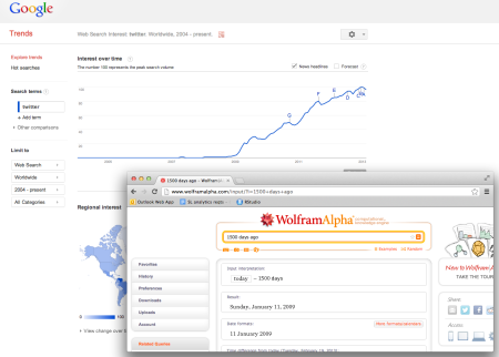
Alternatively, we can do counts by number of days the followers have been on Twitter:
The bump around 1500 days ago corresponds to Twitter getting suddenly popular around then, as this chart from Google Trends shows:
Sometimes, you get a distribution that is very, very wrong… If we do a histogram that has bins along the x-axis specifying that a follower had 0-100 followers of their own, or 500-600 followers etc, and then for all the followers of a particular account, pop them into a corresponding bin given the number of their followers, counting the number of people in each bin once we have allocated them all, we might normally expect to see something like this:
However, if an account is followed by lots of followers that have zero or very few followers of their own, we get a skewed distribution like this:
There’s obviously something not quite, erm, normal(?!) about this account (at least, at the time I grabbed the data, there was something not quite normal etc etc…).
When we get stats from the followers of a set of folk, such as the members of a list, we can generate summary statistics over the sets of followers of each person on the list – for example, the median number of followers, or different ratios (eg mean of the friend/follower ratios for each follower). Lots of possible stats – but which ones does it make sense to look at?
Here’s one… a plot of the median followers per status ratio versus the median friend/follower ratio:
Spot the outlier 😉
So that’s a quick review of some of the views we can get from data grabs of the user details from the followers of a particular account. A useful complement to the social positioning maps I’ve also been doing for some time:
It’s just a shame that my whitelisted Twitter API key is probably going to die in few weeks:-(
[In the next post in this series I’ll describe a plot that estimates when folk started following a particular account, and demonstrate how it can be used to identify notable “events” surrounding the person being followed…]
R-bloggers.com offers daily e-mail updates about R news and tutorials about learning R and many other topics. Click here if you're looking to post or find an R/data-science job.
Want to share your content on R-bloggers? click here if you have a blog, or here if you don't.


