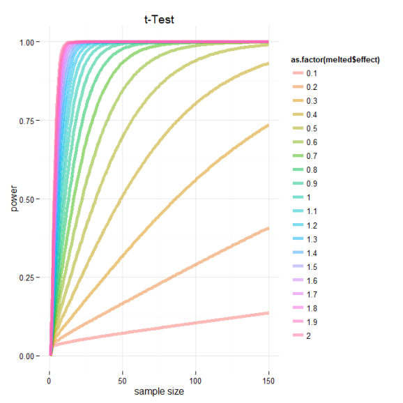
Power Calculations – relationship between test power, effect size and sample size
Want to share your content on R-bloggers? click here if you have a blog, or here if you don't.
I was interested in modeling the relationship between the power and sample size, while holding the significance level constant (p = 0.05) , for the common two-sample t-Test. Luckily R has great support for power analysis and I found the function I was looking for in the package pwr.
To calculate the power for the two-sample T-test at different effect and sample sizes I needed to wrap the basic function power.t.test().
# Need pwr package
if(!require(pwr)){install.packages("pwr");library("pwr")}

# t-TEST
#---------------------------------

d<-seq(.1,2,by=.1) # effect sizes
n<-1:150 # sample sizes

t.test.power.effect<-as.data.frame(do.call("cbind",lapply(1:length(d),function(i)
  {

	sapply(1:length(n),function(j)
		{
			power.t.test(n=n[j],d=d[i],sig.level=0.05,power=NULL,type= "two.sample")$power
		})
	})))

t.test.power.effect[is.na(t.test.power.effect)]<-0 # some powesr couldn't be calculated, set these to zero
colnames(t.test.power.effect)<-paste (d,"effect size")
#plot results using base
#------------------------------------------------
obj<-t.test.power.effect # object to plot
cols<-1:ncol(obj)
color<-rainbow(length(cols), alpha=.5) # colors
lwd=5 # line thickness
lty<-rep(1,length(color))
lty[imp]<-c(2:(length(imp)+1))

#highligh important effect sizes
imp<-c(2,5,8) # cuts
cuts<-c("small","medium","large") # based on cohen 1988
color[imp]<-c("black")
wording<-d
wording[imp]<-cuts

par(fig=c(0,.8,0,1),new=TRUE)

#initialize plot
plot(1,type="n",frame.plot=FALSE,xlab="sample size",ylab="power",xlim=c(1,150),ylim=c(0,1),main="t-Test", axes = FALSE)
#add custom axis and grid
abline(v=seq(0,150,by=10),col = "lightgray", lty = "dotted")
abline(h=seq(0,1,by=.05),col = "lightgray", lty = "dotted")
axis(1,seq(0,150,by=10))
axis(2,seq(0,1,by=.05))
#plot lines
for(i in 1:length(cols)){lines(1:150,obj[,cols[i]],col=color[i],lwd=lwd,lty=lty[i])}
#legend
par(fig=c(.65,1,0,1),new=TRUE)
plot.new()
legend("top",legend=wording,col=color,lwd=3,lty=lty,title="Effect Size",bty="n")
Based on this graph, we can see the relationship between power, effect sizes and sample number. I’ve marked the cutoffs suggested by Cohen 1988 delineating small, medium and large effect sizes. Based on this we can see that if we are designing an experiment and are trying to select a sample size for which our test will be powerd at 0.8 we need to consider the expected effect of our experimental treatment. If we think that or treatment should have a moderate effect we should consider some where around 60 samples per group. However and even better analysis would be to directly calculate the sample number needed to achieve some power and significance level given experimentally derived effects sizes based on preliminary data!
And just for kicks here is the same data plotted using ggplot2.
#plot using ggplot2
#------------------------------------------------
#plot results using ggplot2
library(ggplot2);library(reshape)
x11() # graphic device on windows
obj<-cbind(size=1:150,t.test.power.effect) #flip object for melting
melted<-cbind(melt(obj, id="size"),effect=rep(d,each=150)) # melt and bind with effect for mapping
ggplot(data=melted, aes(x=melted$size, y=melted$value, color=as.factor(melted$effect))) + geom_line(size=2,alpha=.5) +
ylab("power") + xlab("sample size") + ggtitle("t-Test")+theme_minimal()

# wow ggplot2 is amazing in its brevity
# need to tweak legend and lty, but otherwise very similar
R-bloggers.com offers daily e-mail updates about R news and tutorials about learning R and many other topics. Click here if you're looking to post or find an R/data-science job.
Want to share your content on R-bloggers? click here if you have a blog, or here if you don't.

