rasterVis to the rescue
Want to share your content on R-bloggers? click here if you have a blog, or here if you don't.
Programmers like Oscar Perpiñán Lamigueiro are the reason I love R! Oscar is the maintainer of the rasterVis package and it in this post I’ll explain why it is must have package for anyone working with the raster package in R. My latest project is focused on the NOAA’s Climate Reference Network. The details can be found here. Over a year ago I wrote a package call CRN designed to download and organize the data from the Climate Reference Network and I wanted to update and put some finishing touches on that package. In the course of that I decided it would be a cool idea to build a detailed metadata package for the stations.
The CRN is a rather like a gold standard of climate data collection. Triple redundant sensors, 5 minute data, hourly data, daily and monthly. The sites have all been selected using rigorous standards and as the system has matured the data availability rates are close to 100%. Here are just of few of the projects I have in mind.
1. Doing a proper estimate of the US temperature using just the CRN stations. One person has already done this incorrectly ( or sub optimally ) so, I’m planning on approaching the problem with Kriging. For this I won’t use the Berkeley Earth code because I want to do something in R, using gstat perhaps.
2. Looking at LST around the CRN sites. There is also a really cool new package in R called Modis and I really want to do an interesting project to test that package out. The goal here would be to fetch the correct Modis tiles for Land Surface Temperature, and then look at the Air temperatures, soil temperatures ( CRN collects those )
3. Landcover study. I’ve been reading a bunch of papers by Marc Imhoff on SUHI and the relationship between SUHI and impervious surfaces, tree cover, etc. and Marc’s team has done some really cool work on the relationship between SUHI and the particular biome that a city is embedded in. In some forthcoming work they also look at the effects of city size and city shape on SUHI. A a few points in their papers they have hinted at SUHI effects for even small urban developments with areas around 1 sq km. I’d like to understand that better.
To pull off all these projects I will need some rather detailed metadata, more detailed than I’ve ever worked with before. For starters I needed a station list for the CRN and USRCRN stations. There are any number of ways of getting this data, but I drop a note to Matt Menne of NOAA and he directed me to Michael Palecki who was kind enough to send me a csv file of stations. The thing I was looking for was the most accurate Latitude/Longitude data I could find, and Michael supplied it.
Next task was collecting metadata for the stations and assembling a variety of tables. I won’t document that work here, but just to give you an idea of what I’m putting together For every station I have the following : 1) elevation,slope and aspect from 30 meter DEM. 2) distance from the sea coast, distance from the nearest body of water, and percentage of the “land” that is covered in water over a broad range of radii from the site. 3 various landcover datasets. 4. Impervious Area. 5. Biome. 6 Anthrom. 7 Populations from various sources and at various levels of accuarcy. 8 Housing. 9. Nightlights ( stable and radiance calibrated ). 10 economic activity. and I plan to get LST and probably Modis Albedo.
So where does Oscar and rasterVis come in? Specifically in this case Oscar came to the rescue for a plotting problem I was having with landcover data.
Using the 2006 NLCD 30 meter land cover dataset the first thing I do is save off ”patches” of landcover for roughly 1 degree around the site. The 30 meter dataset is huge and things go much easier if I just create small data sets for each station.
In code that looks like this
library(raster)
library(rgdal)
LcName <- ”G:\\NLCD\\nlcd2006_landcover_4-20-11_se5.img”
LC <- raster(LcName)
Inv <- read.table(“Core.tab”,stringsAsFactors =FALSE)
coordinates(Inv) <- c(“Lon”,”Lat”)
proj4string(Inv) <- CRS(“+proj=longlat +datum=WGS84 +ellps=WGS84 +towgs84=0,0,0″ )
Inv <- spTransform(Inv, CRS(projection(LC)))
dir.create(“NLCD2006″)
for(station in 1:nrow(Inv)){
Lon <- coordinates(Inv)[station,"Lon"]
Lat <- coordinates(Inv)[station,"Lat"]
if(Lon >= xmin(LC) & Lon <= xmax(LC) & Lat >= ymin(LC) & Lat <= ymax(LC)){
e <- extent(Lon-110000,Lon+110000,Lat-110000,Lat+110000)
patch <- crop(LC,e)
fname <-file.path(“NLCD2006″,paste(Inv$Id[station],”NLCD06.grd”,sep=”"),fsep=.Platform$file.sep)
writeRaster(patch,filename = fname)
print(station)
}else {
print(“Alaska or HI”)
}
}
Pretty simple. For 2006 Alaska and Hawaii are not in the dataset so we just skip them. The output of this is a small grid with the station in the center and 30 meter landcover data for 110,000 meters in all directions. That’s the data I will be working with.
The next step is to calculate a variety of statistics on this “patch” and smaller and smaller versions of the patch, so we get the land cover stats at various radii from the site, from 110km down to 30 meters. Working with the 1 degree “patch” makes this work go very quickly. raster has a function called “freq” which counts the frequency of values in the entire raster. [ As I write this I wonder if “freq” can be passed as a function to the raster “extract” function as a buffer option]
In addition to creating 1 degree patches for every site I also create 1km patches which makes a nice size for display. That’s where rasterVis comes in.
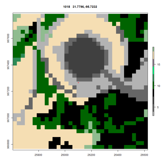
Before Oscar solved my problem here is an example of what my plot looked like. Note this is at 500 meters
There are a bunch of problems here. First and foremost I could not get a consistent coloring for these plots. The issue is that plot() in raster was considering my data to be integers rather than factors and if land cover types were missing my colors scheme changed from plot to plot.
Oscar fixed all that by suggesting that I use rasterVis and the levelplot function. His code dropped right in and after finding the color scheme in rgb for NLCD the same plot now looks like this
I’ve got some work to do to switch back to the official legend descriptions but the maps now use the rgb from the standard and every map is consistently covered. In the next installment I’ll post up Oscars code.
Here is what the Impervious surface data looks like ( Needs a grey scale of 0-100% )
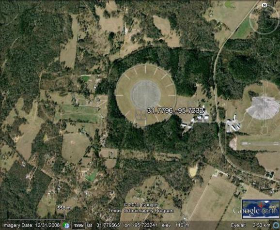
To the naked eye it looks like this
R-bloggers.com offers daily e-mail updates about R news and tutorials about learning R and many other topics. Click here if you're looking to post or find an R/data-science job.
Want to share your content on R-bloggers? click here if you have a blog, or here if you don't.


