Plotting 95% Confidence Bands in R
[This article was first published on Quantitative Ecology, and kindly contributed to R-bloggers]. (You can report issue about the content on this page here)
Want to share your content on R-bloggers? click here if you have a blog, or here if you don't.
I am comparing estimates from subject-specific GLMMs and population-average GEE models as part of a publication I am working on. As part of this, I want to visualize predictions of each type of model including 95% confidence bands.Want to share your content on R-bloggers? click here if you have a blog, or here if you don't.
First I had to make a new data set for prediction. I could have compared fitted values with confidence intervals but I am specifically interested in comparing predictions for particular variables while holding others constant. For example, soil temperature is especially important for salamanders, so I am interested in the predicted effects of soil temperature from the different models. I used the expand.grid and model.matrix functions in R to generate a new data set where soil temperature varied from 0 to 30 C. The other variables were held constant at their mean levels during the study. Because of the nature of the contrast argument in the model.matrix function, I had to include more than one level of the factor “season”. I then removed all season except spring. In effect I am asking, what is the effect of soil temperature on salamander activity during the spring when the other conditions are constant (e.g. windspeed = 1.0 m/s, rain in past 24 hours = This code is based on code from Ben Bolker via http://glmm.wikidot.com
# Compare Effects of SoilT with 95% CIs
formula(glmm1)
newdat.soil <- expand.grid(
SoilT = seq(0, 30, 1),
RainAmt24 = mean(RainAmt24),
RH = mean(RH),
windspeed = mean(windspeed),
season = c(“spring”, “summer”, “fall”),
droughtdays = mean(droughtdays),
count = 0
)
newdat.soil$SoilT2 <- newdat.soil$SoilT^2
# Spring
newdat.soil.spring <- newdat.soil[newdat.soil$season == 'spring', ]
mm = model.matrix(terms(glmm1), newdat.soil)
Next I calculated the 95% confidence intervals for both the GLMM and GEE models. For the GLMM the plo and phi are the low and high confidence intervals for the fixed effects assuming zero effect of the random sites. tlo and thi account for the uncertainty in the random effects.
newdat.soil$count = mm %*% fixef(glmm1)
pvar1 <- diag(mm %*% tcrossprod(vcov(glmm1),mm))
tvar1 <- pvar1+VarCorr(glmm1)$plot[1]
newdat.soil <- data.frame(
newdat.soil
, plo = newdat.soil$count-2*sqrt(pvar1)
, phi = newdat.soil$count+2*sqrt(pvar1)
, tlo = newdat.soil$count-2*sqrt(tvar1)
, thi = newdat.soil$count+2*sqrt(tvar1)
)
mm.geeEX = model.matrix(terms(geeEX), newdat.soil)
newdat.soil$count.gee = mm.geeEX %*% coef(geeEX)
tvar1.gee <- diag(mm.geeEX %*% tcrossprod(geeEX$geese$vbeta, mm.geeEX))
newdat.soil <- data.frame(
newdat.soil
, tlo.gee = newdat.soil$count-2*sqrt(tvar1.gee)
, thi.gee = newdat.soil$count+2*sqrt(tvar1.gee)
)
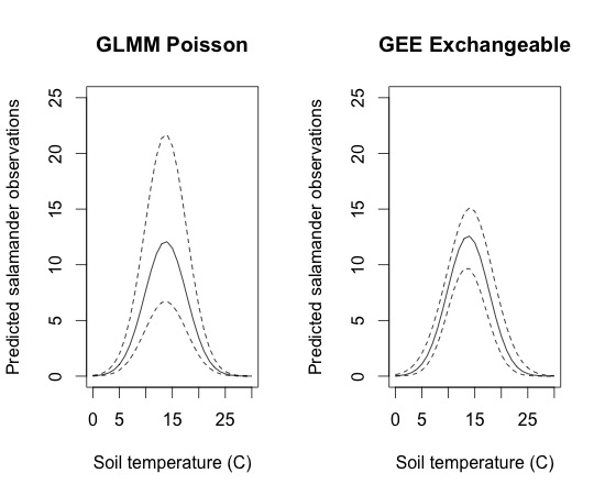
The standard error of the fixed effects are larger in the GEE model than in the GLMM, but when the variation associated with the random effects are accounted for, the uncertainty (95% CI) around the estimates is greater in the GLMM. This is especially evident when the estimated values are large since the random effects are exponential on the original scale. This can be seen in the below plots

Although this plot does the job, it isn’t an efficient use of space, nor is it easy to compare exactly where the different lines fall. It would be nice to plot everything on one set of axes. The only trouble is that all the lines could be difficult to see just using solid and dashed/dotted lines. To help with this, I combine the plots but added color and shading using the polygon function. The code and plot are below
plot(newdat.soil.spring$SoilT, exp(newdat.soil.spring$count.gee),
xlab = “Soil temperature (C)”,
ylab = ‘Predicted salamander observations’,
type = ‘l’,
ylim = c(0, 25))
polygon(c(newdat.soil.spring$SoilT, rev(newdat.soil.spring$SoilT)), c(exp(newdat.soil.spring$thi.gee), rev(exp(newdat.soil.spring$tlo.gee))),
col = ‘grey’,
border = NA)
lines(newdat.soil.spring$SoilT, exp(newdat.soil.spring$thi.gee),
type = ‘l’,
lty = 2)
lines(newdat.soil.spring$SoilT, exp(newdat.soil.spring$tlo.gee),
type = ‘l’,
lty = 2)
lines(newdat.soil.spring$SoilT, exp(newdat.soil.spring$count.gee),
type = ‘l’,
lty = 1,
col = 2)
lines(newdat.soil.spring$SoilT, exp(newdat.soil.spring$count),
col = 1)
lines(newdat.soil.spring$SoilT, exp(newdat.soil.spring$thi),
type = ‘l’,
lty = 2)
lines(newdat.soil.spring$SoilT, exp(newdat.soil.spring$tlo),
type = ‘l’,
lty = 2)
Now you can directly compare the results of the GLMM and GEE models. The predicted values (population-averaged) for the GEE is represented by the red line, while the average (random effects = 0, just fixed effects) from the GLMM are represented by the solid black line. The dashed lines represent the 95% confidence intervals for the GLMM and the shaded area is the 95% confidence envelope for the GEE model. As you can see, the GEE has much higher confidence in it’s prediction of soil temperature effects on salamander surface activity than the GLMM model. This would not be apparent without visualizing the predictions with confidence intervals because the standard errors of the fixed effects were lower in the GLMM than in the GEE. This is because the SEs in the GEE include the site-level (random effect) variation while the GLMM SEs of the covariates do not include this variation and are interpreted as the effect of a change of 1 X on Y at a given site.
To leave a comment for the author, please follow the link and comment on their blog: Quantitative Ecology.
R-bloggers.com offers daily e-mail updates about R news and tutorials about learning R and many other topics. Click here if you're looking to post or find an R/data-science job.
Want to share your content on R-bloggers? click here if you have a blog, or here if you don't.

