Want to share your content on R-bloggers? click here if you have a blog, or here if you don't.
If you haven’t worked with the gWidgets package it’s worth some time exploring it which is what I’ve been doing for a little paleo project I’ve been working on. After struggling with the few demos and tutorials I could find I went ahead and bought the book: Programming Graphical User Interfaces in R. Luckily the book was a little better than the tutorials which just scratch the surface. GUI programming, in my mind, is unlike other programming and I had many false starts, primarily struggling with lexical scoping issues and getting widgets to update based on changes made to other widgets and the underlying data. The only reliable method I could find was <<- Yikes. I’m sure over time I’d figure away around making these type of “globals” it ended up looking pretty but being ugly under the hood.
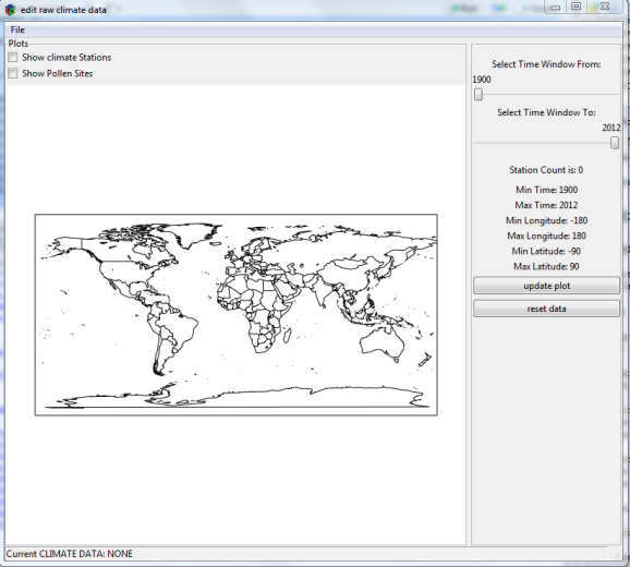
Lets Start with the Top Window
Pretty basic but it took a while to get this to work. Part of the problem was mixing the window on the left a ggraphics() widget with the panel on the right and having it operate correctly with resizing. I tried ggroups(), gframe(), combinations of those two and in all cases the windows would not draw properly upon resizing. Text got left all over the place. That problem was solved with a gpanedgroup(). So the left pane is a gframe() that contains a gcheckboxgroup() and then a ggrpahics() widget and the right group is also a gframe containing other widgets. The purpose of the GI is pretty simple: take a huge climate data file and station inventory and “crop” it with respect to a climate proxy file, in this case pollen data. The idea is to create some custom climate files without requiring programming. The process starts by loading a climate file ( from Berkeley Earth datasets) which uses my BerkeleyEarth Package. Then you load a pollen database and plot the two:
The glabel(0 widgets on the right show you how many stations are loaded and the min and max time. They also show the lat /lon which defaults to the whole world. Next we select our region of interest by using the graphics crosshairs. Selecting that “extent” will automatically crop the climate data to the extent selected:
We see the station count adjust and the lat/lon adjust. And the times at which we have temperatures is displayed. Then hit update plot:
And the plot updates. Here I’ve selected an even smaller region. Unfortunately if you make a region too small, the ONLY way to undo that mistake is to “reset data” which brings you back to square one with all the data present. The last step is to adjust the time window: Here I want to build a dataset from 1961 to 1990. So I move the gsliders() and hit update plot.
The last step I have to write is the “save file”. I also had plans to add more plots, like stations versus time, but at one point I hit a nasty gWidgets error about hitting the limits on the stack. Probably my programming. For now, this will do. For future projects I think I’m going downstream to do toolkit programming. The layout restrictions in gWidgets did cramp my style and I really haven’t mastered the whole “signaling” handler, updating widgets.. perhaps I should use an observer model.. more reading.
I usually post code. In this case its so ugly that it would probably teach you bad things. When I get better at this I’ll do some tutorials.
R-bloggers.com offers daily e-mail updates about R news and tutorials about learning R and many other topics. Click here if you're looking to post or find an R/data-science job.
Want to share your content on R-bloggers? click here if you have a blog, or here if you don't.


