Quickly Explore the Penn World Tables in R
Want to share your content on R-bloggers? click here if you have a blog, or here if you don't.
The Penn World Tables are one of the greatest source of worldwide macroeconomic data, but dealing with its web interface is somewhat cumbersome. Fortunately, the data is also available as a R package on CRAN. Having some tools at hand to quickly draw some nice graphs from the data is useful in many circumstances. Here are three exciting packages that help you to quickly explore the PWT data in R. All of them are on CRAN.
First, get the data:
library(pwt)
1. ggplot2
Use ggplot2 to draw time series for a variable. Exchange the isocodes in the list or the variable name to alter the graph (‘rgdpl’ is one of several GDP per capita measures).
library(ggplot2)
qplot(year,
  rgdpl,
  data = subset(pwt7.0, isocode %in% c("USA", "JPN", "KOR", "CHN")),
  geom = "line",
  group = isocode,
  color = as.factor(isocode)
) + opts(legend.title = theme_blank()) + coord_trans(y = "log")
and thats what you will get:
2. manipulate
Use ggplot2 and manipulate to be even more flexible. (You need RStudio for that, but you should have it anyway!)
library(manipulate); library(ggplot2)
dta = subset(pwt7.0, isocode %in% c("USA", "JPN", "KOR", "CHN"))
manipulate(
  qplot(dta$year,
    dta[, vars],
    geom = "line",
    group = dta$isocode,
    color = as.factor(dta$isocode)
  ) + opts(legend.title = theme_blank()),
  vars = picker(as.list(colnames(pwt7.0)[-(1:3)]))
)
you will get a nice menu to choose the variable of your interest.
3. googleVis
googleVis lets you use the Google Visualisation API.
library(googleVis)
First, you should rename China, the two Congos and South Korea to make them appear in the graphs:
levels(pwt7.0$country)[levels(pwt7.0$country)=="China Version 1"] <- "China"
levels(pwt7.0$country)[levels(pwt7.0$country)=="Congo, Republic of"] <- "Congo"
levels(pwt7.0$country)[levels(pwt7.0$country)=="Congo, Democratic Republic"] <- "CD"
levels(pwt7.0$country)[levels(pwt7.0$country)=="Korea, Republic of"] <- "South Korea"
and get some pretty colors from colorbrewer2.org:
colorbrewer <- "{maxValue: 40000, colors:['#F7FCF0', '#E0F3DB', '#CCEBC5', '#A8DDB5', '#7BCCC4', '#4EB3D3', '#2B8CBE', '#0868AC', '#084081']}"
And now draw a map with your data (make a screenshot if you want to use it)
plot(
  gvisGeoChart(
    subset(pwt7.0, year == 2008),
    "country",
    "rgdpl",
    options=list(width = 900, height = 700, colorAxis = colorbrewer)
  )
)
That’s the result:
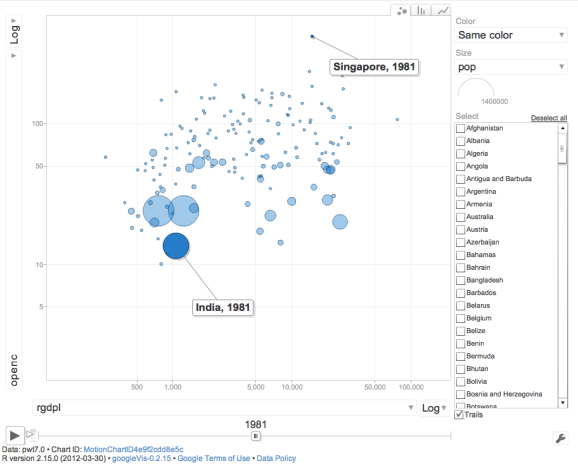
Or simply show all data, in a very similar way as the Google Public Data Explorer does. Be careful, this operation is time consuming:
plot(
  gvisMotionChart(
    pwt7.0,
    idvar="country",
    timevar="year",
    options=list(width = 900, height = 700)
  )
)
R-bloggers.com offers daily e-mail updates about R news and tutorials about learning R and many other topics. Click here if you're looking to post or find an R/data-science job.
Want to share your content on R-bloggers? click here if you have a blog, or here if you don't.


