More Anthromes !
Want to share your content on R-bloggers? click here if you have a blog, or here if you don't.
First off let me thank folks for all the comments and suggestions. I’m just starting to explore this data so perhaps I should explain how I go about doing this. First off, I am looking for a global bias in the record from UHI. It is well known that you can look through the data and stations and find “cases” where an urban station looks to have UHI. Doing this is easy. Pick the biggest cities you can. But, that doesnt get you an answer to the question: “what is the bias in the total record?” If you like remove those few bad apples and the answer you are left with is indistinguishable from the answer you get with those bad apples left in the record. Analytically, I prefer to take them out. However, the effect of removing them or including them is minimal. The concern is that the UHI we see in large cities ( more than 1M pop) is also present in smaller cities and perhaps even in villages.
After looking at the global averages of ”urban” and non urban, the next step I like to take is to look at long series. I selected urban stations, but I did not require that the station have data during the entire period. In this test I test that decision. For this test I do the following
1. Select all stations that are “urban” in the year 2000
2. Window the data to 1900 to 2011
3. Select only those stations that have 1000 months of data. In this 112 year period they have to have 1000 of 1344 months present or about 75%
4. create 2 inventories:
A: start as urban in 1900 and end as urban in 2011: 474 stations
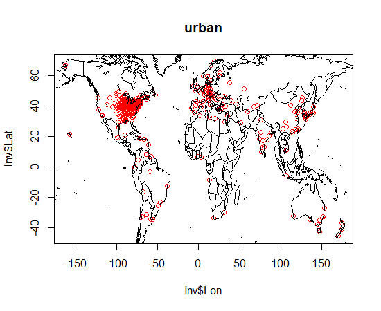
B: start as non urban and end as urban: 950 stations
Here are the maps for these stations: Urban designates “starts as urban”; Rural designates “starts as Rural” And dont bug me about graphics. I’m just exploring stuff here.
Next I show you a histogram of the “starting Anthrome” of the ”rural” stations. Sorry no legend, I’ll explain in the text
The Anthrome key is as follows
21: Rice villages
22: Irrigated villages
23: Rainfed villages
24: Pastoral villages
31: Residential irrigated croplands
32: Residential rainfed croplands
33: Populated croplands
34: Remote croplands
41: Residential rangelands
42: Populated rangelands
43: Remote rangelands
51: Residential woodlands
52: Populated woodlands
53: Remote woodlands
54: Inhabited treeless and barren lands
61: Wild woodlands
62: Wild treeless and barren lands
What we see is that the sample is dominated by residential rainfed croplands being transformed into urban areas. There are a fair number of rice lands transformed and wooded areas transformed. This is interesting because we know from Imhoff that transforming wooded areas to urban areas yeilds the highest UHI. Why is this important? When you read a UHI study that shows a large UHI understand that the UHI is a function of the type of surrounding biome. Clearing woodland to make a city creates a high UHI– a HIGH differential from the surrounding area. creating cities in other biomes doesnt create a differential that is as high. A city in arid areas has no UHI according to Imhoff. In any case, there is more work to do here.
So, what’s the answer? Looking at long series ONLY, what happens to the warming signal when we shift land use and population from non urban( mostly croplands) to Urban?
This should look familiar. black curve is urban, red curve is “non urban” . Blue curve is the difference and I draw the slope of the difference. That slope is indistinguishable form the global answer. 0007C/year
More work I suppose
R-bloggers.com offers daily e-mail updates about R news and tutorials about learning R and many other topics. Click here if you're looking to post or find an R/data-science job.
Want to share your content on R-bloggers? click here if you have a blog, or here if you don't.


