Anthromes and UHI
Want to share your content on R-bloggers? click here if you have a blog, or here if you don't.
With BerkeleyEarth 1.6 posted to CRAN I figured it was time to do some sample programs to explain how the package worked and integrated with other packages. Also, I have some issues to check out with the metadata; and in the long run I want to reformulate my metadata package to include some new resources. There is a great project I found at http://www.worldgrids.org. When that project completes I think it will make an interesting addition to our understanding of temperature station metadata. As I travelled around the internet in search of more data I happened upon a couple of resources. First a resource that will make a great cross check on Modis Urban extent data: It’s a 300 meter resolution map of the entire globe: http://postel.mediasfrance.org/sommaire.php3?langue=English. The dataset is behind a registration wall, but getting access to it was easier than getting access to Modis. In a future post I will compare the two datasets. The second dataset I found was referenced at worldgrids: Anthromes. What is an anthrome? Human beings, like other animals, transform the landscape they inhabit, and anthromes represent the various classes of human transformed landscape. In a nutshell an Anthrome is a function of population, technology, affluence and the natural landscape. Croplands are an example. So are cities. This method of classifying the lanscape was interesting to me because of the difficulty researchers have had in finding a discernable UHI signal in global temperature records. I won’t recount the list of failed attempts. In simple terms most researchers attack the problem by identifying “rural” sites and ”urban” sites and then looking for differences in trends between the two. That is relatively straightfoward. If “urban” sites are infected with UHI, then we should be able to see that bias by differencing rural sites and urban sites. That approach has several complications. First and foremost is the problem of how one classifies a site as Urban or Rural. Underneath that is the assumption that rural sites are not biased by land use changes themselves. Anthromes, it seemed to me, might provide a way out of this issue as sites are classified by basically two dimensions– a land use dimension and a population dimension. The data is open and freely available and can be read into R rather simply after downloading.
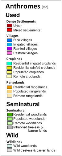
Anthrome data is delivered in 5 minute resolution or roughly a 10KM cell –at the equator. In addition, there are historical estimates for 1900, 1800 and 1700. The work depends upon the HYDE 3.1 dataset and Landscan population. The Anthromes are shown below in the legend
I started with a rather simple test. Let’s go the code
require(BerkeleyEarth)
Stations <- readSiteSummary(Directory = choose.dir())
Anthromes1900 <- file.choose()
Anthromes2000 <- file.choose()
Ant1900 <- raster(Anthromes1900)
Ant2000 <- raster(Anthromes2000)
lonlat <- cbind(Stations$Lon, Stations$Lat)
Stations <- cbind(Stations, Anthrome1900 = extract(Ant1900,y = lonlat),
Anthrome2000 = extract(Ant2000,y= lonlat))
Urban <- Stations[which(Stations$Anthrome2000 == 12 | Stations$Anthrome2000 ==11),]
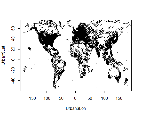
Pretty simple. I use the BerkeleyEarth function to read in the stations. Then I read in two rasters: one containing Anthromes for 1900 and the other for the year 2000. Then I extract the values for each station given its Longitude and Latitude. Then I select only those stations which were Urban or mixed settlements in the year 2000. That reduces the 36,000 Berkeley Earth stations to around 8000. Their geographic distribution looks like this.
Next, we read in the data, window it to 1900 to 2011 and then we use “intersectInvData()” to make sure that the stations in the inventory match those in the data. After that we calculate weights and then “solve” a least squares problem.
Data <- readAsArray(Directory = choose.dir())
Data <- windowArray(Data, start = 1900, end = 2011.99)
Data <- intersectInvData(Urban, Data)
weights <- inverseDensity(Data$Inventory,Data$Array)
Temps <- solveTemperature(Data$Array,weights)
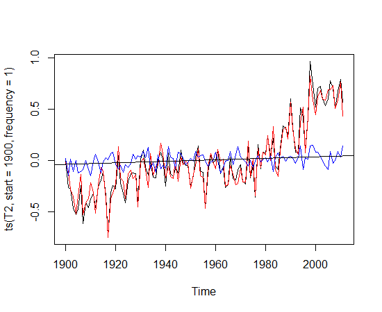
That’s it! The variable Temps now holds the temperature anomalies for all the urban anthromes. Next, I decided to segregate the Urban Anthromes into 2 classes: those that were already urban in 1990 and those that were not. So, we have two classes. In one class the stations were urban in 1900 and remained urban in 2000. In the other class, they were non urban in 1900 and become urban in 2000. I solve the least squares equation for both sub classes and difference them.Think about what you expect the answer to be. In short, you will have two curves. The black curve is the temperature anomaly of all the urban stations that remained urban. The red line is the anomaly of the non urban stations that became urban.
The black line represents those stations that began as Urban and ended as Urban. The red line is stations that began as non urban and became urban. There is a tiny positive trend (.0007) in this difference. What does that mean? You tell me. Did you expect stations that went from non urban to urban to show more warming? I did. Can this negative result be explained by appealing to a variety of suppositions? Sure. As always with these things more research required.
R-bloggers.com offers daily e-mail updates about R news and tutorials about learning R and many other topics. Click here if you're looking to post or find an R/data-science job.
Want to share your content on R-bloggers? click here if you have a blog, or here if you don't.


