Visualising Twitter User Timeline Activity in R
Want to share your content on R-bloggers? click here if you have a blog, or here if you don't.
I’ve largely avoided “time” in R to date, but following a chat with @mhawksey at #dev8d yesterday, I went down a rathole last night exploring a few ways of visualising a Twitter user timeline and as a result also had a quick initial play with some time handling features of R, such as timeseries objects, and generating daily, weekly and monthly summary counts of data value.
To start, let’s grab a user timeline. As Martin started it (?!), we’ll use his…;-)
require(twitteR)

#the most tweets we can bring back from a user timeline is the most recent 3600...
mht=userTimeline('mhawksey',n=3600)
tw.df=twListToDF(mht)

#As I've done in previous scripts, pull out the names of folk who have been "old-fashioned RTd"...
require(stringr)
trim <- function (x) sub('@','',x)

tw.df$rt=sapply(tw.df$text,function(tweet) trim(str_match(tweet,"^RT (@[[:alnum:]_]*)")[2]))
tw.df$rtt=sapply(tw.df$rt,function(rt) if (is.na(rt)) 'T' else 'RT')
The returned data includes a created attribute (of the form “2012-02-17 11:40:25″) and a replyToSN attribute that includes the username of a user Martin was replying to via a particular tweet.
The simplest way I can think of displaying the data is to just display the screenName atrribute of the sender (which in this case is always mhawskey) against time:
require(ggplot2)
ggplot(tw.df)+geom_point(aes(x=created,y=screenName))
As ever, things are never that simple… some tweets with old dates appear to have crept in somehow… A couple of things I tried realting to time based filtering caused R to have all sorts of malloc errors, so here’s a fudge I found to just display tweets that were created within the last 8,000 hours…
tw.dfs=subset(tw.df,subset=((Sys.time()-created)<8000))
ggplot(tw.dfs)+geom_point(aes(x=created,y=screenName))
Okay, so not very interesting… It shows that Martin tweets…
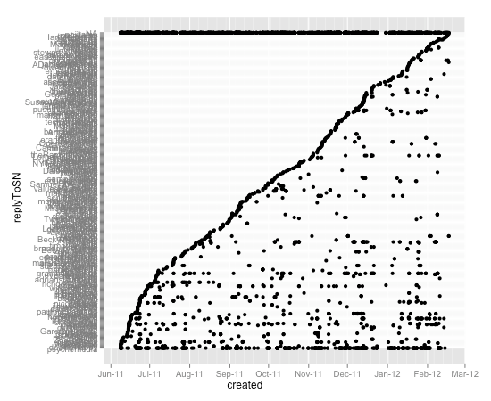
Picking up on views of the style doodled in Visualising Activity Around a Twitter Hashtag or Search Term Using R, where we look at when new users appear in a hashtag stream, we can plot when Martin replies to another twitter user, arranging the user names in the order in which they were first publicly replied to:
require(plyr)
#Order the replyToSN factor levels in the order in which they were first created
tw.dfx=ddply(tw.dfs, .var = "replyToSN", .fun = function(x) {return(subset(x, created %in% min(created),select=c(replyToSN,created)))})
tw.dfxa=arrange(tw.dfx,-desc(created))
tw.dfs$replyToSN=factor(tw.dfs$replyToSN, levels = tw.dfxa$replyToSN)

#and plot the result
ggplot(tw.dfs)+geom_point(aes(x=created,y=replyToSN))
The line at the top are tweets where the replyToSN value was NA (not available).
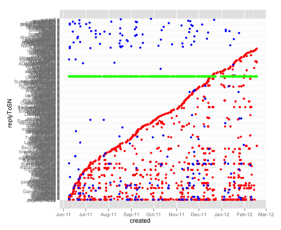
We can then go a little further and plot when folk are replied to or retweeted, as well as tweets that are neither a reply nor an old-style retweet:
ggplot()+geom_point(data=subset(tw.dfs,subset=(!is.na(replyToSN))),aes(x=created,y=replyToSN),col='red') + geom_point(data=subset(tw.dfs,subset=(!is.na(rt))),aes(x=created,y=rt),col='blue') + geom_point(data=subset(tw.dfs,subset=(is.na(replyToSN) & is.na(rt))),aes(x=created,y=screenName),col='green')
Here, the blue dots are old-style retweets, the red dots are replies, and the green dots are tweets that are neither replies nor old-style retweets. If a blue dot appears on a row before a red dot, it shows Martin RT’d them before ever replying to them. If blue dots are on a row that contains no red dot, then it shows Martin has RT’d but not replied to that person. A heavily populated row shows Martin has repeated interactions with that user.
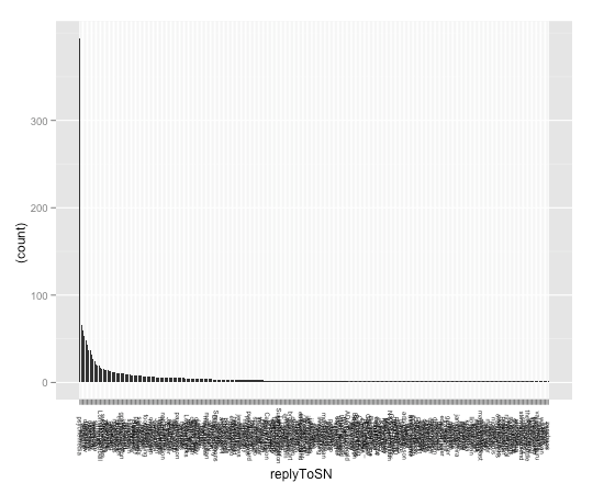
We can generate an ordered bar chart showing who is most heavily replied to:
#First we need to count how many replies a user gets...
#http://stackoverflow.com/a/3255448/454773
r_table <- table(tw.dfs$replyToSN)
#..rank them...
r_levels <- names(r_table)[order(-r_table)]
#..and use this ordering to order the factor levels...
tw.dfs$replyToSN <- factor(tw.dfs$replyToSN, levels = r_levels)

#Then we can plot the chart...
ggplot(subset(tw.dfs,subset=(!is.na(replyToSN))),aes(x=replyToSN)) + geom_bar(aes(y = (..count..)))+opts(axis.text.x=theme_text(angle=-90,size=6))
(Hmmm… how would I filter this to only show folk replied to more than 50 times, for example?)
Sometimes, a text view is easier…
head(table(tw.dfs$replyToSN))
#eg returns:
#psychemedia        wilm     ambrouk    sheilmcn  dajbelshaw  manmalik
        394          66          59          53          48        43
#Hmm..can we generalise this?
topTastic=function(dfc,num=5){
  r_table <- table(dfc)
  r_levels <- names(r_table)[order(-r_table)]
  head(table(factor(dfc, levels = r_levels)),num)
}
#so now, for example, I should be able to display the most old-style retweeted folk?
topTastic(tw.dfs$rt)
#or the 10 most replied to...
topTastic(tw.dfs$replyToSN,10)
Let’s try some time stuff now… From the R Cookbook, I find I can do this:
#label a tweet with the month number
tw.dfs$month=sapply(tw.dfs$created, function(x) {p=as.POSIXlt(x);p$mon})
#label a tweet with the hour
tw.dfs$hour=sapply(tw.dfs$created, function(x) {p=as.POSIXlt(x);p$hour})
#label a tweet with a number corresponding to the day of the week
tw.dfs$wday=sapply(tw.dfs$created, function(x) {p=as.POSIXlt(x);p$wday})
What this means is we can now chart a count of the number of tweets by day, week, or hour… For example, here’s hour vs. day of the week:
ggplot(tw.dfs)+geom_jitter(aes(x=wday,y=hour))
Note that this jittered scattergraph, where each dot is a tweet, only approximates the time each tweet occurred – the jitter applied is a random quantity designed to separate out tweets posted within the same hour-and-day-of-the-week bin.
What about Martin’s tweeting behaviour over time?
#We can also generate barplots showing the distribution of tweet count over time:
ggplot(tw.dfs,aes(x=created))+geom_bar(aes(y = (..count..)))
#Hmm... I'm not sure how to manually set binwidth= sensibly, though?!
Here’s a plot of the number of counts per… I’m not sure: the bin width was calculated automatically…
How about using the number of tweets in a particular day or hour bin to see what times of day or days of week Martin is tweeting?
#We can also plot the number of tweets within particular hour or time bins...
ggplot(tw.dfs,aes(x=wday))+geom_bar(aes(y = (..count..)),binwidth=1)
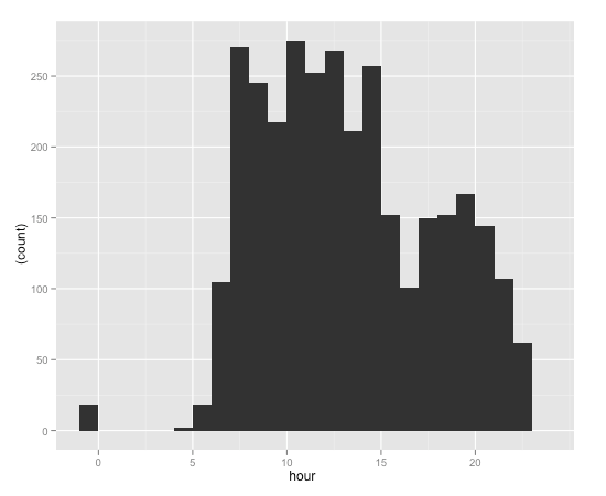
ggplot(tw.dfs,aes(x=hour))+geom_bar(aes(y = (..count..)),binwidth=1)
This chart shows activity (in terms of count…) per hour of day.
As well as doing the count of tweets per hour, for example, via a ggplot statistical graphical function, we can also get day, week, month, quarter and year counts from a set of functions associated with a particular sort of timeseries object…
Each element in a time series typically has two elements – a timestamp, and a numeric value. We can generate a time series of a sort around a twitter usertimeline by creating a dummy quantity – such as the unit value, 1 – and associate it with each timestamp:
require(xts)
#The xts function creates a timeline from a vector of values and a vector of timestamps.
#If we know how many tweets we have, we can just create a simple list or vector containing that number of 1s
ts=xts(rep(1,times=nrow(tw.dfs)),tw.dfs$created)

#We can now do some handy number crunching on the timeseries, such as applying a formula to values contained with day, week, month, quarter or year time bins.
#So for example, if we sum the unit values in daily bin, we can get a count of the number of tweets per day
ts.sum=apply.daily(ts,sum)
#also apply. weekly, monthly, quarterly, yearly

#If for any resason we need to turn the timeseries into a dataframe, we can:
#http://stackoverflow.com/a/3387259/454773
ts.sum.df=data.frame(date=index(ts.sum), coredata(ts.sum))

colnames(ts.sum.df)=c('date','sum')

#We can then use ggplot to plot the timeseries...
ggplot(ts.sum.df)+geom_line(aes(x=date,y=sum))
#Having got the data in a timeseries form, we can do timeseries based things to it... such as checking the autocorrelation:
acf(ts.sum)
Hmmm.. so, one day is much the same as another, but there also appears to be a weekly (7 day periodicity) pattern…
Finally, here’s a handy script I found on the Revolution Analytics site for Charting time series as calendar heat maps in R:
##############################################################################
 #                        Calendar Heatmap                                    #
 #                                by                                          #
 #                         Paul Bleicher                                      #
 # an R version of a graphic from:                                            #
 # http://stat-computing.org/dataexpo/2009/posters/wicklin-allison.pdf        #
 #  requires lattice, chron, grid packages                                    #
 ##############################################################################

## calendarHeat: An R function to display time-series data as a calendar heatmap
## Copyright 2009 Humedica. All rights reserved.

## This program is free software; you can redistribute it and/or modify
## it under the terms of the GNU General Public License as published by
## the Free Software Foundation; either version 2 of the License, or
## (at your option) any later version.

## This program is distributed in the hope that it will be useful,
## but WITHOUT ANY WARRANTY; without even the implied warranty of
## MERCHANTABILITY or FITNESS FOR A PARTICULAR PURPOSE.  See the
## GNU General Public License for more details.

## You can find a copy of the GNU General Public License, Version 2 at:
## http://www.gnu.org/licenses/gpl-2.0.html

calendarHeat <- function(dates,
                         values,
                         ncolors=99,
                         color="r2g",
                         varname="Values",
                         date.form = "%Y-%m-%d", ...) {
require(lattice)
require(grid)
require(chron)
if (class(dates) == "character" | class(dates) == "factor" ) {
  dates <- strptime(dates, date.form)
        }
caldat <- data.frame(value = values, dates = dates)
min.date <- as.Date(paste(format(min(dates), "%Y"),
                    "-1-1",sep = ""))
max.date <- as.Date(paste(format(max(dates), "%Y"),
                     "-12-31", sep = ""))
dates.f <- data.frame(date.seq = seq(min.date, max.date, by="days"))

# Merge moves data by one day, avoid
caldat <- data.frame(date.seq = seq(min.date, max.date, by="days"), value = NA)
dates <- as.Date(dates)
caldat$value[match(dates, caldat$date.seq)] <- values

caldat$dotw <- as.numeric(format(caldat$date.seq, "%w"))
caldat$woty <- as.numeric(format(caldat$date.seq, "%U")) + 1
caldat$yr <- as.factor(format(caldat$date.seq, "%Y"))
caldat$month <- as.numeric(format(caldat$date.seq, "%m"))
yrs <- as.character(unique(caldat$yr))
d.loc <- as.numeric()
for (m in min(yrs):max(yrs)) {
  d.subset <- which(caldat$yr == m)
  sub.seq <- seq(1,length(d.subset))
  d.loc <- c(d.loc, sub.seq)
  }
caldat <- cbind(caldat, seq=d.loc)

#color styles
r2b <- c("#0571B0", "#92C5DE", "#F7F7F7", "#F4A582", "#CA0020") #red to blue
r2g <- c("#D61818", "#FFAE63", "#FFFFBD", "#B5E384")   #red to green
w2b <- c("#045A8D", "#2B8CBE", "#74A9CF", "#BDC9E1", "#F1EEF6")   #white to blue

assign("col.sty", get(color))
calendar.pal <- colorRampPalette((col.sty), space = "Lab")
def.theme <- lattice.getOption("default.theme")
cal.theme <-
   function() {
  theme <-
  list(
    strip.background = list(col = "transparent"),
    strip.border = list(col = "transparent"),
    axis.line = list(col="transparent"),
    par.strip.text=list(cex=0.8))
    }
lattice.options(default.theme = cal.theme)
yrs <- (unique(caldat$yr))
nyr <- length(yrs)
print(cal.plot <- levelplot(value~woty*dotw | yr, data=caldat,
   as.table=TRUE,
   aspect=.12,
 layout = c(1, nyr%%7),
   between = list(x=0, y=c(1,1)),
   strip=TRUE,
   main = paste("Calendar Heat Map of ", varname, sep = ""),
   scales = list(
     x = list(
               at= c(seq(2.9, 52, by=4.42)),
               labels = month.abb,
               alternating = c(1, rep(0, (nyr-1))),
               tck=0,
               cex = 0.7),
     y=list(
          at = c(0, 1, 2, 3, 4, 5, 6),
          labels = c("Sunday", "Monday", "Tuesday", "Wednesday", "Thursday",
                      "Friday", "Saturday"),
          alternating = 1,
          cex = 0.6,
          tck=0)),
   xlim =c(0.4, 54.6),
   ylim=c(6.6,-0.6),
   cuts= ncolors - 1,
   col.regions = (calendar.pal(ncolors)),
   xlab="" ,
   ylab="",
   colorkey= list(col = calendar.pal(ncolors), width = 0.6, height = 0.5),
   subscripts=TRUE
    ) )
panel.locs <- trellis.currentLayout()
for (row in 1:nrow(panel.locs)) {
    for (column in 1:ncol(panel.locs))  {
    if (panel.locs[row, column] > 0)
{
    trellis.focus("panel", row = row, column = column,
                  highlight = FALSE)
xyetc <- trellis.panelArgs()
subs <- caldat[xyetc$subscripts,]
dates.fsubs <- caldat[caldat$yr == unique(subs$yr),]
y.start <- dates.fsubs$dotw[1]
y.end   <- dates.fsubs$dotw[nrow(dates.fsubs)]
dates.len <- nrow(dates.fsubs)
adj.start <- dates.fsubs$woty[1]

for (k in 0:6) {
 if (k < y.start) {
    x.start <- adj.start + 0.5
    } else {
    x.start <- adj.start - 0.5
      }
  if (k > y.end) {
     x.finis <- dates.fsubs$woty[nrow(dates.fsubs)] - 0.5
    } else {
     x.finis <- dates.fsubs$woty[nrow(dates.fsubs)] + 0.5
      }
    grid.lines(x = c(x.start, x.finis), y = c(k -0.5, k - 0.5),
     default.units = "native", gp=gpar(col = "grey", lwd = 1))
     }
if (adj.start <  2) {
 grid.lines(x = c( 0.5,  0.5), y = c(6.5, y.start-0.5),
      default.units = "native", gp=gpar(col = "grey", lwd = 1))
 grid.lines(x = c(1.5, 1.5), y = c(6.5, -0.5), default.units = "native",
      gp=gpar(col = "grey", lwd = 1))
 grid.lines(x = c(x.finis, x.finis),
      y = c(dates.fsubs$dotw[dates.len] -0.5, -0.5), default.units = "native",
      gp=gpar(col = "grey", lwd = 1))
 if (dates.fsubs$dotw[dates.len] != 6) {
 grid.lines(x = c(x.finis + 1, x.finis + 1),
      y = c(dates.fsubs$dotw[dates.len] -0.5, -0.5), default.units = "native",
      gp=gpar(col = "grey", lwd = 1))
      }
 grid.lines(x = c(x.finis, x.finis),
      y = c(dates.fsubs$dotw[dates.len] -0.5, -0.5), default.units = "native",
      gp=gpar(col = "grey", lwd = 1))
      }
for (n in 1:51) {
  grid.lines(x = c(n + 1.5, n + 1.5),
    y = c(-0.5, 6.5), default.units = "native", gp=gpar(col = "grey", lwd = 1))
        }
x.start <- adj.start - 0.5

if (y.start > 0) {
  grid.lines(x = c(x.start, x.start + 1),
    y = c(y.start - 0.5, y.start -  0.5), default.units = "native",
    gp=gpar(col = "black", lwd = 1.75))
  grid.lines(x = c(x.start + 1, x.start + 1),
    y = c(y.start - 0.5 , -0.5), default.units = "native",
    gp=gpar(col = "black", lwd = 1.75))
  grid.lines(x = c(x.start, x.start),
    y = c(y.start - 0.5, 6.5), default.units = "native",
    gp=gpar(col = "black", lwd = 1.75))
 if (y.end < 6  ) {
  grid.lines(x = c(x.start + 1, x.finis + 1),
   y = c(-0.5, -0.5), default.units = "native",
   gp=gpar(col = "black", lwd = 1.75))
  grid.lines(x = c(x.start, x.finis),
   y = c(6.5, 6.5), default.units = "native",
   gp=gpar(col = "black", lwd = 1.75))
   } else {
      grid.lines(x = c(x.start + 1, x.finis),
       y = c(-0.5, -0.5), default.units = "native",
       gp=gpar(col = "black", lwd = 1.75))
      grid.lines(x = c(x.start, x.finis),
       y = c(6.5, 6.5), default.units = "native",
       gp=gpar(col = "black", lwd = 1.75))
       }
       } else {
           grid.lines(x = c(x.start, x.start),
            y = c( - 0.5, 6.5), default.units = "native",
            gp=gpar(col = "black", lwd = 1.75))
           }

 if (y.start == 0 ) {
  if (y.end < 6  ) {
  grid.lines(x = c(x.start, x.finis + 1),
   y = c(-0.5, -0.5), default.units = "native",
   gp=gpar(col = "black", lwd = 1.75))
  grid.lines(x = c(x.start, x.finis),
   y = c(6.5, 6.5), default.units = "native",
   gp=gpar(col = "black", lwd = 1.75))
   } else {
      grid.lines(x = c(x.start + 1, x.finis),
       y = c(-0.5, -0.5), default.units = "native",
       gp=gpar(col = "black", lwd = 1.75))
      grid.lines(x = c(x.start, x.finis),
       y = c(6.5, 6.5), default.units = "native",
       gp=gpar(col = "black", lwd = 1.75))
       }
       }
for (j in 1:12)  {
   last.month <- max(dates.fsubs$seq[dates.fsubs$month == j])
   x.last.m <- dates.fsubs$woty[last.month] + 0.5
   y.last.m <- dates.fsubs$dotw[last.month] + 0.5
   grid.lines(x = c(x.last.m, x.last.m), y = c(-0.5, y.last.m),
     default.units = "native", gp=gpar(col = "black", lwd = 1.75))
   if ((y.last.m) < 6) {
      grid.lines(x = c(x.last.m, x.last.m - 1), y = c(y.last.m, y.last.m),
       default.units = "native", gp=gpar(col = "black", lwd = 1.75))
     grid.lines(x = c(x.last.m - 1, x.last.m - 1), y = c(y.last.m, 6.5),
       default.units = "native", gp=gpar(col = "black", lwd = 1.75))
   } else {
      grid.lines(x = c(x.last.m, x.last.m), y = c(- 0.5, 6.5),
       default.units = "native", gp=gpar(col = "black", lwd = 1.75))
    }
 }
 }
 }
trellis.unfocus()
}
lattice.options(default.theme = def.theme)
}
If we pass the dataframed time series data counting the sum (count) of tweets per day, we can get a calendar heatmap view of Martin’s twitter activity:
calendarHeat(ts.sum.df$date, ts.sum.df$sum, varname="@mhawksey Twitter activity")
I’m not sure if this is even interesting, let alone useful, but I do think now I’ve found out a little bit about working with time in R, that could be handy…
Still to do: extract hashtags and visualise them; extend the twitteR library so it exposes things like retweet counts. But that’s for another day…
R-bloggers.com offers daily e-mail updates about R news and tutorials about learning R and many other topics. Click here if you're looking to post or find an R/data-science job.
Want to share your content on R-bloggers? click here if you have a blog, or here if you don't.


