Kaplan-Meier Survival Plot – with at risk table
[This article was first published on Matt's Stats n stuff » R, and kindly contributed to R-bloggers]. (You can report issue about the content on this page here)
Want to share your content on R-bloggers? click here if you have a blog, or here if you don't.
Want to share your content on R-bloggers? click here if you have a blog, or here if you don't.
Credit for the bulk of this code is to Abhijit Dasgupta and the commenters on the original post here from earlier this year. I have made a few changes to the functionality of this which I think warrant sharing.
A brief intro, this function will use the output from a survival analysis fitted in R with ‘survfit’ from the ‘survival’ library, to plot a survival curve with the option to include a table with the numbers of those ‘at risk’ below the plot.
Changes to Abhijits version included in here:
- Ability to plot subgroups in multivariate analysis
- Ability to set x and y limits (as an argument in the function)
- Strata are now ordered (so strata order in legend will match that in ‘at risk’ table)
- Minor changes to code layout/structure
The major change here, and the motive for toying with the code, was to be able to plot for subgroups. I don’t know how common it is to only have one variable in your survival analysis, but the way the code was set up was to plot one line for each unique level grouping in the analysis. So if you have gender, a two level treatment (A and B) and three age groups (1,2,3), you would get a line for males on treatment A aged 1, a line for males on treatment A aged 2, a line for males on treatment A aged 3, a line for males on treatment B aged 1 etc etc.
This is executed, as you can see, with a regular expression (assistance from bioinformatician Richard Francis appreciated).
So a basic plot, using Abhijit’s example, would now look like this.
library(survival)
data(colon)
fit <- survfit(Surv(time,status)~rx, data=colon)
ggkm(fit, timeby=500, ystratalabs=c("Obs","Lev","Lev+5FU"))
Note: the strata names are now in (the same) order in legend and the table below.
Now say you had another variable you were adjusting for. I’ve assume that the ‘adhere’ variable in the data is full adherence to the treatment regime, and that 0 is Yes and 1 is No (logic to me had 0 as No and 1 as Yes but the 1′s seem to have a worse plot… will research the dataset and update when I get a chance).
colon$adhere <- factor(colon$adhere,labels =c("Yes","No"))
fit <- survfit(Surv(time,status)~rx + adhere, data=colon)
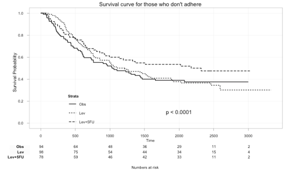
Here we can plot just those that didn’t adhere to the treatment:
ggkm(fit, timeby=500, ystratalabs=c("Obs","Lev","Lev+5FU"), subs="No", main="Survival curve for those that don't adhere")
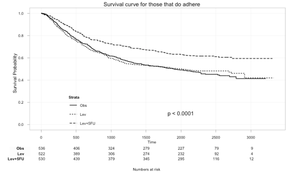
ggkm(fit, timeby=500, ystratalabs=c("Obs","Lev","Lev+5FU"), subs="Yes", main="Survival curve for those that do adhere")
With this you can now easily see the difference in survival for those that did not and those that did adhere to treatment.
This also works for multiple variables. Like if you had sex in the model too, you could use:
ggkm(fit, timeby=500, ystratalabs=c("Obs","Lev","Lev+5FU"), subs=c("Yes","Male"), main="Survival curve for those Males that do adhere")
And, here’s the code. Comments welcomed.
CODE WAS BROKEN by an update in versions (either R or ggplot). Working code available here.
To leave a comment for the author, please follow the link and comment on their blog: Matt's Stats n stuff » R.
R-bloggers.com offers daily e-mail updates about R news and tutorials about learning R and many other topics. Click here if you're looking to post or find an R/data-science job.
Want to share your content on R-bloggers? click here if you have a blog, or here if you don't.


