Isarithmic Maps of Public Opinion Data
Want to share your content on R-bloggers? click here if you have a blog, or here if you don't.
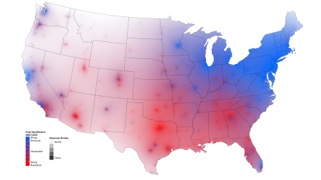
As a follow-up to my isarithmic maps of county electoral data, I have attempted to experiment with extending the technique in two ways. First, where the electoral maps are based on data aggregated to the county level, I have sought to generalize the method to accept individual responses for which only zip code data is known. Further, since survey respondents are not distributed uniformly across the geographic area of the United States (tending to be concentrated in more populous states and around cities), I have attempted to convey a sense of uncertainty or data sparsity through transparency. Some early products of this experimentation can be seen below.
This map is produced from over 30,000 individual responses to the standard 7-point party identification question. I generate dense grid of points across the map, and calculate a distance-weighted mean value for each point, as well as a distance-weighted response density for each point. This grid is then smoothed through interpolation via the akima package and plotted with Hadley Wickham’s excellent ggplot2. I use a blue-red diverging color scale to encode mean values, and a transparency/alpha parameter to encode local density (similar to this approach for choropleth maps). Thus, in the northwestern U.S., from which relatively few responses were collected, the colors can be seen to “fade to black.” The same process, with a white background, is illustrated below.
The feedback I have gotten thus far suggests that the black background has better æsthetics, but the white background is more clearly interpreted. I would be very interested in hearing your impressions of the relative merits of both.
The party identification maps above show the benefit of this ZIP code-based approach. First, unlike the choropleth approach, local political-geographic features are preserved without being obscured by the shape of boundary lines, such as county borders. For example, there is a clear difference between Atlanta and surrounding, more suburban areas, as well as within Miami, where the southern end of the city stands out as more Republican-leaning than the rest. Additionally, unlike choropleth maps in which variable/color values can change abruptly at boundaries which may be unfamiliar to the viewer, the distance smoothing employed here makes color-encoded information very clear around easily-identifiable major communities.
The other major benefit of this approach is that it can take as input any public opinion data for which some rough information is known about respondent location. Here I use ZIP codes, which are sufficiently granular to offer a nuanced view, but not so specific as to identify respondents. While it unsurprisingly works best with a large number of respondents, as seen here, I have also used a sample of 1,000 respondents, with useful results.
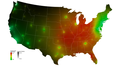
Here is a map of a variable of much current debate — family income. High income levels are concentrated along the coasts and around major cities. Again, compare the white and black backgrounds.

The distribution of family income levels, with a white background to indicate response density. Click to enlarge.
These maps of abortion attitudes, as is the case with many interesting variables, fairly closely mirror the map of party identification. If you have data that you would like to see mapped in this way, especially with variables that don’t correlate so well with party identification or ideology, please get in touch with me.

Map of abortion attitudes. I should emphasize here that the legend illustrates color values describing local means, and the legend text list possible survey responses. Click to enlarge.
On color
Identifying optimal color schemes has been a challenge with these maps. I generally prefer to use a diverging palette to maximize color variance and the ease with which value gradations can be discerned. However, the excellent ColorBrewer diverging palettes tend to pass through white, which becomes indistinguishable from areas with low data density. As such, I have used analogous color palettes which span about 150 degrees around the hue spectrum, and tend to work well with varying alpha values over both black and white. Here again, I would be interested in hearing ideas about optimal color schemes when transparency is used to encode an additional data dimension.
Edit: The code as it stands right now is embarrassingly ugly and convoluted. Once I am able to incorporate any feedback, and clean up the code, I will be happy to share.
R-bloggers.com offers daily e-mail updates about R news and tutorials about learning R and many other topics. Click here if you're looking to post or find an R/data-science job.
Want to share your content on R-bloggers? click here if you have a blog, or here if you don't.


