Extra! Extra! Get Your gridExtra!
Want to share your content on R-bloggers? click here if you have a blog, or here if you don't.
The more I use it, the deeper I fall in love with ggplot2. I know, some of you have heard me kvel about it ad nauseum (oh, yiddish and latin in one sentence – extra points!). But the graphs really look great, and once you wrap your head around a few concepts, it’s surprisingly easy to make it do most anything you want.
Except for one thing.
One thing I loved about the old R plotting functions was the ability to setup panels easily, and fill them with totally different graphs. Ye olde par(mfrow=c(2,2)) for a 2 x 2 grid, for example.
Enter gridExtra. Let the games begin.
What exactly do I mean? Let’s say I’m working with the soil chemistry data in the vegan package. First, maybe I just want to eyeball the historgrams of both the hummus depth and bare soil columns.
To do this in ggplot2, and with a single commend to put them in a single window, first you need to melt the data with reshape2 so that the column names are actually grouping variables, and then you can plot it. In the process, you create an additional data frame. And, you also have to do some extra specifying of scales, facets, etc. etc. Here’s the code and graphs.
library(ggplot2) #for plotting
library(reshape2) #for data reshaping

library(vegan) #for the data
data(varechem)

#First, reshape the data so that Hummus depth and Bare soil are your grouping variables
vMelt<-melt(varechem, measure.vars=c("Humdepth", "Baresoil"))

#Now plot it.  Use fill to color things differently, facet_wrap to split this into two panels,
#And don't forget that the x scales are different - otherwise things look odd
qplot(value, data=vMelt, fill=variable)+facet_wrap( facets=~variable, scale="free_x")
This produces a nice graph. But, man, I had to think about reshaping things, and all of those scales? What if I just wanted to make two historgrams, and slam ‘em together. This is where gridExtra is really nice. Through its function grid.arrange, you can make a multi-paneled graph using ggplot2 plots, lattice plots, and more (although, not regular R plots…I think).
So, let’s see the same example, but with gridExtra.
library(gridExtra)

#make two separate ggplot2 objects
humDist<-qplot(Humdepth, data=varechem, fill=I("red"))
bareDist<-qplot(Baresoil, data=varechem, fill=I("blue"))

#Now use grid.arrange to put them all into one figure.
#Note the use of ncol to specify two columns.  Things are nicely flexible here.
grid.arrange(humDist, bareDist, ncol=2)
“Oh, what a trivial problem,” you may now be saying. But, if you want to, say, plot up 5 different correlations, or, say, the same scatterplot with 4 different model fits, this is a life-saver – if nothing else, in terms of readability of your code for later use.
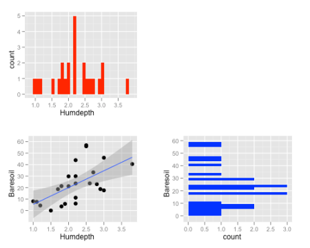
This is all well and good, but, simple. Let’s get into more fun multi-panel figures. Let’s say we wanted a bivariate scatter-plot of Hummus Depth and Bare Soil with a linear fit. But, we also wanted to plot the histograms of each variable in adjacent panels. Oh, and flip the histogram of whatever is on the y-axis. Sexy, no? This is pretty straightforward. We can use the ggplot2 objects we already have, flip the co-ordinates on one, create a bivariate plot with a fit, and fill in one final panel with something blank.
#First, the correlation.  I'm using size just to make bigger points.  And then I'll add a smoothed fit.
corPlot<-qplot(Humdepth, Baresoil, data=varechem, size=I(3))+stat_smooth(method="lm")

#OK, we'll need a blank panel.  gridExtra can make all sorts of shapes, so, let's make a white box
blankPanel<-grid.rect(gp=gpar(col="white"))

#Now put it all together, but don't forget to flip the Baresoil histogram
grid.arrange(humDist, blankPanel, corPlot, bareDist, ncol=2)
Nice. Note the use of the grid.rect. gridExtra is loaded with all sorts of interesting ways to place shapes and other objects into your plots – including my favorite – grid.table, for when you don’t want to deal with text.
a<-anova(lm(Baresoil ~ Humdepth, data=varechem))
grid.table(round(a, digits=3))

Or, heck, if you want to make that part of the above plot, use tableGrob instead of grid.table, and then slot it in where the blank panel is. The possibilities are pretty endless!
R-bloggers.com offers daily e-mail updates about R news and tutorials about learning R and many other topics. Click here if you're looking to post or find an R/data-science job.
Want to share your content on R-bloggers? click here if you have a blog, or here if you don't.


