Infomaps using R – Visualizing German unemployment rates by district on a map
Want to share your content on R-bloggers? click here if you have a blog, or here if you don't.
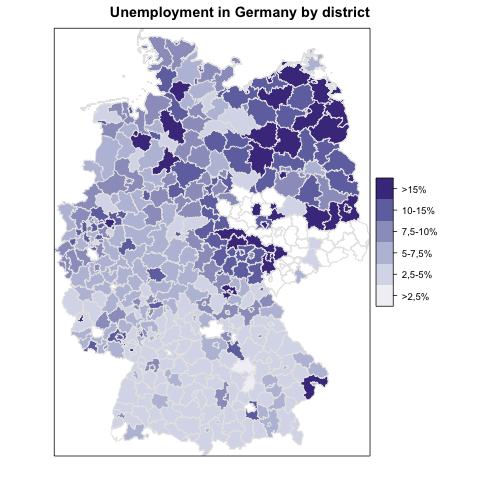
 Lately, David Smith from REvolution Computing set out to challenge the R community with the reprocuction of a beautiful choropleth map (= multiple regions map/thematic map) on US unemployment rates he had seen on the Flowing Data blog. Here you can find the impressing results. Being a fan of beautiful visualizations I tried to produce a similar map for Germany.
1. Getting the spatial country data
The first step resulted in getting data to draw a map of the German administrative districts. Unfortunately, the maps for Germany do not come along in the map package, which would mean I could easily adopt the code results from the challenge. Getting data: The GADM database of Global Administrative Areas has the aim to provide data of administrative districts for the whole world on different levels (country, state and county level). The data can be downloaded as as a shapefile, an ESRI geodatabase file, a Google Earth .kmz file and very convenient for R users, as an Rdata file.
2. Getting socio-demographic data (e. g. unemployment rates by administrative district): A lot of data is available online at www.statistikportal.de. On this site you find links to several data bases. To get the unemployment stats by county I clicked my way through: Regionaldatenbank Deutschland -> Arbeitsmarkt -> Arbeitsmarktstatistik der Bundesagentur für Arbeit -> Arbeitslose nach ausgewählten Personengruppen sowie Arbeitslosenquoten – Jahresdurchschnitt – (ab 2008) regionale Tiefe: Kreise und krfr. Städte -> Werteabruf -> save as CSV format. This table contains all the information I need, although for some reson, for a few districts there is no data listed. I also looked for another source. On Regionalatlas a nice online visualization tool is offered. In the menu I selected unemployment rate 2008 as indicator. Besides the nice visualization you get, there is a menu button “tables” where you can retrieve a html table of the data. I simply copied and pasted it into a .txt file which gives me a tab seperated value format I can read in R. But still: some districts are not listed. Here is a pdf file containing the data.
3. Preparing the data
Now I have two datafiles: One (gadm) containaing the spatial information, the other one (unempl) containing the unemployment rates. It turns out that the same districts are not always named alike. Sometimes the name comes along with a supplement or in other cases the deviations are more severe so that simple parsing will not do it.
I decided to take the quick-and-dirty route and do a fuzzy matching, which surely is prone to errors, very slow and not at all elegant… Well, never underestimate the rawness of raw data.
4. Plotting the data
On Claudia Engel’s Anthrospace blog I found an R script already perfect to make use of the data provided. The Rdata files turn out to contain SpatialPolygonsDataFrame so we can print the data without any further preparation using the sp package.
###############################################################
library(sp)
library(RColorBrewer)

# get spatial data for Germany on county level
con <- url("http://gadm.org/data/rda/DEU_adm3.RData")
print(load(con))
close(con)
# plot Germany with random colors
col = rainbow(length(levels(gadm$NAME_3)))
spplot(gadm, "NAME_3", col.regions=col, main="German Regions",
       colorkey = FALSE, lwd=.4, col="white")
###############################################################
This looks nice. To produce a color vector to visualize the unemployment rate the two data sets have to be merged.
###############################################################
### DATA PREP ###
# loading the unemployment data
unempl <- read.delim2(file="./data/data_germany_unemployment_by_
                     county.txt", header = TRUE, sep = "\t",
                     dec=",", stringsAsFactors=F)

# due to Mac OS encoding, otherwise not needed
gadm_names <- iconv(gadm$NAME_3, "ISO_8859-2", "UTF-8")

# fuzzy matching of data: quick & dirty
# caution: this step takes some time ~ 2 min.

# parsing out "Städte"
gadm_names_n <- gsub("Städte", "", gadm_names)

total <- length(gadm_names)
# create progress bar
pb <- txtProgressBar(min = 0, max = total, style = 3)
order <- vector()
for (i in 1:total){
   order[i] <- agrep(gadm_names_n[i], unempl$Landkreis,
                     max.distance = 0.2)[1]
 setTxtProgressBar(pb, i)               # update progress bar
}


# choose color by unemployment rate
col_no <- as.factor(as.numeric(cut(unempl$Wert[order],
                    c(0,2.5,5,7.5,10,15,100))))
levels(col_no) <- c(">2,5%", "2,5-5%", "5-7,5%",
                    "7,5-10%", "10-15%", ">15%")
gadm$col_no <- col_no
myPalette<-brewer.pal(6,"Purples")

# plotting
spplot(gadm, "col_no", col=grey(.9), col.regions=myPalette,
main="Unemployment in Germany by district")

###############################################################
It seems that the districts for which no data was available mainly belong to the states Sachsen-Anhalt and Sachsen. Also you can see that east of Germany has got a much higher unemplyoment rate than the west. The same holds true for a north-south comparison.
Besides ths sp package there are many other ways to produce such a graphic. I will now take another approch using shapefile data which also is available on GDAM. The data is availabe as a .zip file which includes several dBase files for all levels (3=district, 1=state etc.).
###############################################################

library(sp)
library(maptools)

nc1 <- readShapePoly("./data/DEU_adm/DEU_adm1.dbf",
                    proj4string=CRS("+proj=longlat +datum=NAD27"))
nc3 <- readShapePoly("./data/DEU_adm/DEU_adm3.dbf",
                    proj4string=CRS("+proj=longlat +datum=NAD27"))

# col_no comes from the calculations above
par(mar=c(0,0,0,0))
plot(nc3, col=myPalette[col_no], border=grey(.9), lwd=.5)
plot(nc1, col=NA, border=grey(.5), lwd=1, add=TRUE)

###############################################################
What I like about all this, it that it is pretty simple to draw almost any country you like. Besides the very messy part of data preparation it is only a few lines of code and the results are nice.
R-bloggers.com offers daily e-mail updates about R news and tutorials about learning R and many other topics. Click here if you're looking to post or find an R/data-science job.
Want to share your content on R-bloggers? click here if you have a blog, or here if you don't.


