No need for SPSS – beautiful output in R #rstats
Want to share your content on R-bloggers? click here if you have a blog, or here if you don't.
About one year ago, I seriously started migrating from SPSS to R. Though I’m still using SPSS (because I have to in some situations), I’m quite comfortable and happy with R now and learnt a lot in the past months. But since SPSS is still very wide spread in social sciences, I get asked every now and then, whether I really needed to learn R, because SPSS meets all my needs…
Well, learning R had at least two major benefits for me: 1.) I could improve my statistical knowledge a lot, simply by using formulas, asking why certain R commands do not automatically give the same results like SPSS, reading R resources and papers etc. and 2.) the possibilities of data visualization are way better in R than in SPSS (though SPSS can do well as well…). Of course, there are even many more reasons to use R.
Still, one thing I often miss in R is a beautiful output of simple statistics or maybe even advanced statistics. Not always as plot or graph, but neither as “cryptic” console output. I’d like to have a simple table view, just like the SPSS output window (though the SPSS output is not “beautiful”). That’s why I started writing functions that put the results of certain statistics in HTML tables. These tables can be saved to disk or, even better for quick inspection, shown in a web browser or viewer pane (like in RStudio viewer pane).
All of the following functions are available in my sjPlot-package on CRAN.
(Generalized) Linear Models
The first two functions, which I already published last year, can be used to display (generalized) linear models and have been described here. Yet I want to give another short example for quickly viewing at linear models:
require(sjPlot) # load package
# Fit "dummy" models. Note that both models share the same predictors
# and only differ in their dependent variable
data(efc)
# fit first model
fit1 <- lm(barthtot ~ c160age + c12hour + c161sex + c172code, data=efc)
# fit second model
fit2 <- lm(neg_c_7 ~ c160age + c12hour + c161sex + c172code, data=efc)
# Print HTML-table to viewer pane
sjt.lm(fit1, fit2,
       labelDependentVariables=c("Barthel-Index", "Negative Impact"),
       labelPredictors=c("Carer's Age", "Hours of Care", "Carer's Sex", "Educational Status"),
       showStdBeta=TRUE, pvaluesAsNumbers=TRUE, showAIC=TRUE)
This is the output in the RStudio viewer pane:

Frequency Tables
Another (new) function is sjt.frq which prints frequency tables (the next example uses value and variable labels, but the simplest function call is just sjt.frq(variable)).
require(sjPlot) # load package
# load sample data
data(efc)
# retrieve value and variable labels
variables <- sji.getVariableLabels(efc)
values <- sji.getValueLabels(efc)
# simple frequency table
sjt.frq(efc$e42dep,
        variableLabels=variables['e42dep'],
        valueLabels=values[['e42dep']])
And again, this is the output in the RStudio viewer pane:

You can print frequency tables of several variables at once:
sjt.frq(as.data.frame(cbind(efc$e42dep, efc$e16sex, efc$c172code)),
        variableLabels=list(variables['e42dep'], variables['e16sex'], variables['c172code']),
        valueLabels=list(values[['e42dep']], values[['e16sex']], values[['c172code']]))
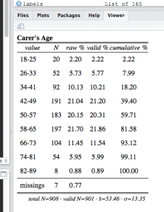
When applying SPSS frequency tables, especially for variable with many unique values (e.g. age or income), this often results in very long, unreadable tables. The sjt.frq function, however, can automatically group variables with many unique values:
sjt.frq(efc$c160age,
        variableLabels=list("Carer's Age"),
        autoGroupAt=10)
This results in a frequency table with max. 10 groups:

You can also specify whether the row with median value and both upper and lower quartile are highlighted. Furthermore, the complete HTML-code is returned for further use, separated into style sheet and table content. In case you have multiple frequency tables, the function returns a list with HTML-tables.
Contingency Tables
The second new function in the sjPlot-package (while I’m writing this posting, source code and windows binaries of version 1.1 are available, Mac binaries will follow soon…) is sjt.xtab for printing contingency tables.
The simple function call prints observed values and cell percentages:
# prepare sample data set
data(efc)
efc.labels <- sji.getValueLabels(efc)
sjt.xtab(efc$e16sex, efc$e42dep,
         variableLabels=c("Elder's gender", "Elder's dependency"),
         valueLabels=list(efc.labels[['e16sex']], efc.labels[['e42dep']]))
Observed values are obligatory, while cell, row and column percentages as well as expected values can be added via parameters. An example with all possible information:
sjt.xtab(efc$e16sex, efc$e42dep,
         variableLabels=c("Elder's gender", "Elder's dependency"),
         valueLabels=list(efc.labels[['e16sex']], efc.labels[['e42dep']]),
         showRowPerc=TRUE, showColPerc=TRUE, showExpected=TRUE)
And a simple one, w/o horizontal lines:
sjt.xtab(efc$e16sex, efc$e42dep,
         variableLabels=c("Elder's gender", "Elder's dependency"),
         valueLabels=list(efc.labels[['e16sex']], efc.labels[['e42dep']]),
         showCellPerc=FALSE, showHorizontalLine=FALSE)
All colors can be specified via parameters, as well as the constant string values. See ?sjt.frq resp. ?sjt.xtab for detailed information.
If you have more ideas on which “quick” statistics are suitable for printing the results in the viewer pane, let me know. I will try to include them into my package…
Tagged: data visualization, R, rstats, SPSS, Statistik
R-bloggers.com offers daily e-mail updates about R news and tutorials about learning R and many other topics. Click here if you're looking to post or find an R/data-science job.
Want to share your content on R-bloggers? click here if you have a blog, or here if you don't.


