GitHub data analysis
Want to share your content on R-bloggers? click here if you have a blog, or here if you don't.
Few weeks ago GitHub announced, that its timeline data is available on bigquery for analysis. Moreover, it offers prizes for the best visualization of the data. Despite my art skills and minimal chances to win beauty contest, I decided to crunch GitHub data and run data analysis.
After initial trial of bigquery service, I found hard to know, what price, if any, I’m going to pay for the service. Hence, I pulled the data (6.5 GB) from bigquery on my machine and further I used my machine for analysis. Bash scripts have been used to clean up and extract necessary data, R for data analysis and visualization and C++ for text extraction.
GitHub dataset is one table, where each row consist of information about repository (i.e. path, date of creation, name, description, programming language, number of forks/watchers and etc.) and action, which was done by user (i.e. username, location, timestamp and etc.).
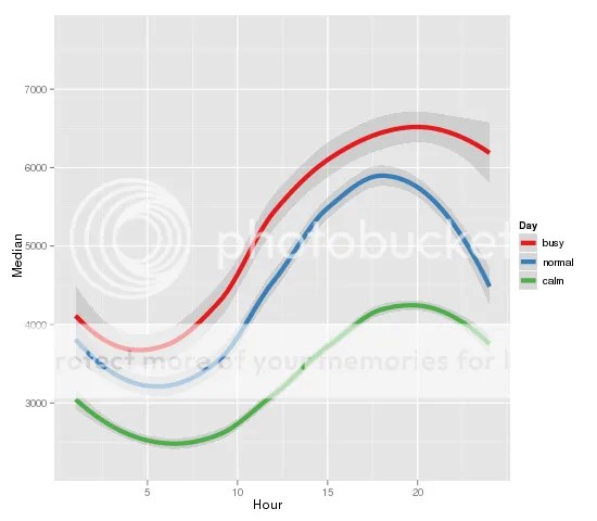
As a result, we can check how GitHub users actions are spread over time during the day. The X axis on the graph below is labeled with the hours of the day (GMT) and the Y axis represent median values of the actions for each hour. From it, we can make a deduction, that highest load for GitHub can be expected between 15:00 and 17:00 GMT and lowest to be expected between 05:00 and 07:00 GMT. The color of the line indicates how busy was the day based on quantiles: green are calm days (20% of days), blue – normal days (50% quantile) and red are busy days (80% quantile). I should to mention, that auto-correlation or serial correlation is high (70% for following hour), which means, that busy hours tend to be followed by busy hours and calm hours tend to be followed by calm hours. Moreover, busy days tend happen after busy days.
Second graph below shows median of actions divided by weekdays. There is not big surprise – weekends are more slow than weekdays, nevertheless the programmers are slightly less productive on Mondays and Fridays.
The analysis of creation of new repository shows, that the pattern of busy or calm hours remains over the years. This can be attributed to the fact, that majority of the users comes from North America and Europe.
Another hypothesis can be drawn from this information, that number of creation of the new repositories grow exponentially. However, I mind you, that the graph below is biased – most likely, GitHub users update recent projects, consequently more recent projects appeared on timeline. Even though, 2009-2011 years show exponential grow.
The X axis of the graph below is labeled with the hour of the day, the Y axis – log of median values of new repositories.
Following graph shows the number of forks per project (the X axis, log scale) versus number of watchers (the Y axis, log scale). As expected, there is linear correlation between forks and watchers. Even so there is something interesting about outliers, which are below bottom line – the projects, where number of watchers is low, but number of forks is high. These are anomalies and worth to check.
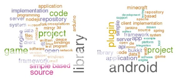
The next thing to do is to look at the repository description. Let’s group the repositories by programming language and count most dominant words in the description. The graph below has C++ word cloud on the left and Java – right . C++ projects are about library, game, simple(?), engine, Arduino. Java is dominated by android, plugin, server, minecraft, spring, maven.

Ruby (left) vs Python(right ):

“Surprise”, “surprise” – R projects (left) are largely about data analysis, however “machine” word, which corresponds to Machine learning is very tiny. Shell (right) is dominated by configuration, managing, git(?).
GitHub dataset includes location field. Unfortunately, the users can enter whatever they want – country, city or leave it empty. Nevertheless, I was able to extract good chunk of actions, where location field has meaningful value. The video below shows country based users activity, where dark red corresponds to high activity and light red – minor. Only 30 most active countries are included, the rest are grey.
The same pattern persist over the days – activity in Asia increases around midnight, Europe wakes up around 8:00 or 9:00, where America starts around 15:00. Who said, that hackers and programmers work at night?
What else can be done with GitHub dataset? Most repositories have description field, which can be used to find similar projects by implementing tf-idf method. I tried that method and the results are satisfying.
Most of the graphs shown above are reproducible (except word clouds) and the code can be found on GitHub.
R-bloggers.com offers daily e-mail updates about R news and tutorials about learning R and many other topics. Click here if you're looking to post or find an R/data-science job.
Want to share your content on R-bloggers? click here if you have a blog, or here if you don't.


