
Making beautiful maps with ggplot
Want to share your content on R-bloggers? click here if you have a blog, or here if you don't.
Many people reach for ggplot for graphing but it is also a great tool for mapping. You have control to customize colors, scales, and themes from ggplot to make beautiful maps. Here we explore an example using the Berkeley climate data to map global temperatures in 1913 compared to a century later in 2013. This dataset contains average temperature data from 1749 through 2013 for many locations around the world. Has there been a change in yearly annual temperatures?
As with most data projects, the data needs to be massaged so that it is ready for mapping. Let’s look at the five steps to pre-process this data.
require(ggplot2)
require(dplyr)
require(stringr)

# Step 1. load data
df <- read.csv("Data/GlobalLandTemperaturesByCity.csv")
df <- df %>% filter(!is.na(AverageTemperature))

# Step 2. format dates
df$dt <- as.Date(df$dt)

df$Year <- as.numeric(format(df$dt, format="%Y")
)

# Step 3. get mean annual temperature
df_yearly <- aggregate(AverageTemperature ~ Year + City, df, mean)

# Step 4. filter 2013 data
df2013 <- df_yearly %>% filter(Year == 2013)

# Step 5. change latitude and longitude from N/S, E/W to +/-
# extract numbers only
df2013$Latitude_num <- as.numeric(str_sub(df2013$Latitude,1,nchar(df2013$Latitude)-1))
df2013$Longitude_num <- as.numeric(str_sub(df2013$Longitude,1,nchar(df2013$Longitude)-1))
# extract characters only
df2013$Latitude_chr <- (str_extract(df2013$Latitude, "[aA-zZ]+"))
df2013$Longitude_chr <- (str_extract(df2013$Longitude, "[aA-zZ]+"))

#lat: N = +, S = -, lon: E = +, W = -
df2013 <- within(df2013, {
  Lat <- ifelse(Latitude_chr=="N", Latitude_num, -Latitude_num)
  Long <- ifelse(Longitude_chr=="E", Longitude_num, -Longitude_num)
})
Step 1. Load the data into the workspace and remove any rows that are missue values. The dplyr filter command is an intuitive way to select rows that fit certain criteria. Here we select rows that do not have NAs in AverageTemperature.
Step 2. When the data loads the date column dt is a character type. We use as.Date() to convert it to the date format. From here we can extract the year into a new variable Year using format(). The as.numeric() command is used to convert year from a date format to numeric so it can be easily plotted and formatted.
Step 3. For each city there are several temperature measurements each year. This step gets the average temperature for each city by year using the aggregate() function.
Step 4. Use the dplyr filter() function to extract data for the year 2013 only.
Step 5. Latitude and longitude are given in decimal degrees but using N/S to designate latitude and E/W to designate longitude. For plotting purposes we need the latitude and longitude to be in decimal degrees with positive and negative signs to designate hemisphere. First we use the str_sub() function from the stringr package to remove the last character from the string which is the numeric part of the latitude or longitude string. Then we use str_extract() looking for the pattern "[aA-zZ]+" to get the character part of the string (N, S, E, or W). Now that the numeric part of the latitude and longitude is stored in a separate variable from the cardinal direction (N, S, E, or W) we use ifelse() to assign positive for N or E and negative for S or W.
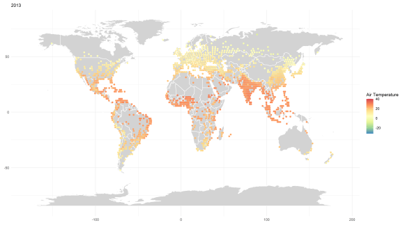
After these pre-processing steps we are finally ready to produce a map of the temperature data for 2013. Let’s look at the figure and then walk through the code that was used to produce it.
world <- map_data("world")

ggplot() +
  geom_polygon(data = world, aes(x = long, y = lat, group = group),
               fill = "lightgray",
               colour = "white") +
  coord_fixed(1.3) +
  geom_point(aes(x = df2013$Long, y = df2013$Lat, color = df2013$AverageTemperature)) +
  geom_jitter() +
  labs(x = " ", y = " ", subtitle = "2013") +
  theme_minimal() +
  scale_color_distiller("Air Temperature", palette = "Spectral", limit=c(-32, 40))
First, extract the world map using the ggplot function map_data(). This creates a dataframe with information to plot each country. Then, call ggplot() to start a figure. The countries are added to the map using geom_polygon() from the world dataframe. The average temperature points are added to the map using geom_point() from the df2013 dataframe produced in the pre-processing steps. geom_jitter() separates points that would otherwise overlap on the map. Labels and theme are updated. Finally, scale_color_distiller() is used to obtain the “spectral” palette. The important thing to notice on this line is the limits are forced to -32 to 40 degrees. Since we want to compare the temperatures in 2013 to the temperatures a century earlier in 1913 the colors need to match up between the two time periods. The temperature range -32 to 40 encompasses the lowest low and highest high experienced over either time period so the color ramps will be the same. Elio Campatelli describes how to customize map color scales elegantly in his blog.
To compare the temperatures in 2013 to 1913 we produce a similar map for 1913. The only difference occurs during step 4 of the pre-processing where we filter for Year = 1913.

It’s tricky to see the difference in temperature from 1913 to 2013. If you squint, it looks like temperatures might be warmer in 2013. But maybe that’s a trick of the light scrolling back and forth between the two maps. Let’s make a map of the temperature difference in each city between the two years.
dfcompare <- merge(df2013, df1743, by = c("City"), all.x = TRUE)
dfcompare$AvgTempDiff <- dfcompare$AverageTemperature.x - dfcompare$AverageTemperature.y #2013-1913


airtempmapdiff <- ggplot() +
  geom_polygon(data = world, aes(x = long, y = lat, group = group),
               fill = "lightgray",
               colour = "white") +
  coord_fixed(1.3) +
  geom_point(aes(x = dfcompare$Long.x, y = dfcompare$Lat.x, color = dfcompare$AvgTempDiff)) +
  geom_jitter() +
  labs(x = " ", y = " ", subtitle = "2013 - 1913") +
  theme_minimal() +
  scale_color_distiller("Air Temperature Difference", palette = "Spectral")

Ah, much better! We can see that the annual average temperature was warmer in 2013 than in 1913 in most cities (yellow or red dots). But, amazingly, the temperature is actually colder in some cities in 2013 than in 1913 such as the southern points in South America.
There you have it! Mapping with ggplot. I hope that you found this post helpful or at least interesting. Please let me know if you have an R question that you would like explained on here. And thanks for following along with my R journey.
R-bloggers.com offers daily e-mail updates about R news and tutorials about learning R and many other topics. Click here if you're looking to post or find an R/data-science job.
Want to share your content on R-bloggers? click here if you have a blog, or here if you don't.