New features in Power BI for Data Analysts – Small multiples, Anomaly Detection and Zoom on visuals
Want to share your content on R-bloggers? click here if you have a blog, or here if you don't.
Great new features have bundled and are now available in Power BI. With December 2020 update, all of the features described in this blog post will be available.
Once you downloaded the latest update (as of writing of this blog, this is December 2020 update), open Power BI Desktop and head to Options and Settings -> Options and go to Preview feature.
Make sure to have Anomaly detection and Small multiples checked. Restart Power BI Desktop.
Small multiples
Small multiples is a layout of small charts over a grouping variable, aligned side-by-side, sharing common scale, that is scaled to fit all the values (by grouping or categorical variable) on multiple smaller graphs. Analyst should immediately see and tell the difference between the grouping variable (e.g.: city, color, type,…) give a visualized data.
In Python, we know this as trellis plot or FacetGrid (seaborn) or simply subplots (Matplotlib).
In R, this is usually referred to as facets (ggplot2).
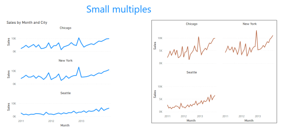
These multiples are customizable to show you number of graphs per column and row, can be type of line-chart, bar-chart, area-chart and I am positive, that it will get more visuals supported in following updates (this is still under preview as of writing this post).
Anomaly detection
Anomaly detection is a process of detecting and finding the values that deviate from normal (base) line. It can be described as outlier detection. Anomaly detection currently supports finding anomalies in time series data, and can provide also explanation of finding the root cause analysis. This is part of adding more analytics out of the box into Power BI (like Key influencers, decomposition tree and many additional visuals based on R or Python available in marketplace).
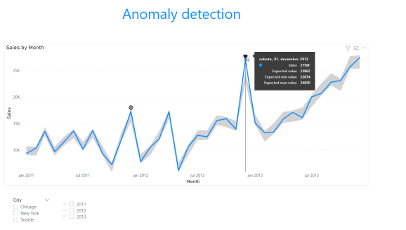
You can also fine-tune the sensitivity and get explanation of the anomalies by adding a variable for the anomaly to be explained by.
Visual Zoom Slider
Visual Zoom slider was introduced in November 2020 Power BI update and gives you the option to zoom in on dataset without having to use or change the filters. Zoom slider will examine a smaller portion of the chart and give you a detailed look on the data.
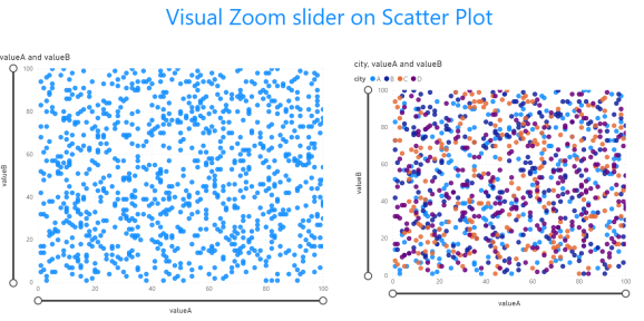
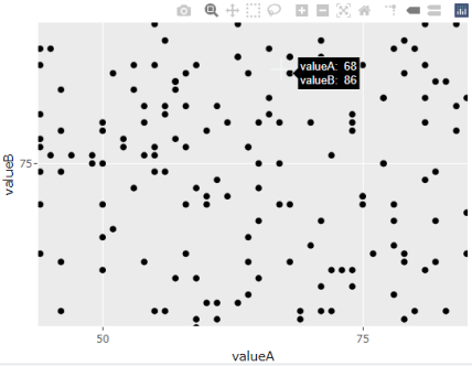
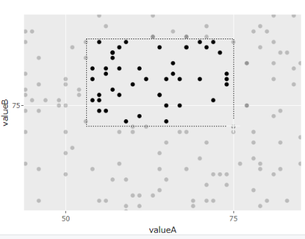
This is a step in right directions for the analysts. And a great response to capabilities that bring R or Python libraries for visualisations, like Plotly. Plotly gives you the capability to zoom in on smaller range of data, to examine or understand a denser set on the graph.
Here is a R exampla of plotly:
########################
### Creating random data
########################
set.seed(2908)

df <- data.frame(time = seq(1,1000, by=1),
                 value = sample(1:34, size=1000, replace=TRUE),
                 valueA = sample(1:100, size=1000, replace=TRUE),
                 valueB = sample(1:100, size=1000, replace=TRUE),
                 city = sample(LETTERS[1:4], size=1000, replace=TRUE),
                 dist = runif(1000),
                 Date = sample(seq(as.Date('2016/01/01'), as.Date('2021/01/01'), by="day"), 1000))

########################
### ggplot scatter plot
### Plotly
#######################

library(plotly)
library(ggplot2)

p <- ggplot(df, aes(valueA, valueB)) + geom_point()
fig <- ggplotly(p)
fig
And this will generate same looking chart as in Power BI with command line in right upper corner, giving data engineer to zoom in (pane in / pane out) on smaller range of data.
Great and new features available for you in Power BI, making data engineering and data science even easier.
As always, the sample, code and PBIX file is available on Github.
R-bloggers.com offers daily e-mail updates about R news and tutorials about learning R and many other topics. Click here if you're looking to post or find an R/data-science job.
Want to share your content on R-bloggers? click here if you have a blog, or here if you don't.


